
foversta
[PuristSPro Moderator]
20814

Hands on review of the Trilobe "Nuit Fantastique"
Note: the pictured watch is a prototype and the grained finish of the dial will be different from the one shown in the pictures.
I remember my first meetings with Gautier Massonneau and Volcy Bloch, respectively founder and general manager of Trilobe. That was only two years ago and yet I feel that the young brand has come a long way since then. To measure this, one only needs to analyze the different iterations of the "Les Matinaux" collection, which show that since the launch of its inaugural model, Trilobe has constantly improved its offer from both a technical and aesthetic point of view. The cornerstone of this evolution towards greater maturity is the use of the exclusive X-Centric movement, developed with the Cercle des Horlogers, which has enabled the refinement of the cases and the design of more slender watches. Yet, and this is something I really appreciate, Gautier Massonneau and Volcy Bloch don't skip any steps. Rather than releasing new models, the brand preferred to capitalize on the singularity of its time display and stay in a field it masters to avoid technical problems and disappoint its customers. The calculation paid off because Trilobe has found its place, having convinced a circle of loyal customers.
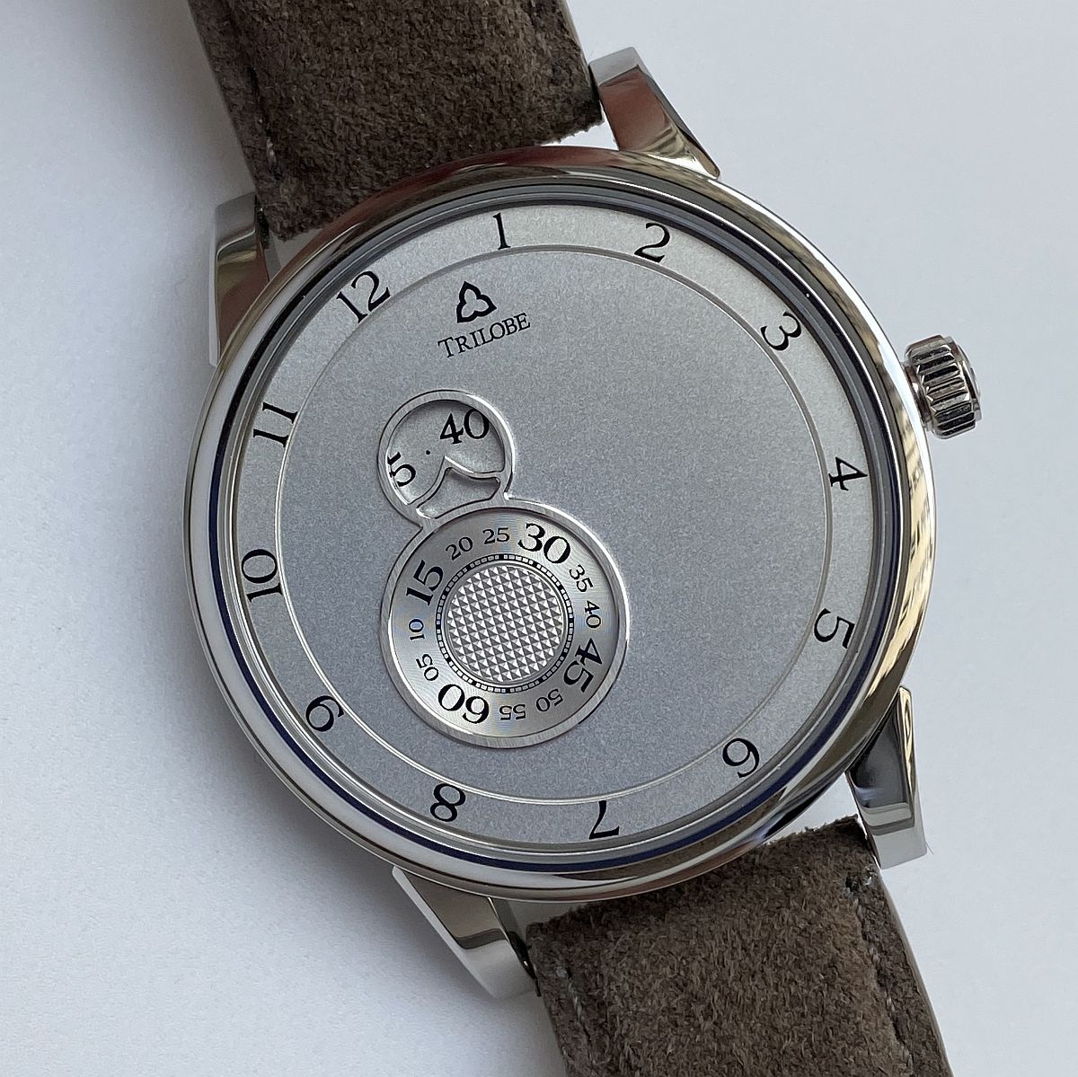
The new collection "Nuit Fantastique" takes its name from the short story written by Stefan Zweig which describes the experience of a night that changed the life of the main character. Behind this enigmatic name, the Trilobe team wants to remind us of the importance of living with passion, as if our own personality can only be revealed through extraordinary events. In any case, the new display of watches from this collection offers us once again an alternative approach to create a special and different relationship with the passing time. In fact, the concept has been defined with great intelligence. Why? Simply because while setting up a dial organization distinct from that of the "Les Matinaux" collection, the Trilobe team keeps the same movement. It is a way for the brand to evolve while building on its achievements.
There are, of course, common points between the two collections, including the peripheral hour indicator, the concept of rotating discs and the asymmetrical character. But, and this is perhaps what explains the success of this new collection, the visual rendering of the dial is almost opposite. The "Matinaux" display filled the entire dial and the positions of the fixed indexes gave the impression of having been chosen randomly. It gave off a feeling of freedom, almost of escape to the outside of the dial. On the other hand, the display of the "Nuit Fantastique" is more aligned and positioned in the left zone of the dial. In fact, the reference to Stefan Zweig's novel appears more clearly: time seems more concentrated and somehow more precious. In short, let's not waste it and take advantage of it to live intensely!
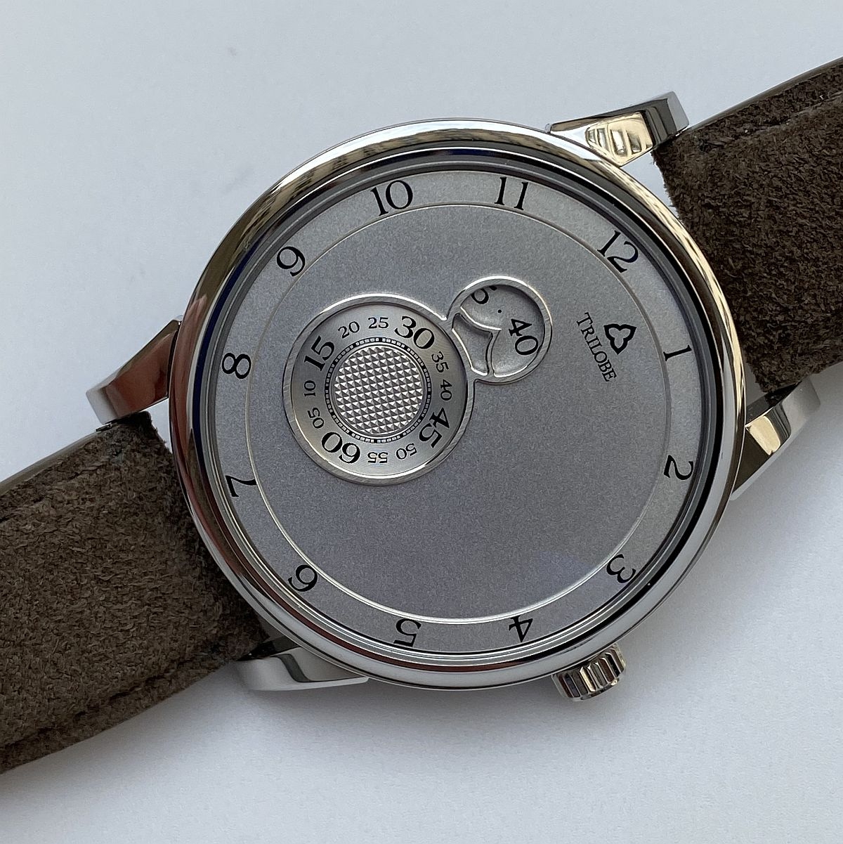
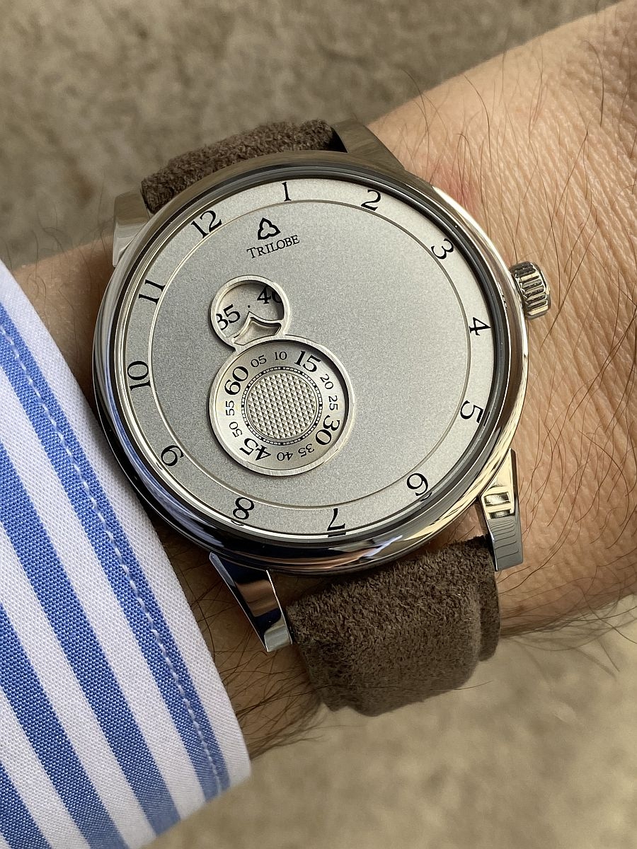
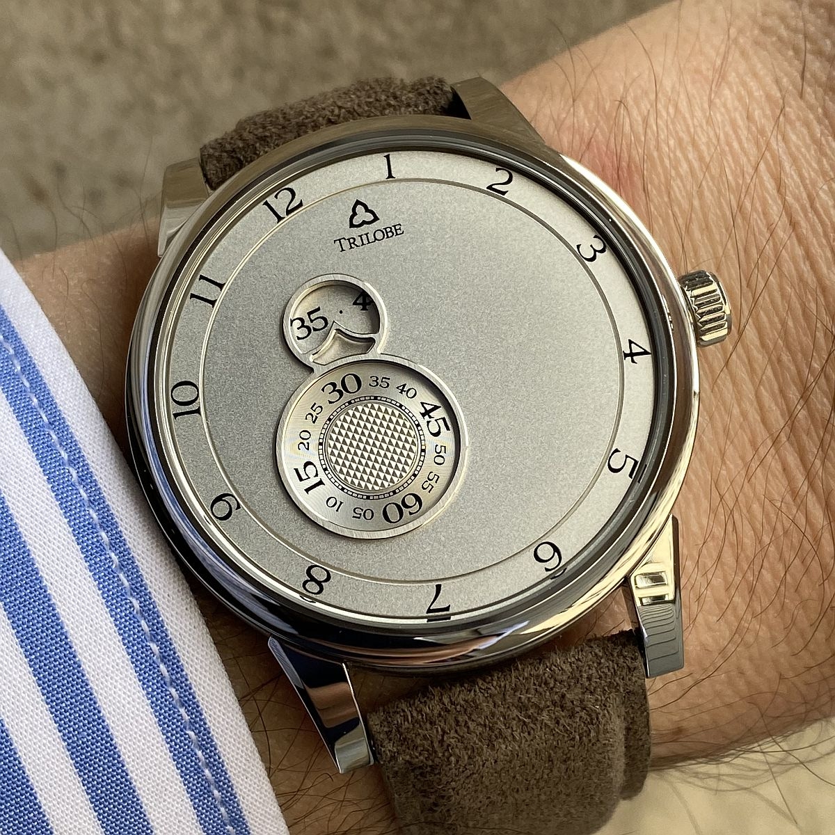
I really like the organization of the dial. It is intriguing, surprising and has a lot of character. The asymmetry creates an imbalance and this imbalance gives dynamics. If the watch had been symmetrical with an alignment on the vertical diameter, I think it would have lost its interest, becoming more consensual. The other advantage of this organization is that it offers a large expression area on the right side. In order to preserve the dynamics and to offer light reflections, the dial has been made with a grained stamped finish. The result is spectacular and despite the lack of display on this area (except for the peripheral ring of the hours), the whole is far from being static or inert.
In any case, the watches of the "Nuit Fantastique" collection are not lacking in animation. After all, 3 discs are in constant motion. The most noticeable is obviously the seconds disc which plays the main role. The minutes disc is located above and is revealed through a small window. The reading of the minutes is here more delicate because according to certain positions of the disc, a small doubt can remain when the figures are not completely displayed... without forgetting the fact that the disc turns from the right to the left. This is the natural movement of a watch but it always surprises in a digital approach. Fortunately, the position of the peripheral ring of the hours brings an indication not only on the current hour but on the minutes. Just look at the distance between the hour numeral and the place in front of the fixed index, the famous trilobe, symbol of the brand. Of course, the hour ring also rotates from right to left, in a clockwise direction.
In any case, the watches of the "Nuit Fantastique" collection are not lacking in animation. After all, 3 discs are in constant motion. The most noticeable is obviously the seconds disc which plays the main role. The minutes disc is located above and is revealed through a small window. The reading of the minutes is here more delicate because according to certain positions of the disc, a small doubt can remain when the figures are not completely displayed... without forgetting the fact that the disc turns from the right to the left. This is the natural movement of a watch but it always surprises in a digital approach. Fortunately, the position of the peripheral ring of the hours brings an indication not only on the current hour but on the minutes. Just look at the distance between the hour numeral and the place in front of the fixed index, the famous trilobe, symbol of the brand. Of course, the hour ring also rotates from right to left, in a clockwise direction.
The seconds and minutes are displayed in the shape of an 8, reminiscent of some F.P. Journe or Jaquet-Droz watches. But the Trilobe team has managed to preserve the brand's own identity, whether through the peripheral ring, the font or the very nice integration of the fixed minute index. Above all, despite the different aesthetic approach, I find again the spirit of the previous collection, namely the desire to create a special relationship with the passing time.
The use of a steel case of similar size proves it. Again, the diameter is 40.5mm and only the thickness changes imperceptibly from 8.8mm to 9.2mm. The style is slender and harmonious. Several dial colors are available with the grained finish (black, blue, silver) as well as a "Secret" variation. I could only see the silver version for the moment but the aesthetic potential linked to the organization of the dial is real. The free space of the right zone gives a lot of freedom of expression and I can imagine later on other types of finishing or decoration. The "Secret" version looks very promising.
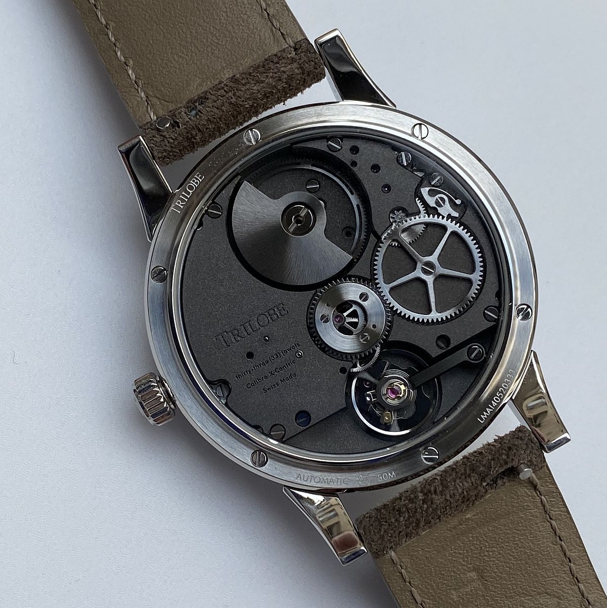
The movement that powers the "Nuit Fantastique" collection is, as mentioned before, the X-Centric caliber. I like its presentation, which is both very pure and contemporary. It is consistent with the aesthetics of the dial. The use of the micro-rotor and the integrated construction have reduced the thickness of the movement to 5.78mm, which explains the height of the case to less than 10mm despite the presence of discs that rotate on the dial. The movement occupies the case generously because its diameter is 35.2mm. This size contributes to the nice visual rendering.
The finishing of the movement is neat, modern but it is especially its architecture that makes it attractive. Its aligned construction based on a vertical axis created by the micro-rotor and the balance wheel is not without reminding the display. In any case, I found this movement adapted to the aesthetic context of the watch. Its performances are correct with a power reserve of 48 hours (satisfactory considering the power required to turn the discs) for a frequency of 4hz.
I was therefore seduced by this new proposal from Trilobe. It renews the approach while remaining in the spirit of the initial collection. I personally have a slight preference for the new collection, especially because of the emphasis on the seconds record. The choice is made primarily according to our sensitivity to the display because the quality of execution is consistent between the two collections. The use of the same X-Centric movement is also reassuring in the context of an independent brand, as it proves that the brand is working on a solid, perennial foundation without embarking on excessive development. The strength of the new collection lies in the organization of the dial, which generates an intriguing and characterful style with a certain decorative potential. I can't wait to see the next steps, namely the final versions of the first watches in the collection as well as the "Secret" version, which seems particularly appropriate. In any case, the Trilobe brand continues to grow and develop at a pace that I find well balanced and reassuring.
Note that the watches of the "Nuit Fantastique" collection with a grained stamped dial are sold at a price of 8,300 euros, which is a small price difference (500 euros) compared to the watches of the "Les Matinaux" collection. The "Secret" watch from the "Nuit Fantastique" collection will be sold at a price of 10,500 euros with as always a customizable sky.
Pros:
+ a known and proven technical context
+ an intriguing dial design with a certain artistic potential
+ the general neat finish
Cons:
- the reading of the minutes can sometimes be tricky in certain positions of the disc
Hands on review of the Trilobe "Nuit Fantastique"
Note: the pictured watch is a prototype and the grained finish of the dial will be different from the one shown in the pictures. I remember my first meetings with Gautier Massonneau and Volcy Bloch, respectively founder and general manager of Trilobe. Tha...


Thats my kind of watch . Hope to see one in person when possible.
Love this way of time telling a lot . Also a a reasonable price point imho . Thanks for this great review

It would seem to me.
That you’d almost want to reverse the minutes and seconds ring sizes on the dial. Functionally it would make more sense to have the most ambiguity in the seconds function. You would then flip the two rings on the dial to preserve the hierarchy of time if ...

Fantastic watch!!!
I follow them on instagram and love their unique movement and telling of time!! Really cool and interesting indie watch at an competitive price point! I would though like to see if they do some interesting/wild designs for the dial but i mean, with that s...

Maybe technically interrsting but...
Not esthetic on the dial side. How do you read the minutes and seconds?
