
New Release
Mark in Paris offers a hands-on review of the Vacheron Constantin Harmony Dual Time, a significant novelty celebrating the brand's 260th anniversary. His detailed impressions highlight the watch's unique cushion-shaped case, refined movement decoration, and thoughtful dial layout. This article provides valuable insights into a limited-edition piece that blends traditional craftsmanship with a distinctive aesthetic, appealing to collectors seeking both heritage and originality.


Gentlemen,
I could handle the new Harmony 260th Anniversary Dual Time reference for a long look and wished to share this new very nice model with you.
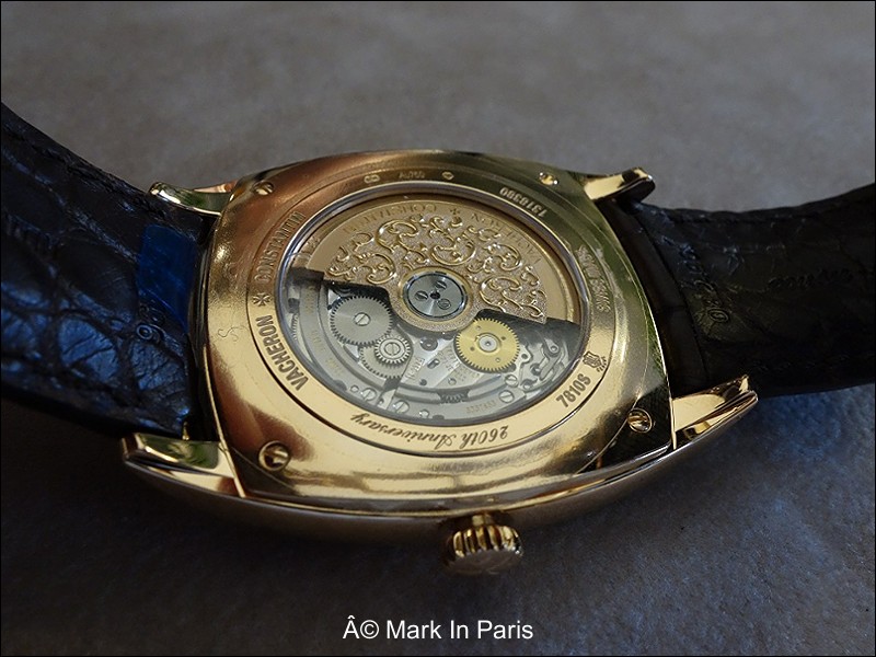
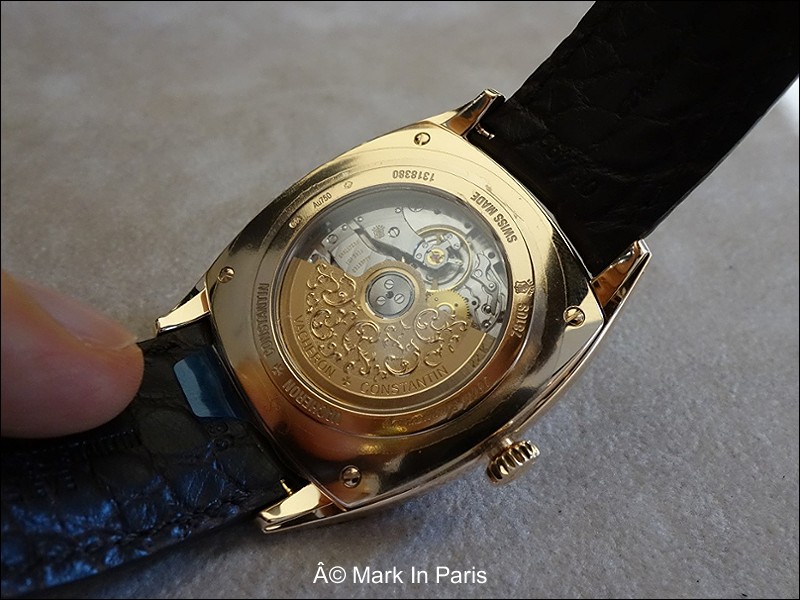
As you know, the new Harmony family has been unveiled to celebrate the 260th anniversary of the brand. The decoration of the movement is specific to this event with a particularly fine engraving work (balance cock, rotor for the automatic calibers etc...).
The Dual Time version we have here is a smaller interpretation of the cushion shaped case seen in the Men's Chronograph you already know (pictures of some models I shot here: vacheron.watchprosite.com ) and that Sam presented with a post not long ago on our forum (here: vacheron.watchprosite.com ).
Furthermore, the watch is a 625 pieces limited edition (in rose gold as well as in white gold) which is very nice as it allows quite a reasonable number of customers to acquire it. In the mean time, when sold, we can easily imagine that the new Harmony line will propose a more standard decoration (even if this was not announced yet).
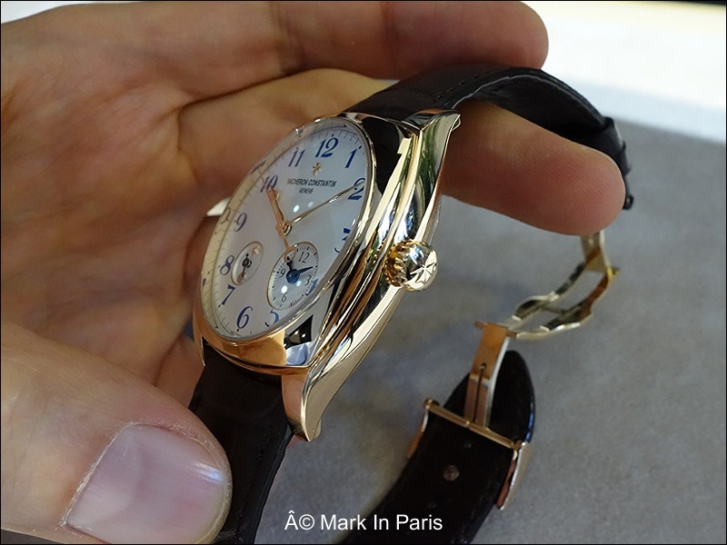
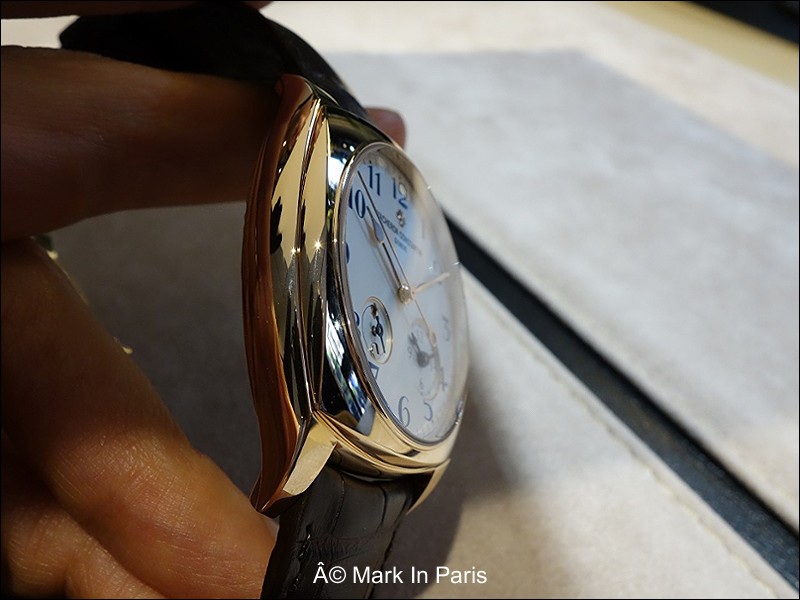
On the dimensions' side, the Men's Chronograph Monopusher is 42x52 mm with a thickness of 12.8mm whereas this Dual Time model is 40x49.3 mm and 11.4mm thick. It will certainly please people with a smaller wrist or who are more used to wearing small watches.
Here below, you will notice the caseband and the view from the side is very appealing (at least to me) as we can appreciate its very refined curves. It is of course even more attractive in the metal.
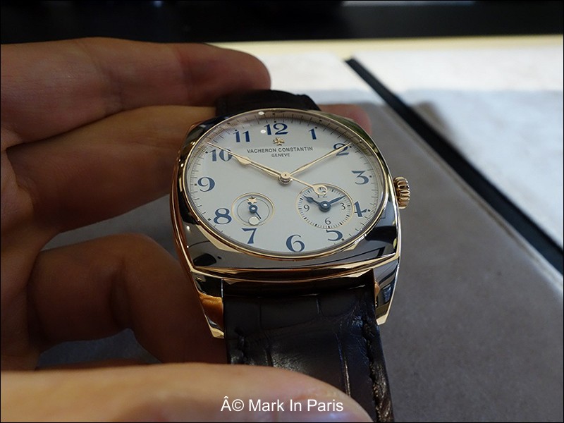
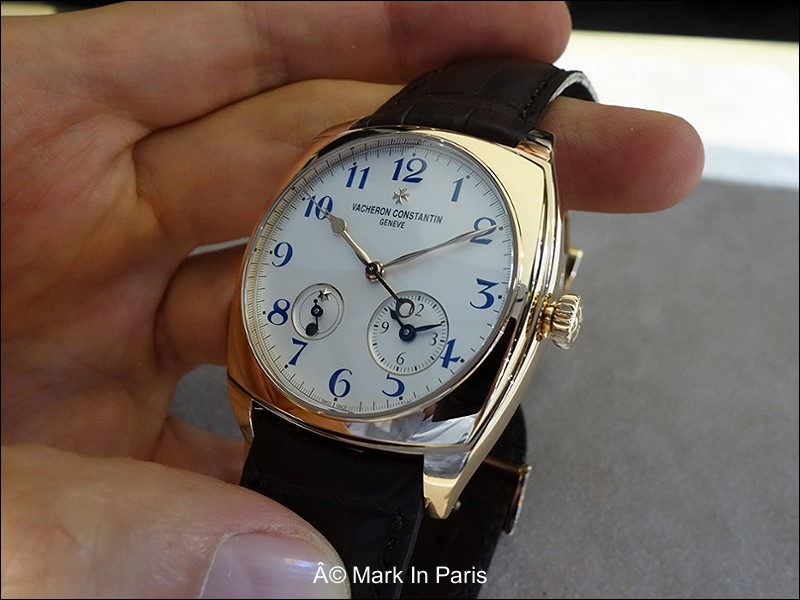
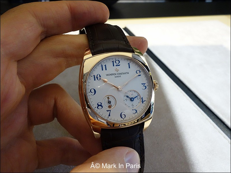
On the dial, you can see the features it is equipped with: a second Time Zone and a Day & Night indicator. They are all operated through the crown.
Something I always liked about Vacheron Constantin is that, though it is a traditional brand, it always developed a unique and original design in at least one model or two: think about the Quai de l'Ile, the American 1921 even the Malte (new) and 1972...
This gives the brand a special taste and allows the watch lovers to distinguish it from the other market actors.
A little detail I like on the pictures is that the Sun and Star of the Day & Night indicator are placed "across" the disk's limit: it looks as if the virtual line was in fact the 2 objects orbit.

So, here, we have a very daring move in choosing a cushion-shaped case for such an event. It would have been so much easier to work on the basis of a classic round watch. I guess, as every daring shapes, it will not please everyone but the few people getting it will do so because they really love it.
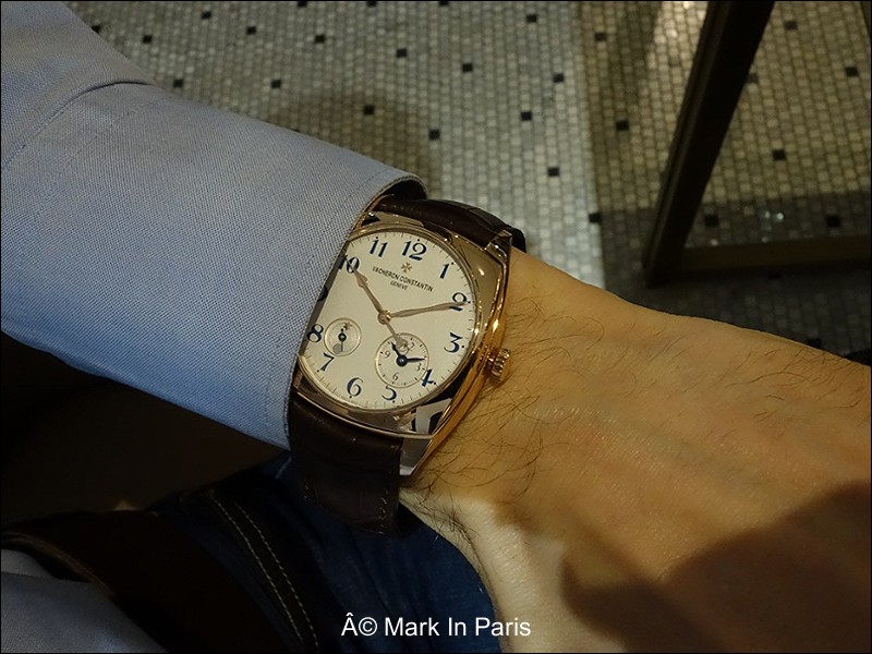
And as you can see on this pictures, the watch looks very nice on a wrist and perfectly proportionned.
What I haven't talked about yet is the dial's decoration and colors choice. In the whole family, there are painted blue numerals, sometimes red scales and a very specific aesthetical design choice.
This will certainly be surprising at first but this layout is modern and contemporary. It will need time to get used to it but it is a nice choice imho. This is how VC decided to adapt the usually conservative lines of traditional brands to our modern world, and I think it deserves attention.
The strap is equipped with a
deploying buckle and we still have the Maltese cross on the crown.

Even the hour and minute hands have a different shape and the second hand is very long with a significant counterweight. Furthermore, the two subsidiary dials are framed with a thin golden ring. These are interesting details as well as very different from the standards one we are used to seeing.
The caliber (2460 DT) is a new in-house movement (as are the chronograph 3300, 3200) quite nicely though simply decorated. The main remarkable element is the lightly "fleurisanne" engraved rotor, which is inspired by the decoration of a pocket watch designed by Jean-Marc Vacheron back in 1755. We don't have something too busy here, which is a detail I like (please note there is a sticker on the caseback).

The movement is equipped with a stop-second feature.

However, the movement's bridges remain quite "normal" and not as interesting as the other models. Of course, it is always difficult to compete with open-worked chronographs' movements.
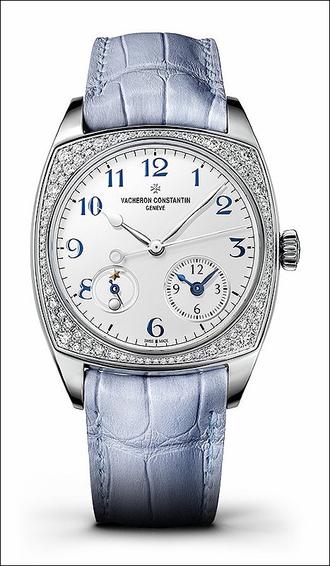
There is also a smaller Lady version of this watch which is diamond set (500 pieces in white gold only, 37x46.6mm, housing the same caliber).
The Chronoswiss Historiques 1972Prestige is a distinctive model within the Historiques collection, characterized by its non-traditional case shape. It represents Chronoswiss's exploration of design beyond conventional round forms, offering a unique aesthetic that appeals to collectors seeking individuality and historical design influences from the early 1970s. This reference stands out for its commitment to a specific period's design language while maintaining Chronoswiss's signature attention to detail.
The watch features an 18k white gold case, measuring 38mm x 38mm, which houses the automatic caliber C. 125. This movement provides a power reserve of 40 hours. The silver dial is protected by a sapphire crystal, ensuring clarity and durability. Water resistance is rated at 30 meters, suitable for everyday wear but not for immersion. The fixed bezel complements the overall case design.
This reference appeals to collectors who appreciate independent watchmaking and specific vintage design cues, particularly those drawn to the 1970s aesthetic. It offers a blend of traditional craftsmanship with a less common case silhouette, making it a noteworthy piece for those interested in Chronoswiss's more experimental designs. The inclusion of a date complication adds practical functionality to its distinctive appearance.
amd I really like the blue color of the numbers. In the flesh I found them just gorgeous. I thought the rotor work was also a change of pace from all the blasé ones in the market. Best Joe
but I find it much more in phase with today's standards. It will surprise potential clients first, but satisfy many after a while. Traditional watchmaking is a very conservative field and yet sometimes difficult to bring change to. Thanks you Joe for your nice comments :) Cheers, Mark
was not love at first sight for me as I found the day/night indicator to be a bit out of place. But then over the months I grew used to it and I have really come to like this piece so much so that it is my laptop desktop wallpaper. I think this watch without the day/night indicator would look strange, and the presence of it is the quirky 'X' factor VC has given this piece to stand out from the mass market identical looking / repetitive looking models that keep coming out (including those from pr
a watch is often not easy to understand at first sight. But they usually bring much more if it works in the end. The subdials' decoration and style in this watch or in other Harmony models are definitely something very different from what we are used to seeing (from VC or even any other traditional brands). I find the D&N indicator so romantic. People will need time :) (even me!) I know you're a great VC admirer and I'm glad to read from you about this line. "this piece to stand out from the
For sharing your thoughts and photos of the new Harmony Dual Time. Bill
It was a nice experience. Cheers, Mark
This thread is active on the Vacheron Constantin forum with 14 replies. Share your knowledge with fellow collectors.
Join the Discussion →


