Collection
Fernando shares his journey to appreciating the Vacheron Constantin Overseas Dual Time, a timepiece that initially challenged his aesthetic preferences. His post delves into the nuances of its design, particularly the asymmetrical dial and integrated bracelet. This article explores why this specific reference resonates with collectors, offering insights into its wearability and unique visual appeal.

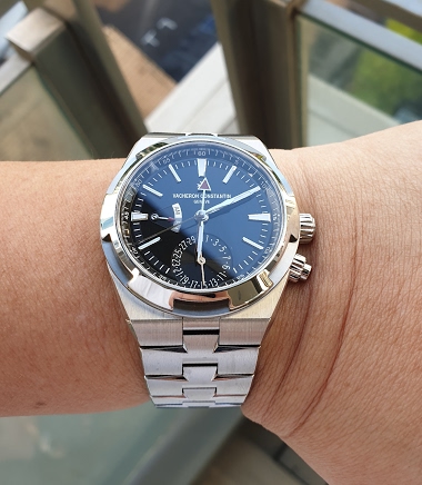
But it makes perfect sense for a dual time and aesthetically, it adds a new dimension to the dial. The date indicator at 6 to me, is preferable to a date window. The two red hands complete the picture. It's not a boring watch.
This thread is active on the Vacheron Constantin forum with 26 replies. Share your knowledge with fellow collectors.
Join the Discussion →