Review
Halgedahl offers a comprehensive review and historical overview of the Seiko Alpinist SPB089, a new US release following the discontinuation of the popular SARB017. This article provides valuable context for the Alpinist line, tracing its evolution from 1959 and examining how the SPB089 fits into this storied lineage. Halgedahl's detailed analysis helps new readers understand the significance and appeal of this specific model within Seiko's Prospex collection.


Seiko Alpinist SPB089
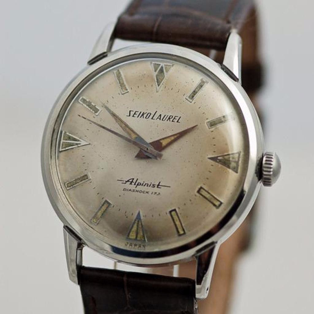
It’s been a little more than a year since Seiko announced the end of the line for their extremely popular Alpinist, the SARB017. Until then, the ’017 was (nearly) the last iteration of a timepiece in a line that stretches back all the way to 1959. Since the original Laurel,
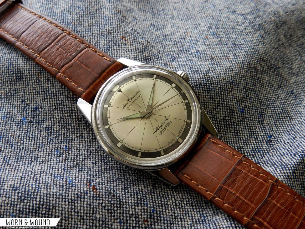
Seiko has gone through a number of Alpinist series, including the long-lived “Campion” of 1963;
the first of the “Prospex” Alpinists (now affectionately referred to as the “Red” Alpinists—highly collectable), arriving thirty years later;

then in 2003, the first and only titanium “HAQ” Alpinist, the Prospex SBCJ1019;
followed by the enthusiastically received “SARB” series of 2006 (which included the ’017, with it’s jewel-green dial and gold numerals/indices).
Finally, in 2009, the SARBs ’059, ’061 and ’063 appeared—larger watches (42mm) with a more rugged aesthetic.

Then came February, 2018.
***
There was a lot of hand-wringing last year over the discontinuance of the ’017. Yet, I don’t recall a post (those who wrote one will be sure to remind me) expressing concern that with the ’059 Seiko had finally capitulated to modern tastes, and that any successor to the line would most probably fall on the far side of 40mm. Well, I was concerned about that. As things have turned out, though, my fears were unfounded.
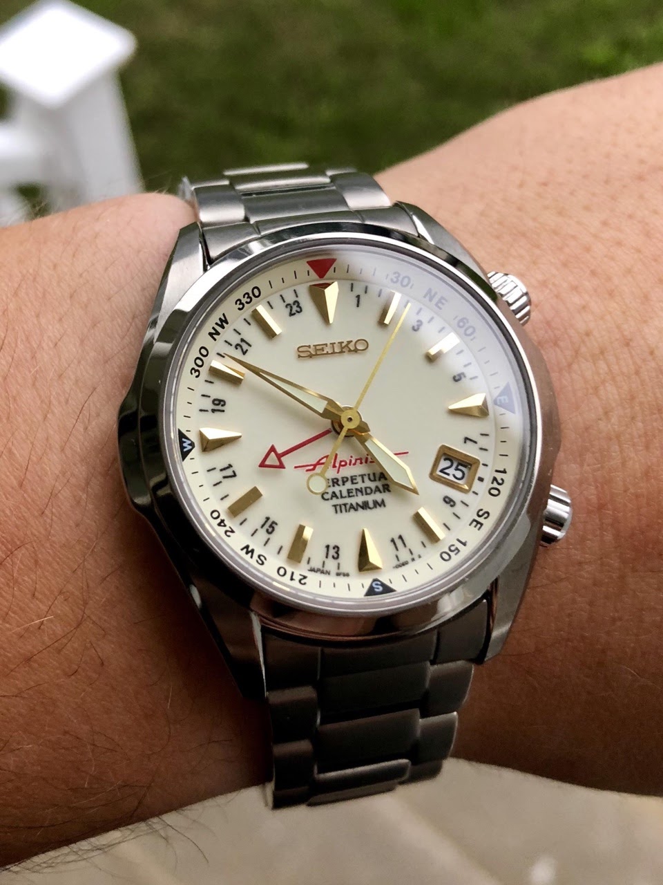
But before we get to Seiko’s new release, allow me to explore why the ’017 was so popular. For the new Alpinist, the SPB089 (with the exception of its dial color and a few minor tweaks) is the spit and image of its predecessor. I am not a watch industry professional, but having gone through the “Shall I? Shall I Not?” for months before purchasing a SARB, and now having lived with my ’017 for nearly three years (with the available comparisons of an ’035 and ’059 acquired along the way) I feel I have a good handle on the reasons for its (well-deserved!) popularity.
Let’s start with that green gleam. No doubt it was the first thing to catch many an eye—mine, included. But after taking a closer look at the dial, my reaction to gilt hands, numerals and indices on a sports watch was, “What on earth???” Now I know the reason. There is simply no light in which the time is not reflected with perfect clarity by this cleverly-conceived tool. From first light to firelight, the SARB017 will tell you what time it is at a glance. And after all, isn’t that about all the effort a shivering survivor of a sudden downpour, hiding out now beneath a hastily discovered overhang, wants to put into reading how long he’s been in that predicament?
You’ll immediately see the difference when the new SPB089 is placed alongside. The new watch’s dial isn’t hard to read. But the SARB’s contrasting elements advance the ball as much as fifty yards! No. The gold-against-green is not so much a decorative choice. Instead, it’s Louis Sullivan’s “form follows function” thing. While many have responded to the ’017’s color scheme, trust me, it’s all about legibility.
The case is perfectly sized. It’s modern enough at ~39mm (yet wears smaller, in my view). And while some adherents to classicism may find it bold, those with medium to large forearms and wrists will find in its relatively modest size another attribute: the watch is well protected from potential hazards by the arm itself. It has long been my belief that the watch industry’s 34mm, and then 36mm, standards held sway for so long because they were practical. When a watch’s case exceeds the dimension of the arm, bumps and resultant dings are inevitable. Oh, we all learn to be careful—to accommodate larger pieces. But one of the joys of wearing the Alpinist is that one may live more freely.
Compact and substantial, the watch’s reasonable ~12mm height does not invite unwanted collisions either (though the sapphire crystal would laugh most of them off). The crown protectors do their job, too, but because of their taper, unobtrusively. And the screw-down crown and back provide a feeling of security that affirms the claimed 20bar water resistance on the dial. This is sufficient protection (finally) for me to feel comfortable wearing a watch in the pool. (No one that I’ve read has yet compared the static pressure of +/- twenty feet of water at the deep end of a pool with the dynamic pressure experienced at one’s rear end on contact with the surface in a cannonball. The difference must be terrific, and might shed a brighter light on just how much sense it might make to wear an expensive piece—even one with a 10 bar rating—into the surf while on vacation in Maui.) But I digress! The date wheel’s black and white might seem a cost-cutting measure. But I prefer to think of this decision as a nod to maximum contrast, as well. And the lugs—not too long, not too short—curve nicely to hug the wrist. My wrist, anyway. Taken together, these many strong points add up to what looks and feels like a well-conceived and solidly built timepiece.

Now, lest one be put off by evidence of the movement’s detractors, a quick sift of discussions available on the Internet will turn up quite a good deal of enthusiasm for Seiko’s tried-and-true workhorse. The 6R15 allows hacking and hand winding, a really handy 50 hr. power reserve, and decent accuracy. Sure, in this day and age when everyone’s cell phone passes on the accuracy of the US Bureau of Standards’ cesium fountain clock (accurate to 1 sec. in 100,000,000 years—yes, one-hundred-million) a deviation of 15spd can seem alarming. But the movement sports 23 jewels, runs slightly slower than today’s standard 4 Hz at 21,600 vph so that it can maintain that useful 50 hr. power reserve, and contains Seiko’s proprietary “Spron” mainspring—quite a sophisticated plus at the heart of this watch.
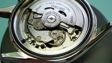
The actual stated accuracy of the movement is +25/-15spd, but it’s probably fair to say most owners will find their watches bettering those extremes. (My SPB, for example, is running a dependable -2 spd, and turning in 0.0 over 24 hrs. when worn continuously.) Feet on the ground, here: if you set your watch once a week, at worst you’ll be a minute-and-a-half to two minutes early/late for a meeting, or your daughter’s gymnastics class. (And at that, probably a good degree closer to “on time” than if you’d decided not to sweat the small stuff at all and opted for a Meistersinger!) For a few hundred dollars the balance of features this movement achieves keeps it high on the list of enthusiasts who consider these things carefully. Which brings us to the new SPB089.
Seiko is not so successful as it is because of haphazard choices. Nor because it fails to recognize what works. And so rather than reinvent the wheel they have repurposed enthusiasts’ beloved SARB. Yes, for 2019, the ‘017 in new… GARB.
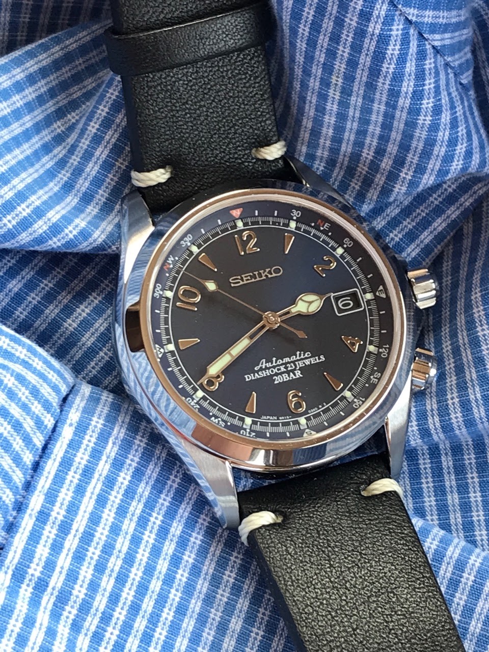
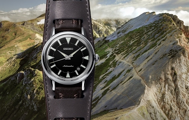
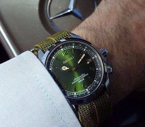
What a lovely change! The dial is almost a flat blue—in shadow, with grey tones;

tilted toward the light, with navy highlights. A shade that doesn’t call undue attention to itself—is not too beautiful.

Only when teased does the telltale hourglass of a sunburst in royal blue appear—not unlike the emerald burst that comes rarely from what appears to be the SARB059’s deep black dial.

Thus, the SPB’s dial is easily read in most lights. The applied silver numerals and indices, as well as the three hands, pull the eye in from the case’s stainless bezel, and are immediately noticeable because they use this familiarity to emphasize their contrast with the dial color. Seiko’s designers have outlined the date window in a white that acts as a foil for the dial’s blue, highlighting that feature far better than the 017’s nearly invisible gilt rim does, and pulling the white numerals out of the (thoughtfully) blue date wheel—giving the watch a cultural lift, if you will. In fact, what I’ll call the dial’s bicolor scheme—blue, and white (the minute track and compass markings on the moveable internal bezel are white, as well)—dresses the piece up considerably. With the added upgrade of a black heritage strap the watch just begs for grey slacks and a blazer!

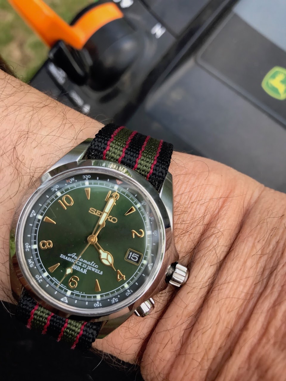
IMHO, Seiko has given its Alpinist fans a watch that will look just as appropriate at a polo match or afternoon recital as its predecessor looks on my lawn tractor.
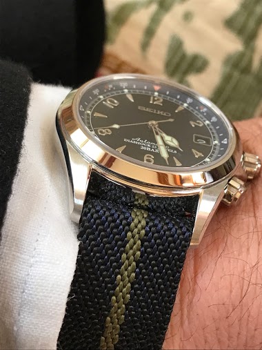
The internal compass bezel mentioned above has been retained—its slightly recessed crown at 4:00 now subtly keeping the piece from becoming too dressy for sport. Yes, the crown turns a bit too easily. But for those wondering about the usefulness of such a device in the first place, I’d call attention to the fact that few Submariners will ever see a set of air tanks, nor specified pilot’s watches the cockpit of an airplane. This highly identifiable mark of the SARB series had to be kept to make the re-issue complete. So too, the large cathedral hands.

Some may have wished for a different lume, a step up in movement quality. I wished for a Cyclops date. No! Changes such as those would undoubtedly have driven up the price. And what fun it was for me—on a fixed income in retirement—not to have to think twice about spending the money to reserve one of these new babies. The decision (can we even call it a decision?) took me all of 20 seconds to make.
***
There are thousands of SARB017 enthusiasts spread across the globe who will quickly deplete (have quickly depleted? will there come a second wave of available pieces?) the stock of 1,959 limited edition SPBs available. It’s what many of us have dreamt of but feared would never happen: an updated reissue of a watch we’ve loved and appreciated—true in every way to its predecessor, though slightly dressier, slightly more refined. An Alpinist for the gentleman in us all.

***Reviewer’s note… Thanks to all for reading this far! Also, I'm grateful for the unidentified photo sources in the early part of this review. Photos after the historical overview my poor stuff, excepting that of the venerable 6R15.
The Aston Martin DB5, reference 959, is a special edition timepiece created in partnership with Breitling, serving as the official watch partner for Aston Martin and the Aston Martin Aramco Formula One™ Team. This collaboration marks Breitling's re-entry into Formula 1®, connecting the worlds of high-performance automotive engineering and precision horology. The reference is part of a broader initiative to celebrate the shared values of speed measurement and mastery between the two brands.
This particular reference is distinguished by its association with the Navitimer B01 Chronograph 43 Aston Martin Aramco Formula One™ Team, indicating a robust chronograph movement. The case is typically crafted to a substantial diameter, reflecting a contemporary sport watch aesthetic. It features a sapphire crystal for durability and clarity, protecting a dial designed to reflect the partnership's branding.
This timepiece appeals to collectors interested in automotive-themed watches and brand collaborations, particularly those with an affinity for Aston Martin's heritage and its involvement in Formula 1. It represents a specific moment in the partnership between Breitling and Aston Martin, offering a tangible link to both the luxury car manufacturer and its racing division. Variants within this collaboration often feature distinct dial treatments and case finishes.
Thank you!! Thomas
Especially welcome from a "countryman!" (My grandfather came over from the region south of Brandbu, along with another brother and sister, ~1907. The 1900 census for the kommune lists them all. My last name should therefore most likely be Helgedahl (?) after the Helgedalssaggen by which they lived and worked, floating timber downstream on the river for milling.) But I was reared in my Sicilian family on the east coast (my Norwegian ancestors settled in Washington and Oregon)! Ah… America. A land
I have actually looked at your profile before, because your username is very Norwegian. First name Helge and surname Dahl sounds as about the most typical Norwegian name you can think of. But Helgedal as well, I just haven't heard about that valley (Dal) before. Thomas
It is called Helgedalssagen. A "sag" is a saw, so it means the saw of Helgedalen. Here is a photo: This is actually just north of Oslo where I reside! I think life was probably very hard at the time they left.
This thread is active on the Seiko forum with 9 replies. Share your knowledge with fellow collectors.
Join the Discussion →