
Review
Henry's captivating images of the Patek Philippe Ref. 5990/1A-011 highlight the mesmerizing grayish-blue gradient dial, a feature that has sparked considerable discussion among collectors. His post invites readers to appreciate the aesthetic and functional nuances of this highly sought-after Nautilus reference. This article explores why the 5990/1A-011 continues to be a significant piece in Patek Philippe's modern collection, drawing on community insights.

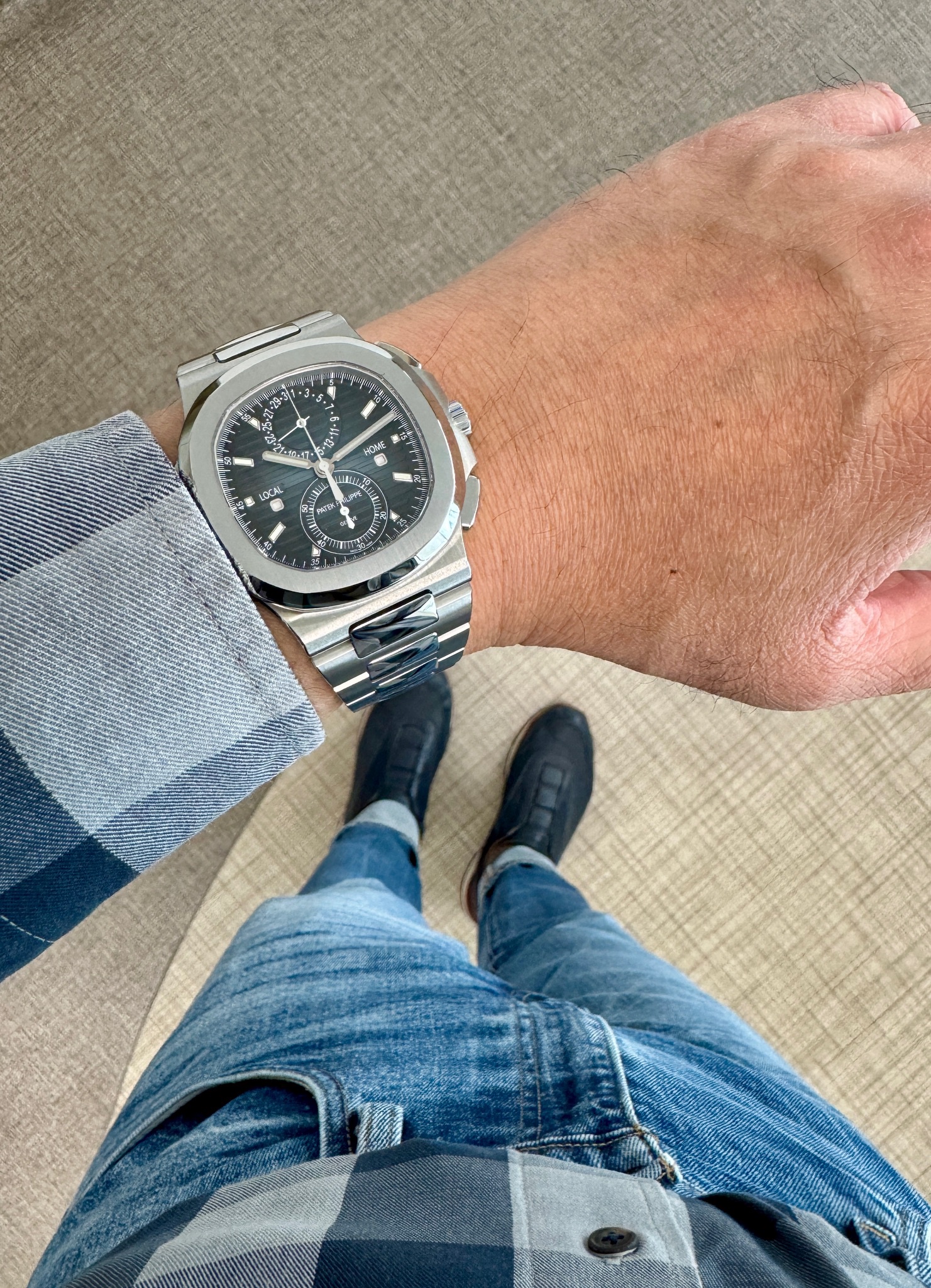
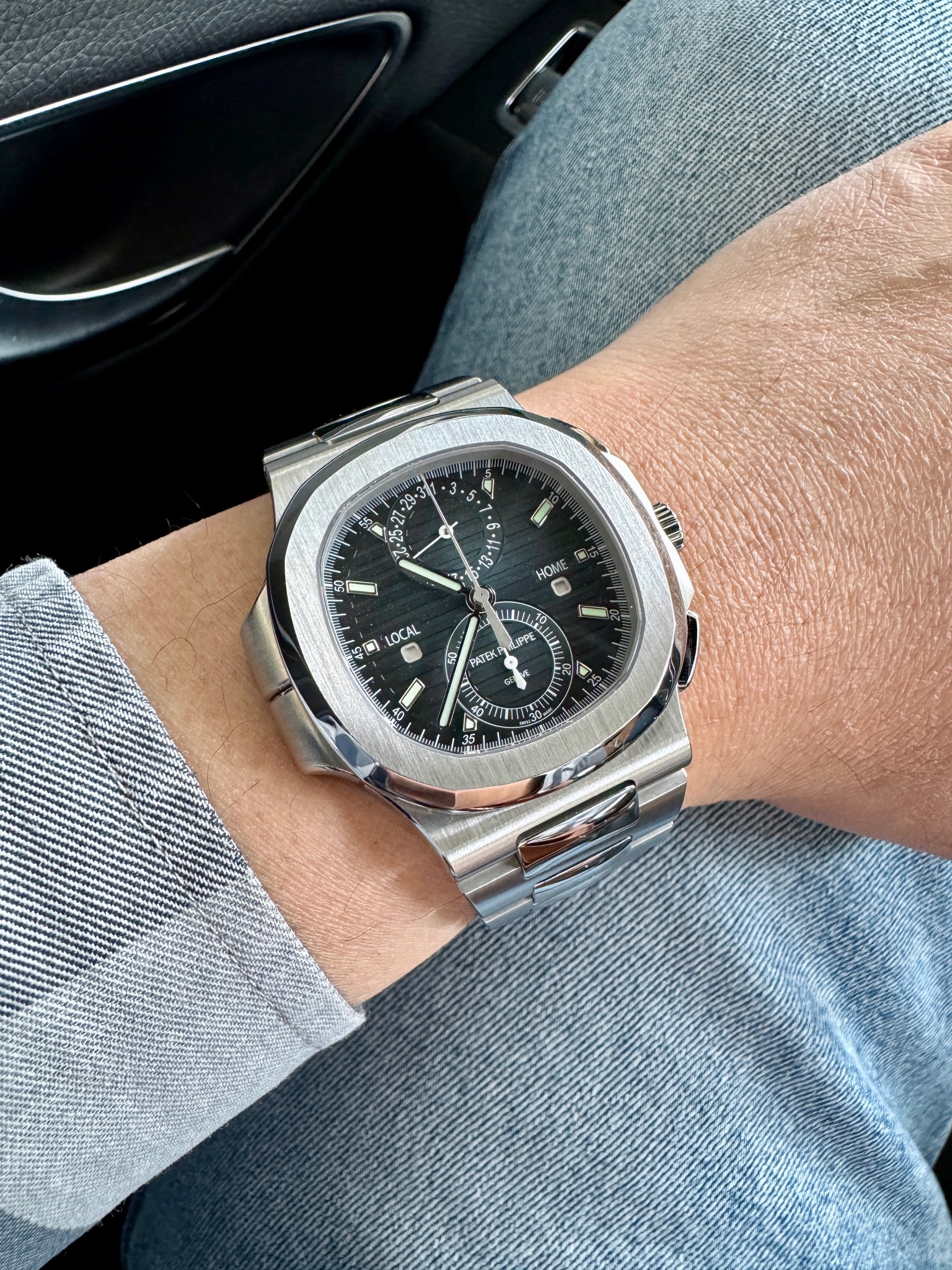
The Patek Philippe Nautilus Travel Time Chronograph represents the apex of the iconic Nautilus collection, merging Gérald Genta's revolutionary 1976 sports watch design with contemporary haute horlogerie complications. Introduced in the 2010s, the 5990 series marked Patek Philippe's commitment to expanding the Nautilus beyond simple time-only and date functions, incorporating the manufacture's dual-time and chronograph expertise into the beloved octagonal case architecture. This integration required significant case redesign to accommodate the additional complications while maintaining the Nautilus's essential proportions and wearability.
The 5990/1R houses the caliber CH 28-520 C FUS movement, a self-winding chronograph with travel time function that displays a second time zone via centrally-mounted hands with day/night indicators. The blue sunburst dial features applied gold hour markers and maintains the characteristic Nautilus horizontal embossing, while sub-dials at 6 and 9 o'clock provide chronograph and dual-time displays. The 40.5mm rose gold case retains Genta's signature porthole-inspired bezel and integrated bracelet construction, though the added complications necessitated a slightly thicker profile than standard Nautilus models.
As one of the most complicated Nautilus references in current production, the 5990/1R occupies rarified territory in both Patek Philippe's catalog and the secondary market. Production numbers remain deliberately constrained, with allocation typically reserved for established Patek Philippe clients and collectors. The combination of rose gold construction, in-house chronograph movement, and travel time complication positions this reference as a cornerstone piece for serious Nautilus collectors, commanding significant premiums over steel variants and representing the technical sophistication possible within Genta's enduring design framework.
Comparing the two, 5740/1G is indeed has a slimmer build, yet the dial colour is not as iconic as the traditional one. 5990/1A is a bigger watch, but still acceptable in size. The complications of traveling time plus chronograph are more practical, especially during travel. Just my two cents. Cheers, Henry
Best, Emmanuel
This thread is active on the Patek Philippe forum with 17 replies. Share your knowledge with fellow collectors.
Join the Discussion →
