Review
Foversta provides a hands-on review of the A. Lange & Söhne 1815 Chronograph Boutique Edition, a timepiece that revisits the aesthetic charm of the original 2004 model while incorporating the technical enhancements of the current production version. He meticulously details how this boutique edition distinguishes itself with its pulsometric scale, inclined flange, and unique blue markings, offering a refined yet characterful alternative to its predecessors. Foversta's analysis highlights the subtle design choices that make this chronograph a standout in Lange's collection.


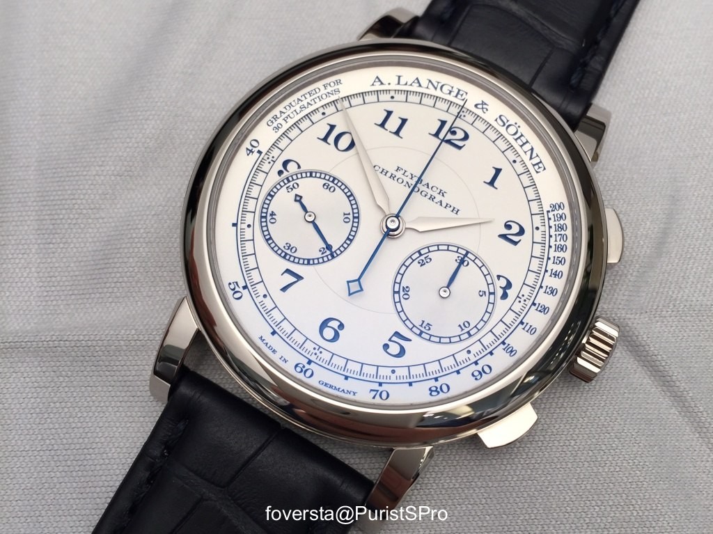
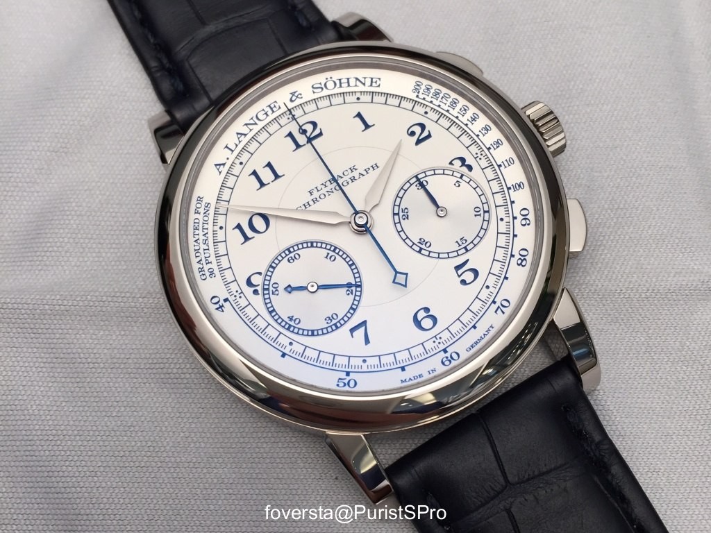
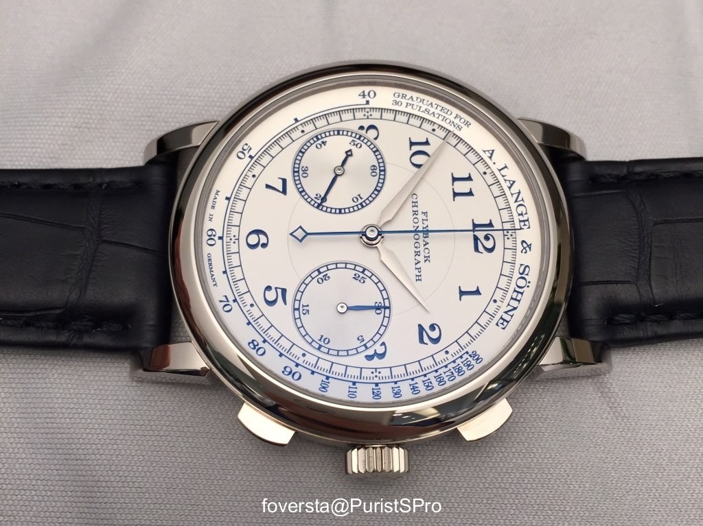
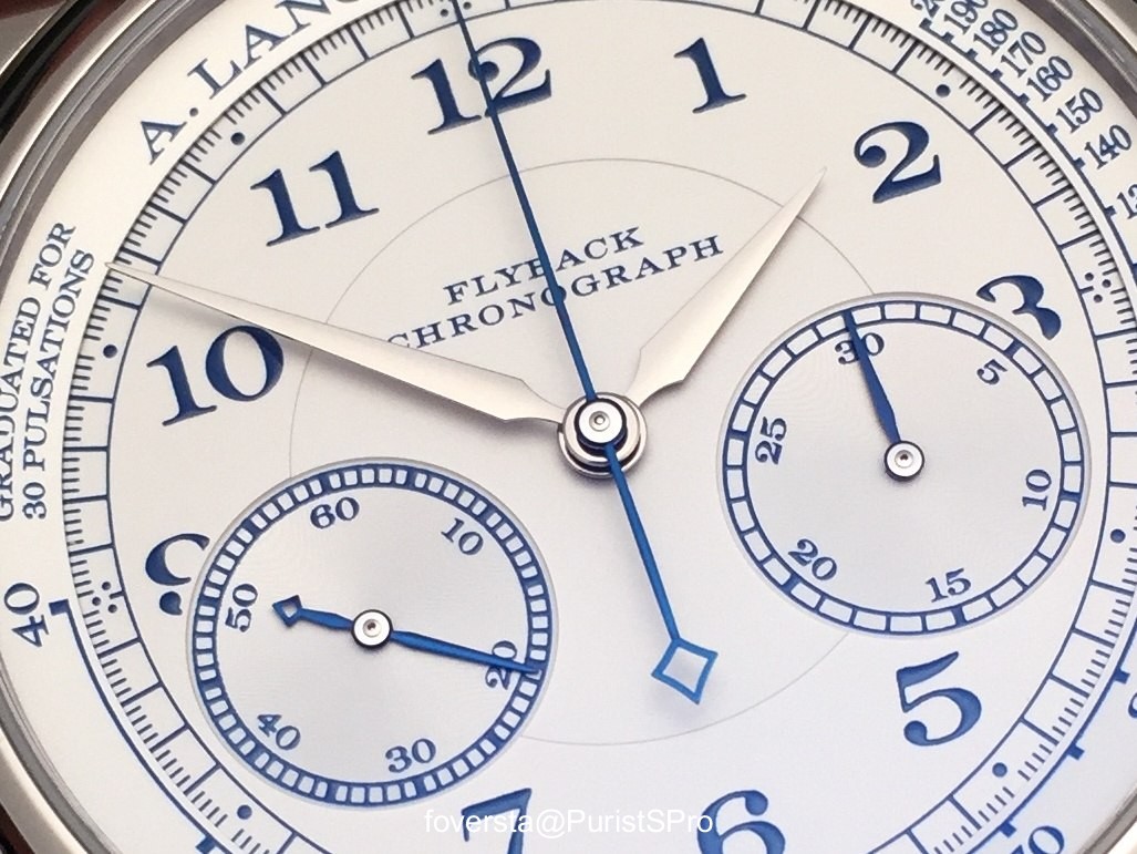
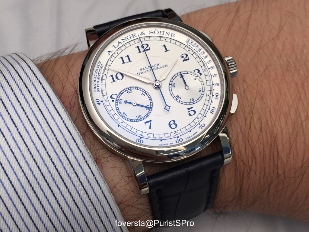
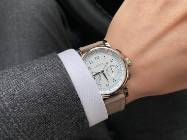
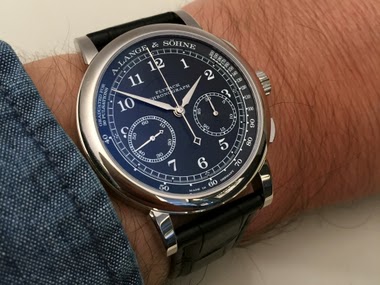
The 1815 Chronograph, reference 414.026, is a distinguished member of the 1815 collection, known for its focus on traditional watchmaking and classical design elements. This particular edition, often referred to as the "Boutique Edition," stands out with its white gold case and a black dial, offering a monochromatic aesthetic that enhances its legibility and understated sophistication. It represents a more contemporary interpretation within the 1815 chronograph lineage while maintaining the collection's core principles of precision and craftsmanship.
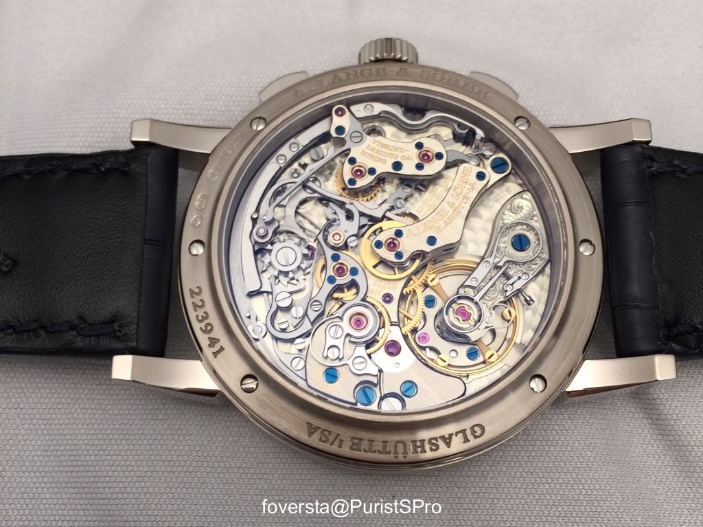
The watch features a 39.5 mm white gold case with a thickness of 11.4 mm, housing the manually wound caliber L951.5. This movement is visible through a sapphire crystal case back, allowing appreciation of its intricate finishing and traditional German silver components. The front crystal is also sapphire, ensuring durability and clarity. The movement provides a power reserve of 60 hours, indicative of its robust and reliable construction.
This reference appeals to collectors who appreciate a chronograph with a strong classical identity, executed with a high level of artisanal finish. Its white gold and black dial combination offers a versatile appeal, suitable for various occasions while remaining true to the brand's heritage. The 1815 Chronograph series is a cornerstone of the brand's offerings, providing a purist's approach to the chronograph complication.
.... And the wait was definitely worth it! I am in full agreement that the boutique edition is the perfect blend of the original and the remake. I'm keeping my fingers crossed that they will launch this combination in a regular edition.
Do you mean with a 3 hands watch for example? Who knows? It could be great! Fx
The date made the perfect triangle with the 2 subdials. I would have loved to see a 1815 Chrono with the 2 Subdials on a 3 / 9 line. Not under. If the subdials were " aligned ", in that case, the date would not miss. The distance with the Datograph would make it look very appealing. Good to know that the movement has an improved power reserve. I just regret that the improvement was not also on the aesthetical side. Best, Nicolas
I like this one as I am used to this look in Lange, lower sub dials, as the Emil reflects that look as well. I really like the blue use here. I don\'t disagree the date on a datograph makes that perfect triangle. That is why I would never not own a datograph. But this report opens up a new option to add a pulse scale chrono too Thanks Fx, beautiful pix as always, especially the close up of the numerals. Best Joe
- first of all, due to a better balance, the off-centered position is less perceptible here than with the first version. - the 2 subdials on a 3/9 line would oblige to fully redesign a movement and it would be a different story... As an owner of the first version, the off-centered position has never been a problem for me. Actually, I'm less and less attracted by symmetric watches. I don't know why. Funny detail: even the 5170 is (very slightly) off-centered! Thanks for your comments. Fx
This thread is active on the A. Lange & Söhne forum with 33 replies. Share your knowledge with fellow collectors.
Join the Discussion →