JLC Grande Reverso Ultra Thin Duoface SIHH 2013
New Release

JLC Grande Reverso Ultra Thin Duoface SIHH 2013

By amanico · Feb 3, 2013 · 49 replies
amanico
WPS member · Jaeger-LeCoultre forum
49 replies22754 views0 photos
f 𝕏 in 💬 🔗

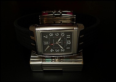
Amanico's 2013 SIHH report on the Jaeger-LeCoultre Grande Reverso Ultra Thin Duoface remains highly relevant for collectors interested in the evolution of JLC's iconic Reverso. His detailed comparison of the new GRUT with its predecessors, particularly the Reverso GT and the Tribute To Reverso 1931, offers crucial insights into design and proportion changes. This post is a valuable resource for understanding the nuances of JLC's Duoface models and their aesthetic development.

49 collectors discussing this on the WatchProSite forumJoin the Conversation →


2 watches in one. The Reverso is the essence of Duality, with its two sides.

The new Grande Reverso Ultra Thin Duoface ( which we will awfully call GRUT ) pushes the duality a step forward.

You know the Duoface. It was a lovely Reverso in a GT case ( 42, 2 x 26 mm ) offering two times: A local and a second time zone.

The new GRUT offers the same possibility, houses the same movement, the Cal 854 ( manual winding / 21 600 vibrations per hour / 45 hours power reserve ) but receives a different body ( the case ) and a different face ( the dial ).

As for the case, if the Reverso GT was very elegant, the Grande Ultra Thin is spectacular.

Much bigger ( 46mm ) slightly larger ( 27 mm ) than its predecessor, the case of the GRUT is also thinner.

Not as thin as the Tribute To Reverso 1931, which was 7, 23 mm high, though, the GRUT can be seen as a thin watch, thinner than the previous Reverso Duoface ( 8, 9 mm versus 9, 4 mm in height ).

These new proportions or volumes are very pleasant to the eye.

As the dial is!

You will recognize, on the recto side, the dial we had the pleasure to discover on the TT R 1931 Small Seconds in White Gold, released in 2012.

A silver grained finition, with painted indexes, and glaive hands,which are as understated as elegant.

You will also notice that the name " Reverso " is not located at the same place, on the SS and on the RG version.

The Stainless Steel:


The Rose Gold:


Please keep in mind that the watches you are seeing are prototypes and that some small changes can come on the definitive pieces.

The verso side is very close to the one you are familiar with, on the previous model.

Black, same overall design, but with a different guilloché, and the hours dial receives a different typo, too, as well as new hands.

Enjoy the live pictures:


While these " Duo Faces " are available woridwide, and at the Boutiques or at your favourite AD, you have to know that Jaeger-Lecoultre offers you another possibility, or version, available at the Boutiques of the brand, only.

A Blue Recto Dial, which is white on its verso, which is also very tempting, in my opinion.

One regret: I would have preferred a small second, on this blue dial. While this " base " dial would have been superb on a Reverso UT 1931, as an alternative to the Red.

Here are the photos taken at the SIHH:


The grained dial is sublime, very elegant, while the blue is eye catching. Which one to choose is a such a delicious dilemma to have!

Looking forward to hear your comments and thoughts,

Best.

Nicolas This message has been edited by amanico on 2013-02-03 00:28:26 This message has been edited by amanico on 2013-02-07 03:38:33

Key Points from the Discussion

Advertisement
The Discussion
MO
moc
Feb 3, 2013
Very nice article Nico...

essential and clear. I don t like the rg version much,but the other 2 are very nice. My fav combo woud have been the small second white dial and the blue...joking aside, obviously the blue version is the most appealing(and JLC knows that,hence the boutique edition...),a very cool watch. Again difficult to describe the blue in pics,like the red,its a very attractive tone of blue. i must admit that its really tempting,and useful,and with the possibility of the second time ,its really like having 2

AM
amanico
Feb 4, 2013
Like the Red, the tone of blue is hard to take in picture.

Depending on several factors, such as the angle of your camera when you take a picture of this " Blue ", and the light, the surroundings, and so on, you will have very different outcomes. I am now used to that phenomenon, as I had big issues with the Red last summer, but it is surprising. Back to the watch, now, yes, the " Blue " is tempting, my friend, even more when you already own the Red, for the perfect pair. ;) Best, Nicolas.

MO
moc
Feb 4, 2013
Yeah yeah yeah, don't need a push....

I am already in trouble, like you and many others.......:) :) It's fun to be in trouble... Mo

AM
amanico
Feb 4, 2013
How true, my friend. How true! [nt]

WA
watchme
Feb 5, 2013
Thanks, Nicolas. Again, I think...

that I JLC should either change the "Night/Day" to "AM/PM", or move the 12 and 24 hour indications to the 9 and 3 position on the subdial. From midnight to noon being "night" just doesn't make any sense and flies in the face of every world-time and dual-tim watch JLC or PP or GP or Zenith ever produced. Please, Mr. Lambert, that's the ONLY detail I think needs re-evaluation. OTHERWISE, I think the watch is AWESOME (!!!), especially with that 1931/32 dial on the front. I WANT ONE!!!!!!!!!!!!!!! -

AM
amanico
Feb 5, 2013
I thought you were speaking of the Duometre, on your former answer. ;)

Yes, I agree that there are few things to change to be close to perfection... Best, Nicolas

Continue the conversation

This thread is active on the Jaeger-LeCoultre forum with 49 replies. Share your knowledge with fellow collectors.

Join the Discussion →