Review
Mitch K's post captures the immediate allure of a Jaeger-LeCoultre Reverso with a striking burgundy dial, a piece that impressed him significantly in person. This article delves into the community's reactions to this specific Reverso, exploring its aesthetic details and how it compares to other beloved Reverso models. The discussion highlights both the admiration for its color and critical observations on its design elements.

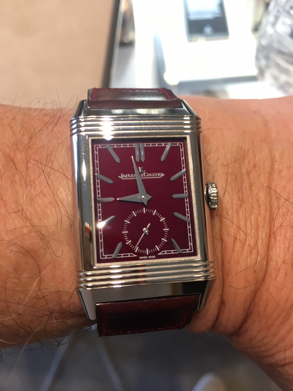

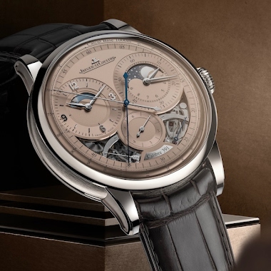
-the hour hand indicator is asthetically not pleasing vs sword hand of rouge -the circular vs rectangular subs seconds loses its Art Deco feel -the x2 JLc logo is redundant, less is more -makes the Reverso Rouge even more desirable Photo credit included
no other blue in this line will take its place b
I wonder whether a complementary (rather than matching) strap color would set off the dial to its full advantage. Ano “Mr. Burnt Sienna plus two parts Chartreuse and a touch of Cerulean ;-)” Nuevo
Hmmmm...Burgundy with chartreuse...Sounds like something Natalie Kalmus would love. Ano “Bring back the 1953 Technicolor palette, please” Nuevo
Ano “Why, yes, I AM a PhotoShop expert!” Nuevo 🤡
Love the dial colour, but agree with comments above regarding strap colour, something with more contrast could set the dial of better.
This thread is active on the Jaeger-LeCoultre forum with 33 replies. Share your knowledge with fellow collectors.
Join the Discussion →