
Collection
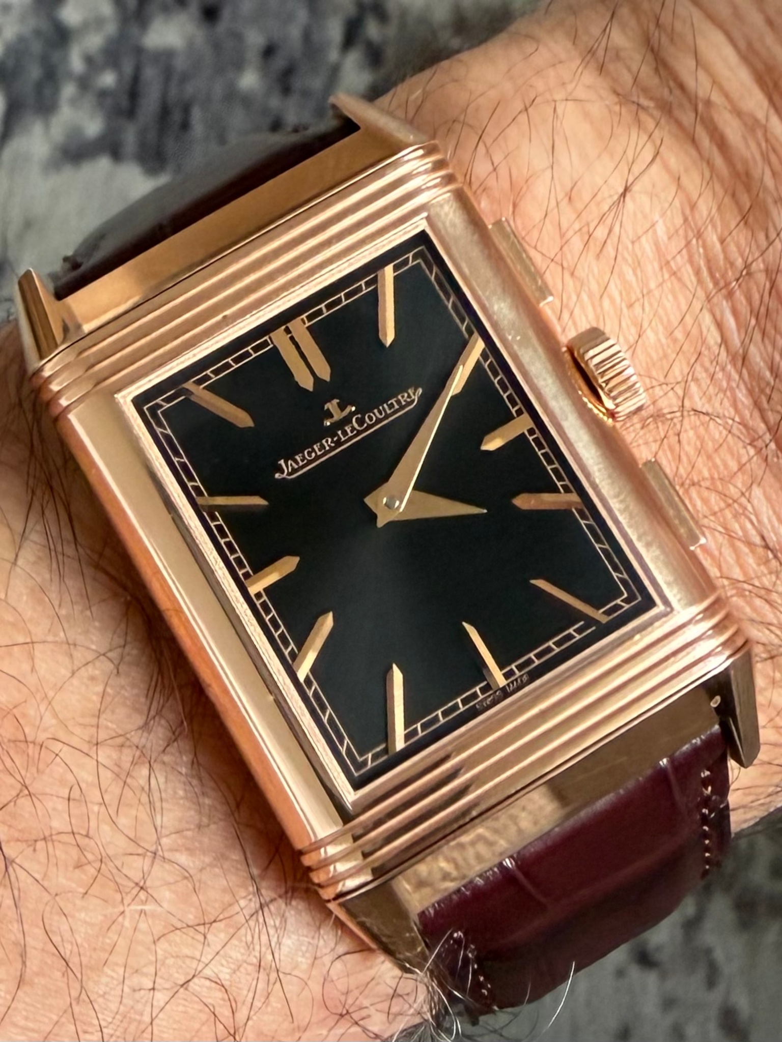
MTR's original post highlights the Jaeger-LeCoultre Reverso Tribute Chronograph, a timepiece where aesthetic appeal on the reverse side, despite legibility challenges, is celebrated over pure functionality. His personal experience underscores the importance of wrist presence and the unique allure of red gold in this specific reference. This article delves into MTR's insights and the community's appreciation for this distinctive JLC model.

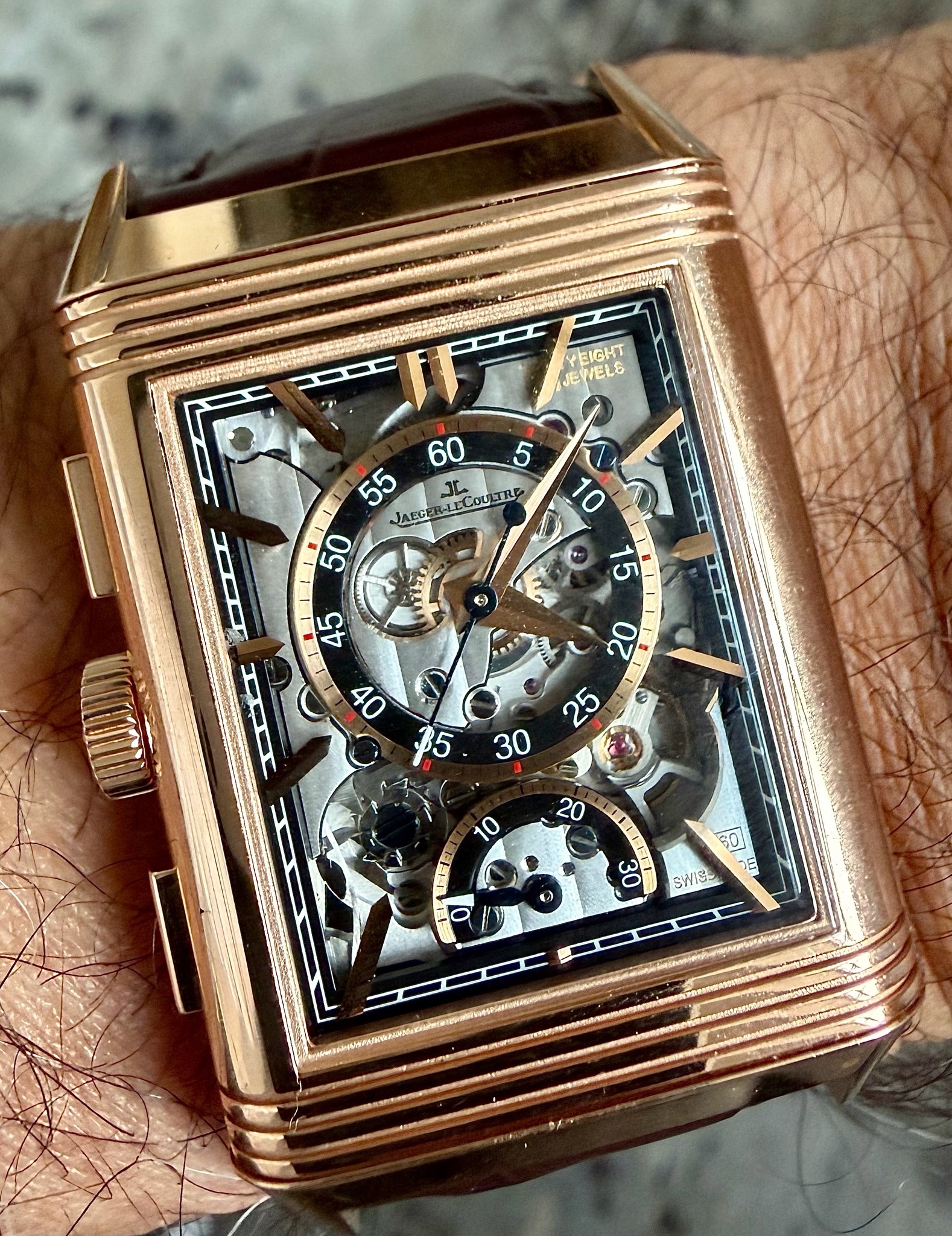
The Reverso Répétition Minutes represents Jaeger-LeCoultre's mastery of both Art Deco design heritage and haute horlogerie complications. Born from the original 1931 Reverso concept created for British polo players in India, this contemporary interpretation elevates the reversible case philosophy to house one of watchmaking's most challenging complications. The minute repeater transforms the iconic sliding case into an acoustic instrument, with the rectangular architecture serving both protective and resonant functions.
The skeletonized dial reveals the intricate dance of the minute repeater mechanism, showcasing Jaeger-LeCoultre's Caliber 944 movement through dramatic open-worked architecture. The rectangular case geometry presents unique acoustic challenges compared to traditional round repeaters, requiring specialized engineering to achieve optimal sound transmission. Rose gold construction enhances both visual warmth and acoustic properties, while the Art Deco numerals and stepped case profile maintain the collection's essential design DNA.
As one of the most complex expressions within the Reverso lineup, the Répétition Minutes occupies the apex of Jaeger-LeCoultre's rectangular watchmaking expertise. Production numbers remain extremely limited, making authentic examples highly sought among collectors who appreciate the intersection of mechanical complexity and design purity. The combination of iconic case architecture with grand complication movement places this reference among the most significant achievements in contemporary rectangular watchmaking.
I love that these Tribute watches are duofaces to take full advantage of the Reverso design. All the best, Jon
I’m also very enthusiastic about this model. I truly feel that you still get a lot of watch for the price here.
even had the steel version with the matte blue dial in mind, because I thought it would be more wearable in daily and business use than this red gold version. But once I saw the two watches side by side - and especially once I had them both on the wrist - there was no question anymore. For me the red gold version was simply far more powerful and beautiful. Once again, proof that a watch must always be tried on the wrist. A final judgement based on photos on the internet or in a catalogue is simp
I have two friends who bought this watch in RG because of me. And one of them even wears it on that grey strap. My other friend and I, however, find that grey strap in combination with the red gold case and black dial … quite dreadful. 😂 On the steel World Timer with the big date and dark blue dial and on this steel Chrono, on the other hand, the blue-grey sporty strap actually looks much better. Just my personal taste.
This thread is active on the Jaeger-LeCoultre forum with 26 replies. Share your knowledge with fellow collectors.
Join the Discussion →