New Release
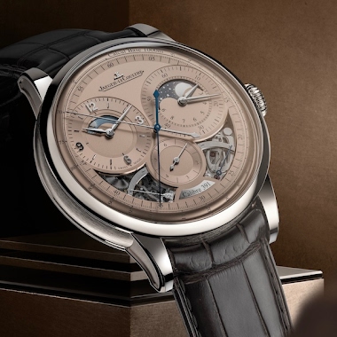
Nicolas (amanico) introduces the Jaeger-LeCoultre Master Control Date and Calendar in their new 'Steel Blue' limited editions. His initial post, featuring official images, sets the stage for a deeper dive into these boutique-exclusive references. This preview sparked immediate community discussion on design choices, functionality, and JLC's evolving aesthetic.


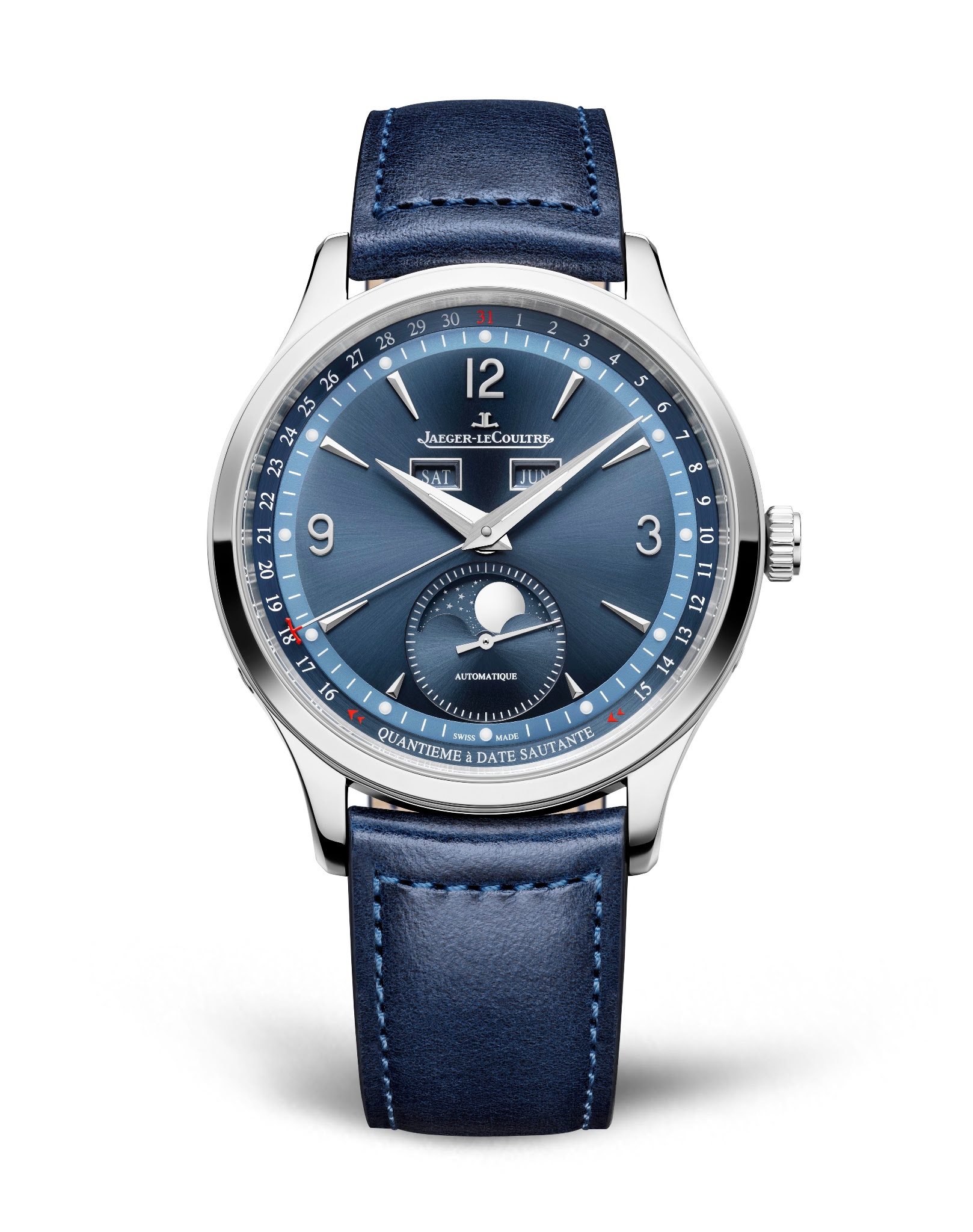
Would it have been nicer if they had adopted the latter date mechanism on the former?
The hand design on the calendar is compromised and prevents reading of the day and month. Ulysse Nardin did it right on the perpetual aqua, for example. Not as charming but more functional. I personally prefer their previous blue lacquered dials.
Very nice shade of 'steel blue' from the pictures and the leather strap even looks nice. Just need to swallow the price...
…this two tone blue is very attractive. Although my French is pretty good in that I know “Automatique” means Automatic I confess I am beaten by “Quantieme a Date Sautante”. A little help with translation would be most welcome. Regards Kev.
“We had some empty space on the dial and we couldn’t just leave it like that so we decided to write ‘this watch has a jumping date’.” The next version might say in really really small text “Also it has some hands, and day and month windows, plus it’s a superlative master control automatic rotor chronometer officially certified lots of meters 25,000 gauss 100 metres water resistant stainless steel case” …nope, I’m not a fan of dial text… 😁
As limited edition for no reason except for the colour. Which make us mere mortal very difficult to acquire one. I don't know any reasons behind this gesture, except as quick and easy money grab.
This thread is active on the Jaeger-LeCoultre forum with 85 replies. Share your knowledge with fellow collectors.
Join the Discussion →