Review
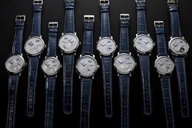
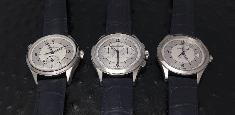
Amanico revisits Jaeger-LeCoultre's 2017 Master Control 'Sector' dial trio, released to commemorate the 25th anniversary of the Master Control 1000 Hours. These limited-production pieces offered a unique aesthetic and value proposition. Amanico shares his personal preferences and invites the community to weigh in on the design choices, particularly the date window and hands.

The font on the sundials really bothers me--it should be sans serif like the tachymetre!
I think it makes particular sense, though, to be picky about printing style on a sector dial. Dial printing is what these watches are all about!
This thread is active on the Jaeger-LeCoultre forum with 50 replies. Share your knowledge with fellow collectors.
Join the Discussion →