Bifrost is the brand new collection from the duo Johan Gustafsson and Patrik Sjögren. It symbolizes the come-back of the use of an automatic movement but more importantly the introduction of a new type of stainless damascus steel. Bifrost is the name of the sacred rainbow bridge which creates the link between the Earth and the Realm of the Gods in the Norse Mythology. The question is to know if the watch meets the expectations provoked by such name!
Like it is often the case with any G&S, the aesthetics are the main point of interest. The horological contents under the leadership of Patrik Sjögren remains flawless and solid but its purpose is to create the perfect context in order that Johan Gustafsson's talent can be expressed. A G&S watch is before everything an invitation to a journey, the feeling to travel in a distant land in where the lights would play with our own perception to create mysterious and enigmatic reflections.
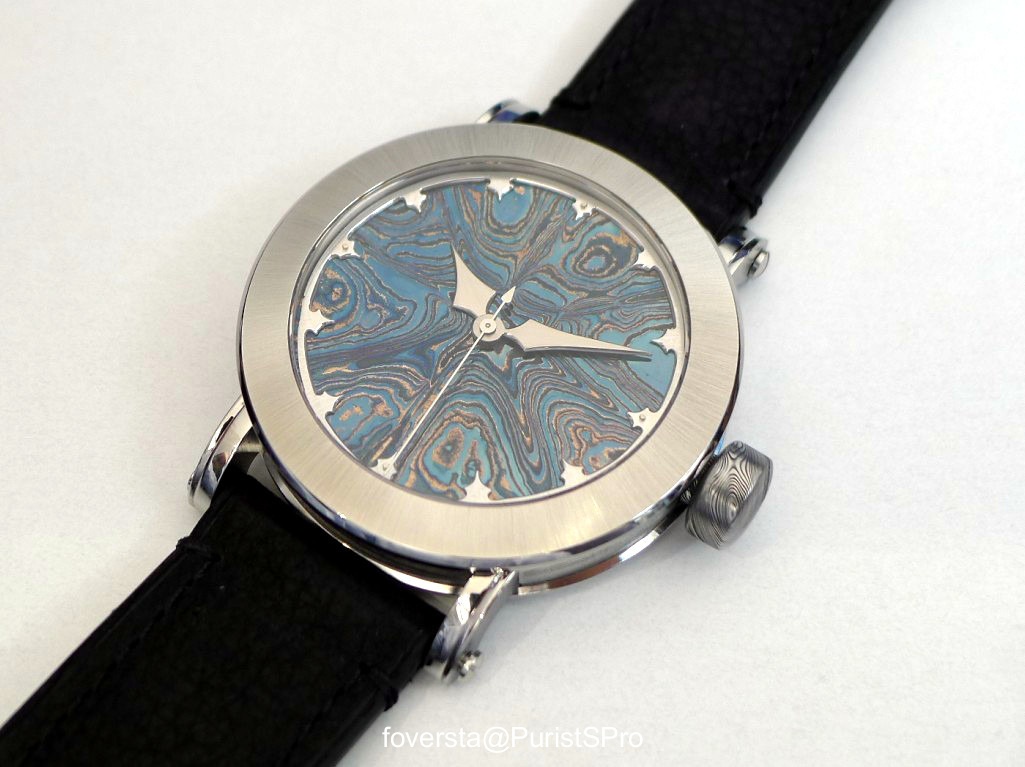
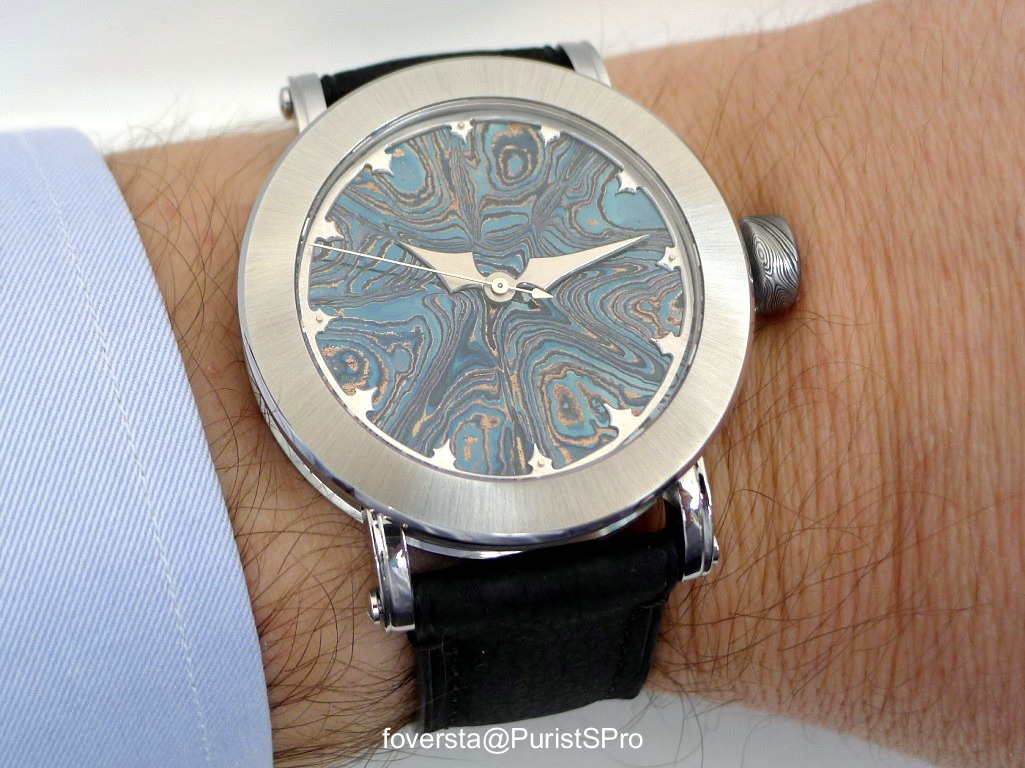
This first watch from the Bifrost collection offers a dial whose radiance and glare evoke the blue nuances of thick ice. A G&S watch can be recognized at first glance. The solid damascus steel dial embodies the unique and inimitable style of Johan Gustafsson who, by working on it, by tempering it converts it in a kaleidoscope. It is very difficult to describe the rendering of such dial because it changes continuously according to the light conditions and the position of the wrist. Even the central second hand seems unnecessary in this context because the animation created by the dial itself is enough. As for the indexes, they are faithful to the recent production of G&S. I appreciate them a lot because they give a kind of medieval touch to the watch.
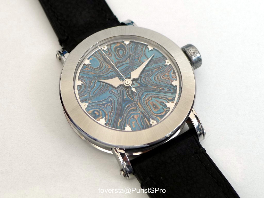
However, the close observation of the watch makes a change appear if we compare it to the aesthetics to other G&S timepieces. Contrary to the Midnight Sun or the Winter Nights on which the bezel pattern is highly visible and seems to be a kind of extension of the dial, the Bifrost Isbla plays a different tune. Johan Gustafsson introduces here a new stainless "high contrast" damascus steel which has a very different rendering. It looks almost like a mirror with sunrays finishings. Taking into account the fact that the bezel pattern is smoother, thinner, the pattern of the dial is more emphasized. The watch seems to be more refined because its design looks visually lighter. I don't say that I prefer this style over the the previous one as expressed on the Winter Nights watches. The result is different. If I listen to my heart, I like a lot the dial extension on the dial of the Winter Nights or Midnight Sun. The other part of the Bifrost Isbla which is highlighted is the crown. Since its pattern is very visible and due to its darker colour, the crown offers a strong contrast with the bezel. I know that Johan Gustafsson and Peter Sjögren are working on this to reduce this visual gap. Its size will be reduced and it will be as shiny as possible without losing friction.
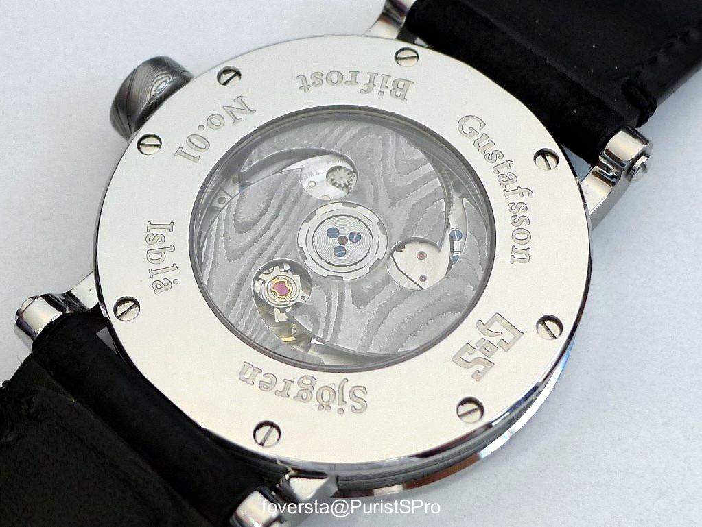
The Bifrost Isbla is powered by the Soprod A10 movement which has a 4hz frequency and a power reserve of 42 hours. The movement is reliable (I find its winding efficiency better than with the ETA2892-A2) and is specified to chronometer grade. But the nicest surprise is found on the winding rotor whose shape hides almost the whole caliber. The triple blade rotor uses the same type of stainless "high contrast" damascus steel than the casel. The pictured watch is a prototype and its final rendering will be different than on the pictures (it is also the case of the caseback whose finishings will be similar to the bezel ones). But the prototype already gives us the opportunity to appreciate the beauty of this rotor which is inspired by the celtic or nordic triskele. My only regret on this side of the watch comes from the limited size of the movement which is a bit too small for a 42,5mm case: the width of the back bezel seems to smother the rotor and I would have loved to see the later... more visually present.
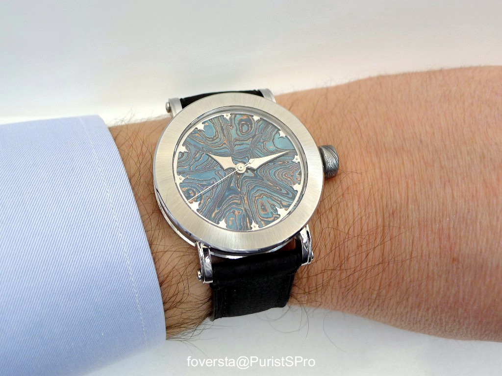
Thanks to a more contained size and a reasonable thickness (9,5mm), the Bifrost Isbla is a watch which can be worn more easily than a Winter Nights or a Midnight Sun. It creates a feeling of elegance, of sobriety while allowing to take advantage of the mesmerizing character of the dial. As such, it appears as an excellent compromises for collectors who want to discover the specific world of Johan Gustafsson and of Patrik Sjögren whle keeping a balanced context. I consider the Bifrost Isbla as a great achievement because it embodies an interesting evolution of the G&S style which becomes maybe more accessible but which keeps at the same time its charm and its enchanting side.
Thanks to Patrik Sjögren for his warm welcome at Baselworld.
Pros:
+ the more reasonable diameter and thickness
+ the spectacular rendering of the dial
+ the contrast between the bezel and the dial
+ the winding rotor design
Cons:
+ the movement is a bit too small for the case size
+ the contrast between the crown and the bezel is a bit too high but this gap will be softened.