Review
Crescendo's inaugural review on WatchProSite offers a deep dive into the Grand Seiko SBGW001, a watch he discovered while seeking a dressier alternative to his Rolex Submariner. This article explores the SBGW001's design, horological significance, and its place within the broader landscape of luxury watches, providing valuable insights for collectors considering a classic, refined timepiece.


Hello,
Thank you for choosing to read my review of the Grand Seiko SBGW0001.
This will be my first post on PuristSPro, but my reticence is not out of a lack of appreciation. I very much enjoy reading the learned discussion both here and on the other brand forums.
Without fruther ado, presented below is a review of the Grand Seiko SBGW001, a watch that I am sure the crowd here will find quite familiar. (This review was also posted another watch website a while ago – apologies if you have already read it.)
(Disclaimer: Please keep the inherent biases of the author in mind while reading this review. Specifically, I have made no effort to be objective when it comes to evaluating the aesthetic qualities of this particular watch. Nevertheless, I think that if you have similar tastes you may find my opinions interesting and valuable in some small way.)
(Disclaimer 2: Please excuse my overly-flowery writing style and grammatical errors.)
(Disclaimer 3: If you are the copyright owner of any of the photographs I sourced from the web, please let me know. I can remove them per your request, or I can add the appropriate citations.)
It Begins
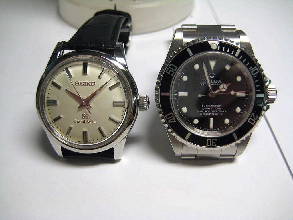
My watch sickness started over a year ago when I acquired a no-date Submariner to serve as my first ‘good’ casual watch. Ever since that most regrettable day I’ve been in the market for a ‘finer’ sort of watch, a watch with more classical and ‘refined’ styling – in other words, a dress watch.
Over the course of many months I trawled watch forums looking for ‘the one’. Eventually I always came back to the Patek Philippe 5127R.
The following image is sourced from the web: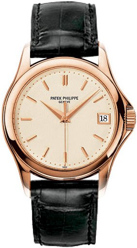
To me this watch is a pillar of classical, understated design. I’m sure I don’t need to explain that sentiment any further. I even grew to the love the bizarre ‘crown protector’ growth on the right-hand side of the case.
Unfortunately, I could not justify spending such an amount of money on a watch. Thus my hand was forced: I had to search for a suitable replacement!
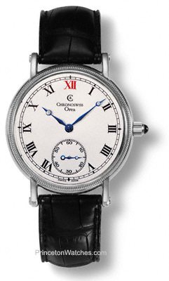
Presented below is a very small portion of the fondly remembered potential candidates.
The following images are sourced from the web:
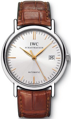


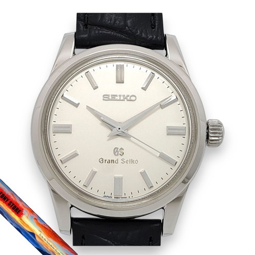
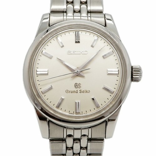
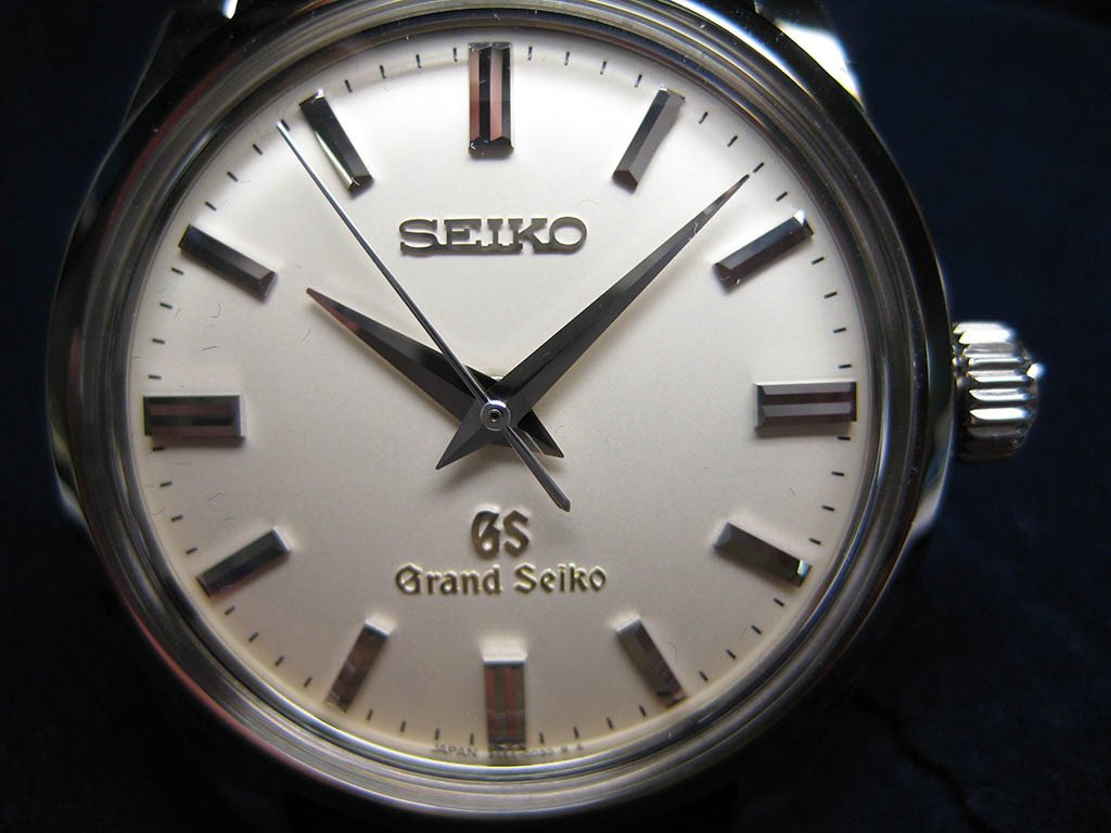
Eventually, as was the case with the PP 5127R, one watch in particular kept separating itself from the ‘chaff’ – the Grand Seiko SBGW001:
The following image is sourced from the web:
This watch seemed to meet all of my aesthetic criteria, but at the same time it was all so strange: A Seiko? What exactly is this ‘Grand Seiko’ thing, and why does it seem to have a small cult following on watch forums?
The Horological Significance of Seiko and Grand Seiko
Seiko is undoubtedly one of the most important and innovative companies in the world of horology and is a true manufacture in every sense of word. Seiko designs and produces all of its watches and movements in-house, and this self-sufficiency is also uniquely extended to other minor goods such as lubricating oils and Lumibrite (Seiko’s own proprietary version of luminescent paint).
At risk of oversimplification, in the 1960s the ‘Grand Seiko’ model line was unveiled in a response to the belief that Japanese watches were inferior timekeepers when compared to their Swiss counterparts. These Grand Seiko badged watches eventually served as a catalyst to the development of the Grand Seiko standard, which is an internal timekeeping standard that has higher tolerances than the equivalent COSC standard.
Mechanical Grand Seiko watches remained in production until the so-called ‘quartz crisis’, at which point manufacturing was terminated. It was not until 1998, almost 24 year later, that the mechanical Grand Seiko watch was revived.
The new line of mechanical Grand Seiko watches enjoy ‘flag ship’ status in terms of case and dial finishing and are stylistically based on the vintage Grand Seiko designs of the mid-twentieth century. Furthermore, in typical Japanese fashion, the movements have been constructed and decorated using a process of machine automation that ultimately results in precise, accurate timekeeping.
The blending of these three intrinsically linked philosophies – that is, high standards of finishing and attention to detail, automated precision of movement construction and decoration, and recognition of historical roots – culminates in a Grand Seiko watch: An ageless, classically styled timepiece that is finished superbly and powered by an accurate movement backed by Japanese engineering expertise and the skill of Grand Seiko’s watchmakers. With such pedigree it is clear why Grand Seiko watches are so desired by enthusiasts.
On Lions and Gothic Fonts
I suspect that the use of a lion for the Grand Seiko seal and a gothic font for the “Grand Seiko” and “GS” branding has always raised some eyebrows. From my reading of the ‘literature’ it would appear that Seiko’s original decision to use these motifs was a response to the ‘European threat’. As discussed above, the Grand Seiko idea was developed in order to safeguard Seiko’s timekeeping honour, and therefore it does not seem implausible that these traditionally European motifs were selected in order to communicate that Seiko’s watches were just as good as any quality European brand.
To today’s modern observer these design motifs undoubtedly seem strange, and in my personal opinion they are unnecessarily kitsch. Nonetheless, it is useful to be mindful of Seiko’s attitudes at the time. Similarly, it is also difficult to begrudge contemporary Grand Seiko watches for remaining true to their roots, especially as they are presently only being sold to the domestic Japanese market.
Naturally this does not excuse these ‘flaws’, but it does provide the proper context in which to understand Grand Seiko design decisions. Besides, in many ways such historical quirks are quite charming.
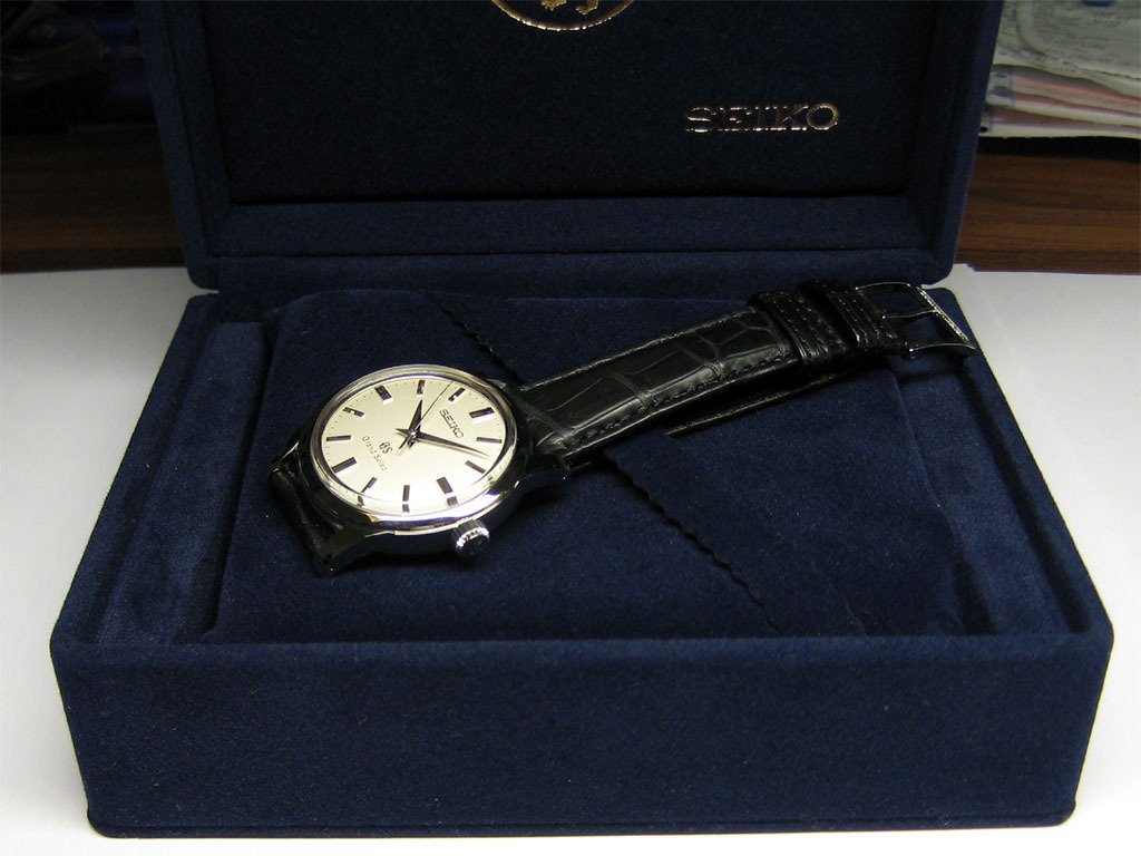
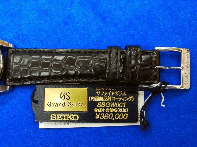
Presentation
The SBGW001 and its trimmings are packaged in a cardboard box. This cardboard box has been evenly covered with thin leather-print plastic that is dark blue in colour. The Grand Seiko lion seal and the text “GS” and “Grand Seiko” have been gilt on top of the lid in gold lettering. Being of cardboard construction, one may think that the box does not look and feel luxurious, but that is not necessarily the case (at least for me). I was impressed with the size and colour of the box, and it seems to have been assembled with care despite its cheap components. Perhaps I’m just easy to please.
Inside the box the first item of interest is a large, faux-leather ‘binder’ that is not unlike a check binder or a ‘leather restaurant bill presenter’. Inside this binder is a Grand Seiko certificate that certifies the cased Grand Seiko movement as having passed “all inspections of the Grand Seiko standard”. On the right hand side of this certificate the timekeeping standard is laid out in detail. There is a disclaimer at the bottom of the right hand side that says, “In the case of actual use of this watch, rough standard of gains/losses per day is -1 ~ +10 seconds.”
Interestingly, it seems that Seiko no longer issues Grand Seiko certificates that detail the individual timing performance of the new watch. Rather, they now only certify the watch as having passed the Grand Seiko standard.
The actual watch presentation box is packaged within the outer cardboard box and is held in place by four internal dark blue cardboard ‘keepers’. The watch presentation box itself is of a simple hinged design and is covered in some sort of dark blue felt or velvet material, not unlike an engagement ring box (only on a larger scale). Inside the watch presentation box is a compartment that houses a soft cushion. The soft cushion has a ‘strap’ running diagonally across it like a beauty pageant sash that is used to secure the watch. The watch presentation box is certainly very simple, but I think it has a certain charm.
The watch box. Note the sash:
Underneath the watch presentation box is a recessed compartment that houses a number of booklets including the “Mechanical Watches Hand Book”, the instructions, and an international guarantee.
Of special interest is the “Mechanical Watches Hand Book”. This booklet is Seiko’s attempt to explain the intricacies of mechanical watch ownership presumably to a lay audience. Although there are grammatical errors in abundance, this booklet is very impressive and I think that Seiko deserves special recognition for trying to educate people and to give them a reasonable and realistic idea of how their new watch will perform. The English section of the booklet begins with a sort of ode to the mechanical watch and then continues with a section by section outline of what to expect when owning a mechanical watch and how to understand and manipulate its performance properly.
To reiterate, I feel that Seiko deserves to be praised for the inclusion of this hand book. Personally I have never seen such a good attempt to address the ‘mechanical watch problem’, and I think that other brands should take note. The information presented in this hand book is also covered in part in the instruction manual, but I think that Seiko has done well to also package it separately in a user-friendly way, and in so doing has successfully addressed ‘instruction manual stigma’.
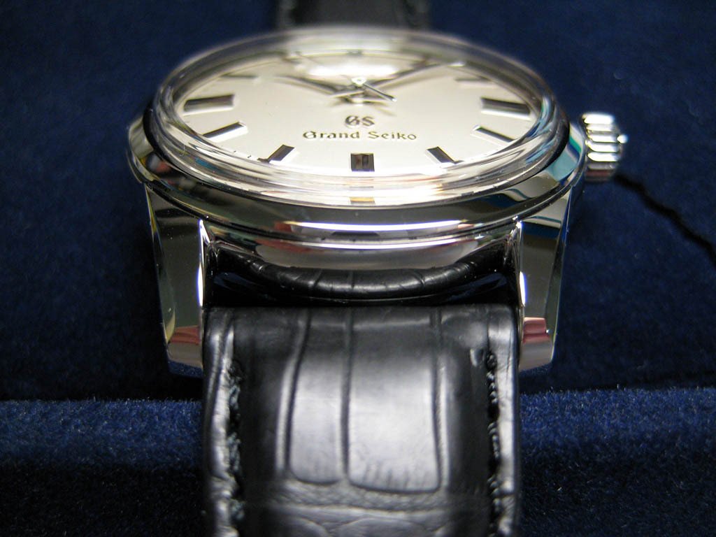
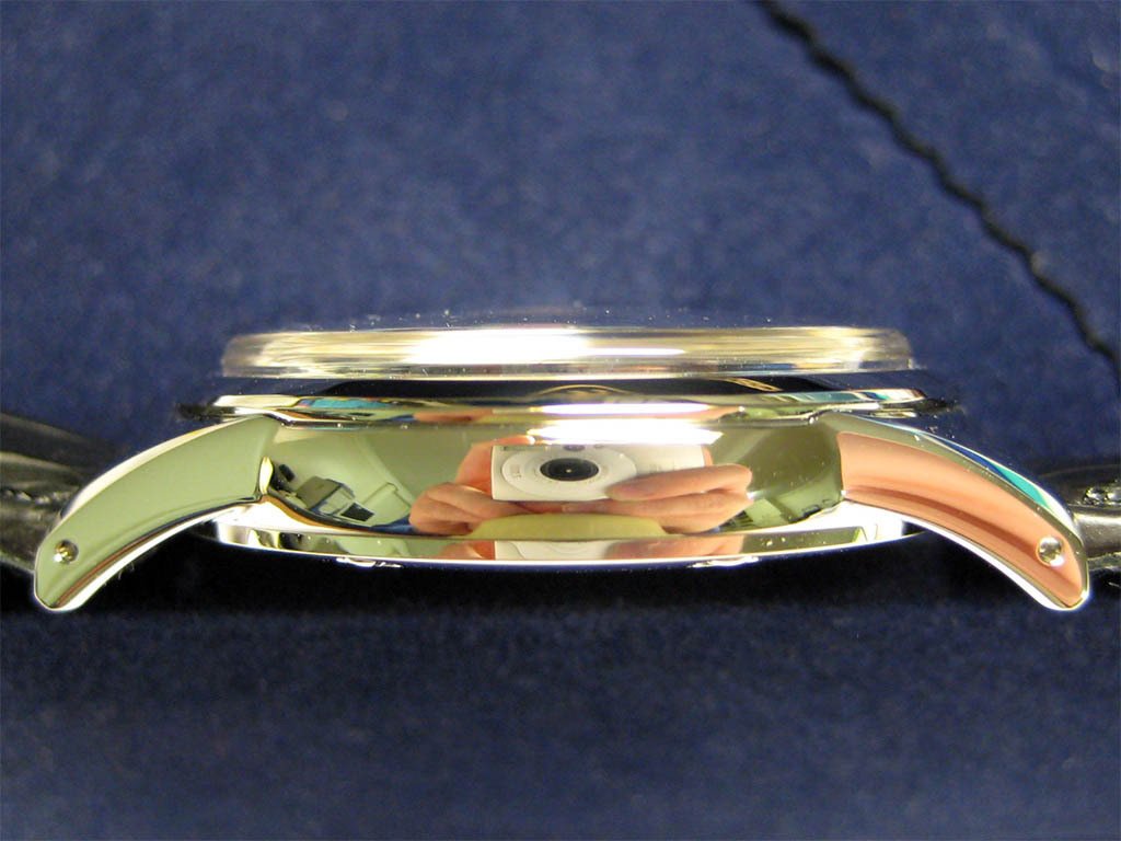
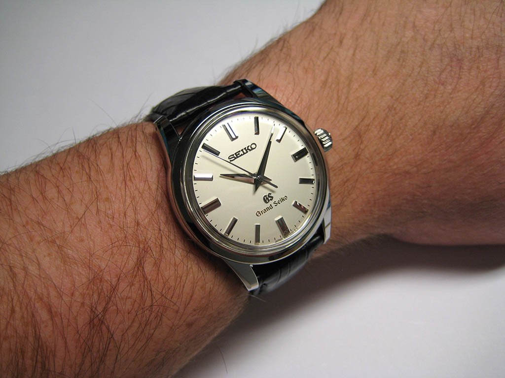
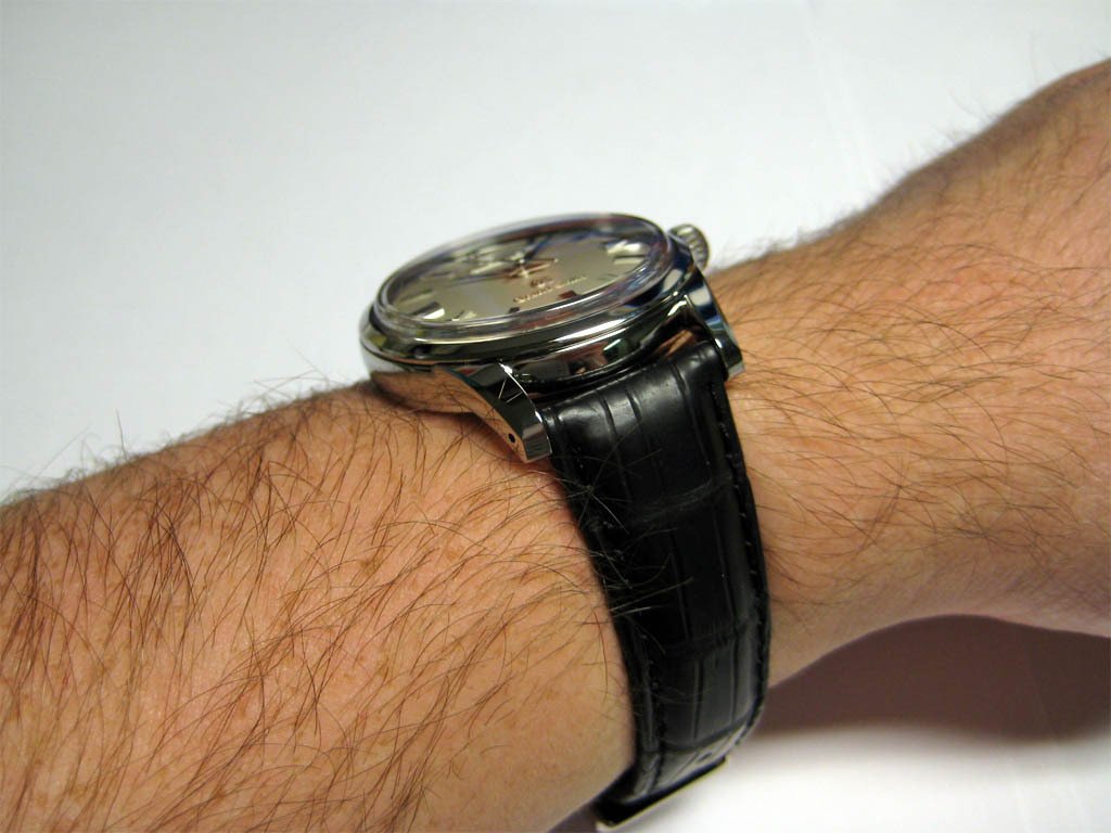
Case
The SBGW0001 has a round, stainless steel case with a diameter of 37.4mm and is approximately 11.4mm thick. In theory this seems relatively thick for a watch of this size, but in practice the case appears thinner due to the combined effect of the raised and domed sapphire crystal, and the subtly curved caseback.
The case is composed of three major parts: The bezel, the main case body, and the caseback. The various demarcations between these three components create a slight ‘stepping’ effect that adds geometric interest to the overall design. This effect is especially pronounced where the bezel and the sapphire crystal meet, and this adds to the ‘vintage’ feeling exuded by the watch.
Various views of the watch case:
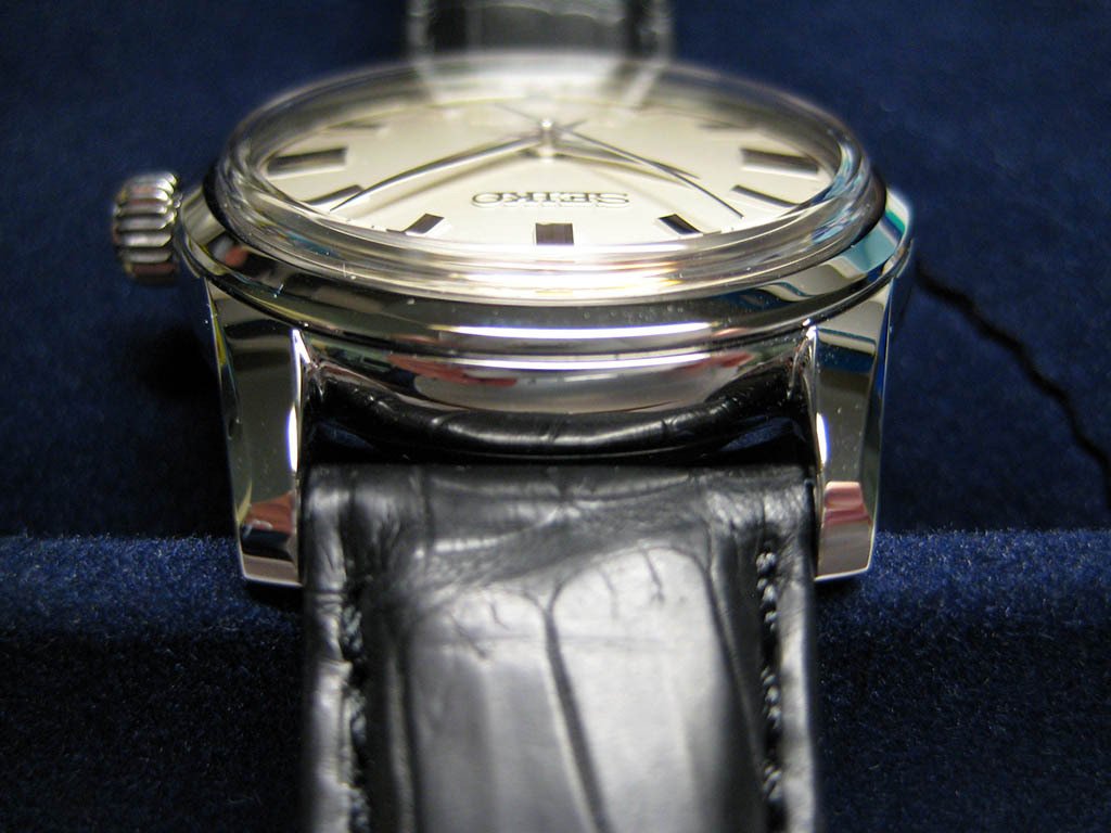
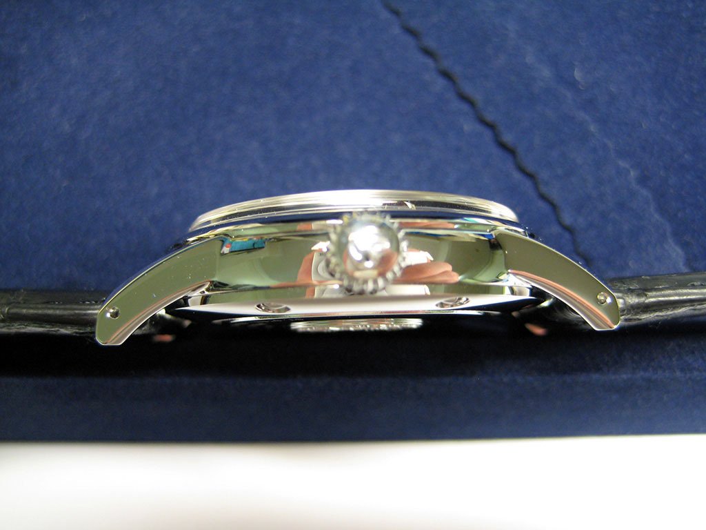
The bezel itself is relatively simple, but I feel this simplicity is its strength. The bezel is polished to a standard as good as any decent watch, and is without flaw when viewed using a 10X loupe. It is relatively thin, but is in perfect proportion with the dial, that is, it is thick enough to be noticeable and appreciated, but thin enough not to be overpowering, which allows the eye to be naturally drawn to the dial. The bezel retreats from the sapphire crystal at a shallow angle and is rounded where it meets the main case body in order to create a noticeable separation – another subtle, interesting detail.
The main case body exhibits many of the same features as the bezel. It is highly polished without visible flaw, and is simple in design. This minimalism allows the bezel and the caseback to attach securely to the main case body, and has the added benefit of accentuating their features. Aesthetically speaking, the main case body serves the purpose of holding the watch together and does so admirably without being distracting.
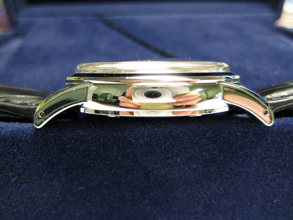
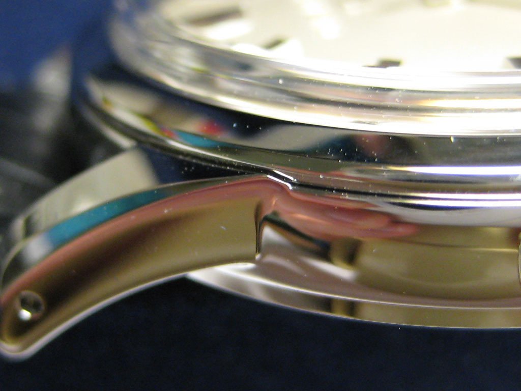
Of special interest are the lugs, which are beautifully shaped and curve downwards to extend below the caseback. When laid flat on a surface dial up, the watch sits on the ends of its lugs with a gap of approximately 1mm between the surface and the caseback. While adding visual interest, this downward curve and extension below the caseback also serves a practical purpose – clearly the lugs have been designed with wrists in mind.
Upon close examination the lugs reward the observer. Viewed from above, the lugs meet the main case body with a pleasing tangent and are tapered to a rounded end. The inside ‘joins’ to the main case body have a very subtle ‘webbed’ styling that is much like the ‘webs’ between one’s stretched out fingers. The top of the lugs also have a machined facet similar to the lugs of an Omega Seamaster. This facet catches and ‘absorbs’ the light in a unique manner that results in attractive lighting effects covering a spectrum from mirrored light to deep black.
One of the lugs. Note the facet:
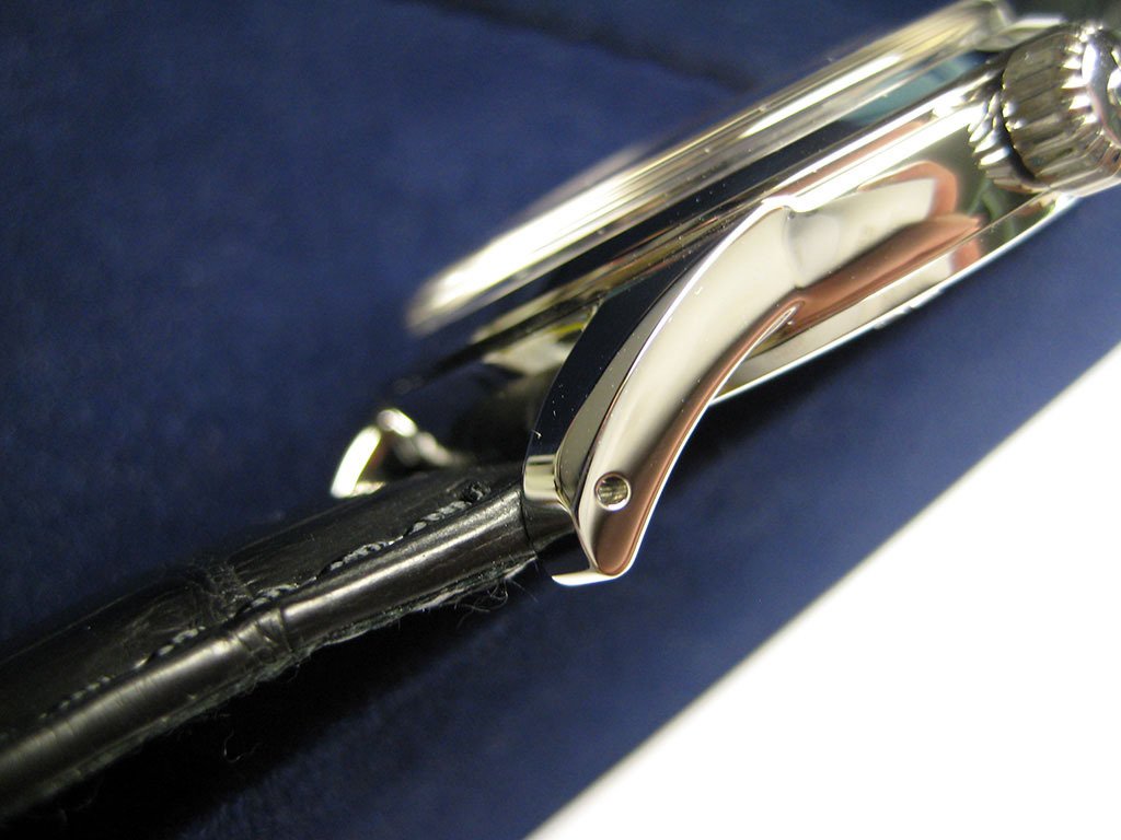
The lugs have drilled holes for the strap springbars. These drilled holes contribute to the vintage feel of the SBGW001 and are very much in keeping with tradition. The positioning of the lug holes at the ends of the lugs results in the strap being positioned partially ‘underneath’ the main case body. This has the very pleasing effect of the bezel and main case body covering the strap slightly when viewed from directly above, and gives the appearance of the strap touching and sitting flush with the top and bottom of the case. Whether this feature is intentionally designed or not, it is certainly a novel take on how to position the strap relative to the other features of the case (to me at least).
Perhaps most attractively, when viewed from the side the lugs exhibit a very interesting styling feature. The top of the lug actually extends slightly above the join between the bezel and the main case body, and in doing so Seiko’s designers have included a most striking flourish. There is a small feature that rises above the bezel and then descends back down to the main join, ultimately resulting in a crest that appears to envelop or ‘hug’ the bezel in a most pleasing way. This detail may not be noticed under casual scrutiny, but once again the SBGW001 rewards close inspection.
The lug ‘crest’. Scroll back up to the case views to enjoy the full effect:
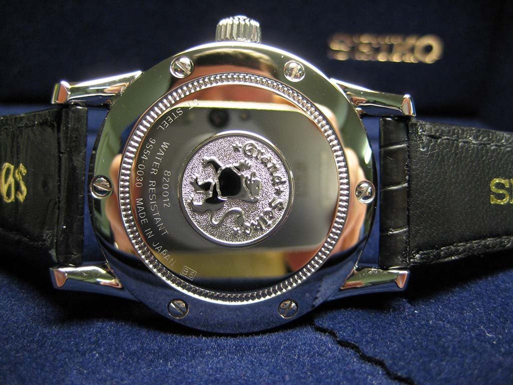
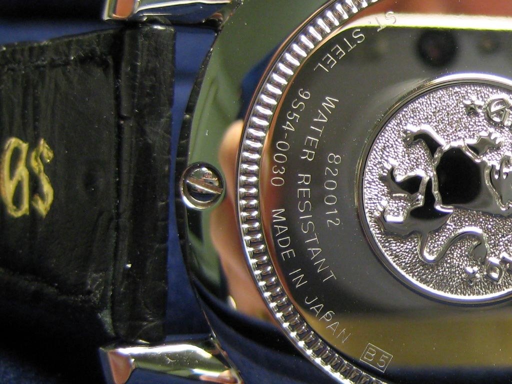
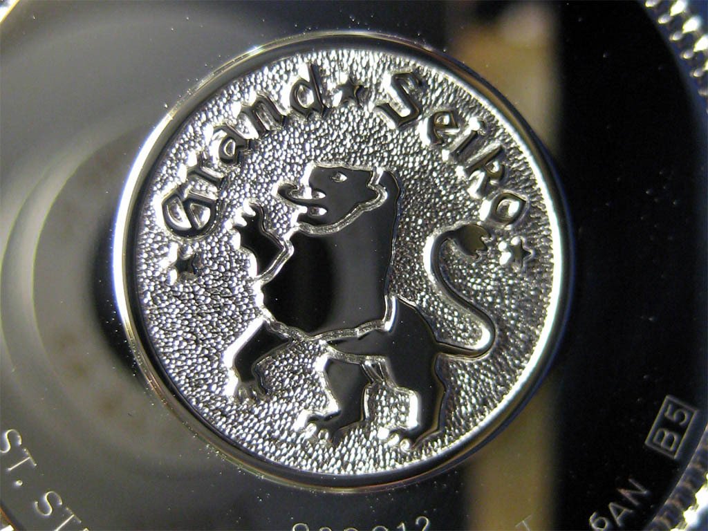
The caseback is secured by six highly-polished screws in well-executed recessed holes. The mirror-like finish of the slightly domed caseback is punctuated by the inclusion of the (in)famous Grand Seiko lion seal surrounded by a coin edge border. Initially I was concerned that the seal and coin edge border would appear gaudy, but in reality they are offensive. The ‘rough-frosted’ effect that surrounds the raised polished design of the lion and “Grand Seiko” text reminds me of certain A. Lange & Sohne clasp buckles and automatic rotors, an effect that I’ve always found quite pleasing. It almost seems out of place on the SBGW001, but once you begin to understand what Seiko was/is trying to achieve with its Grand Seiko line, it begins to make sense and helps to soften the kitsch.
A caseback screw and the Grand Seiko lion:
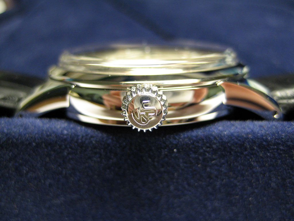
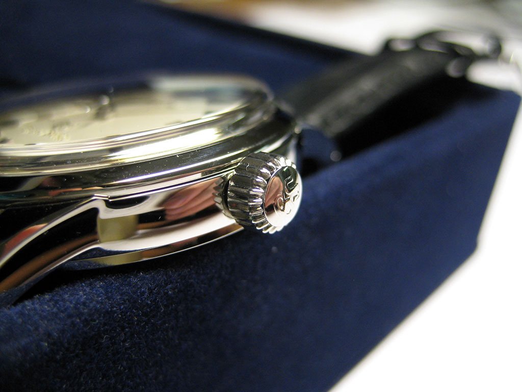
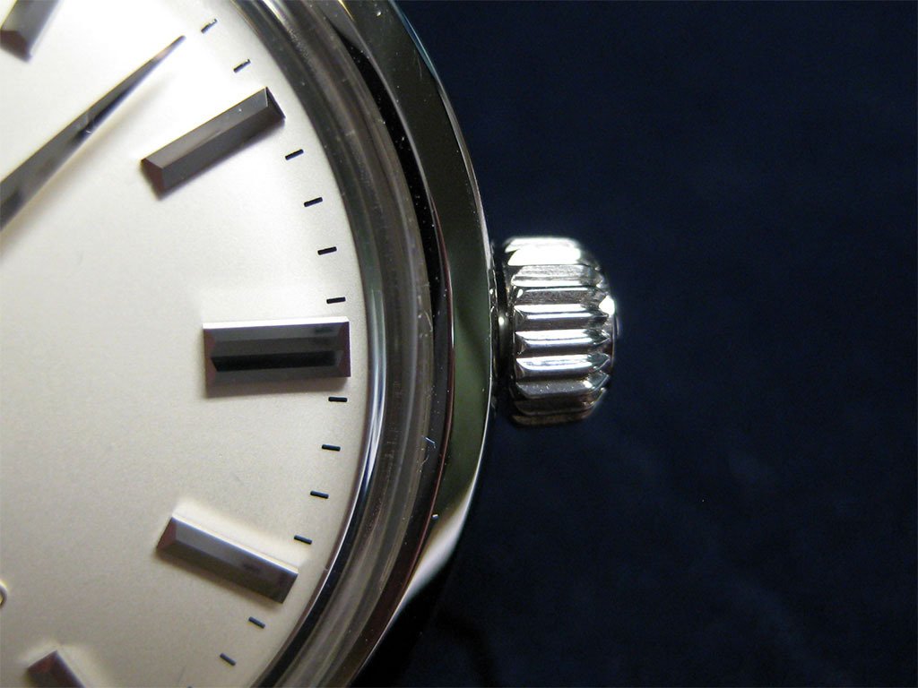
Finally, the crown could be described as being semi-onion in style. It is large enough to be functional (the SBGW001 is hand winding), but small enough to be relatively unobtrusive and visually consistent with the rest of the watch. The beveled ridges and signed “GS” text add interest to an otherwise perfectly adequate, but relatively unremarkable component.
Some views of the crown:
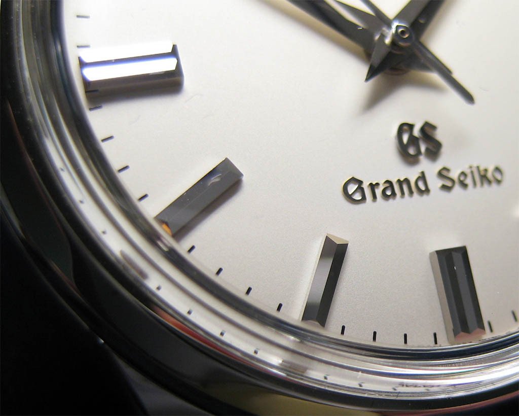
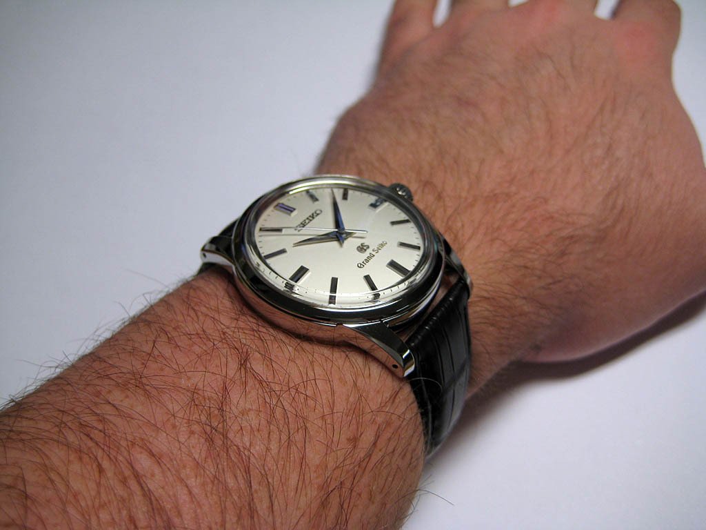
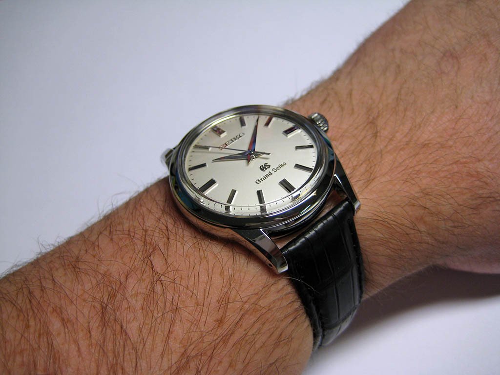
Dial
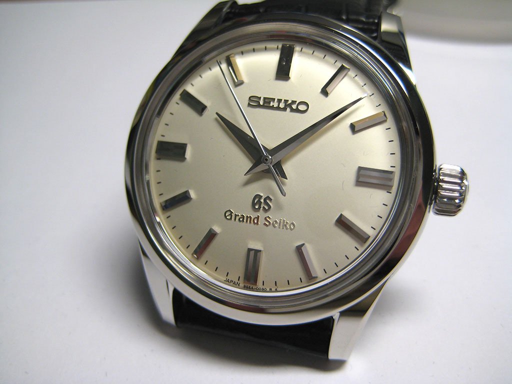
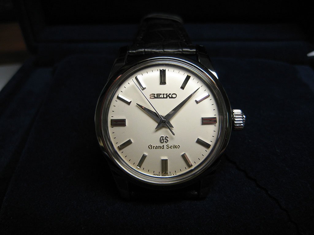
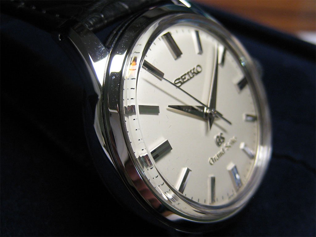
The dial is arguably the most important part of a watch when it comes to communicating the intended aesthetic. With this is mind, the SBGW001 has strived to achieve a balanced, classic simplicity that is consistent with designs of the past and present. I feel it has reached this goal. Every of part of the dial works together to create a cohesive and deceptively simple design that is pleasantly vintage and ‘old world’ in its styling – a true classic of mid-twentieth century wristwatch design.
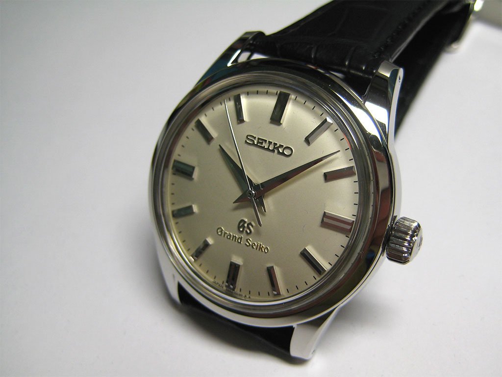
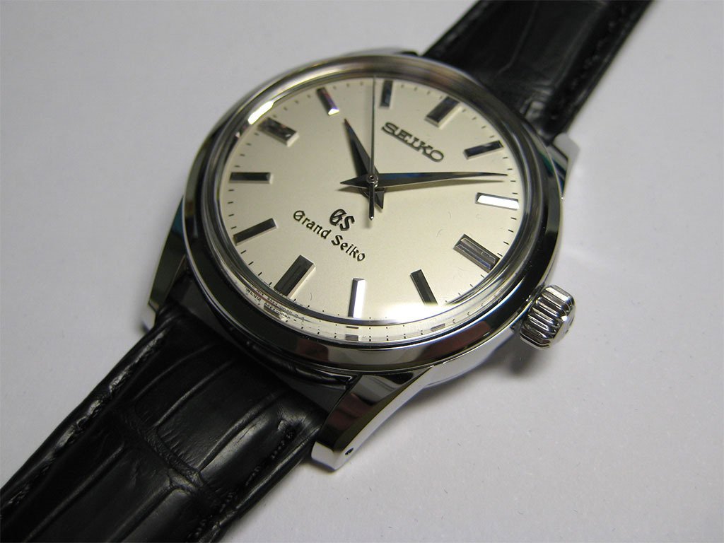
Classic styling:
The SBGW001’s dial consists of a white dial surface (perhaps very slightly gray), three hands (hour, minute, and seconds), applied indices (‘double batons’ at 15 minute intervals, and ‘single batons’ at 5 minute intervals), printed minute markers, applied text (“Seiko” and “GS”), stamped text (“Grand Seiko”), and printed text.
The ‘canvas’ of dial is the white dial surface. This white colour evokes a sense of purity and simplicity that is in keeping with the function of a dress watch. Although darker colours can be used in designs such as this, I feel they are not as attractive, nor are they as traditional. In any case, the white colour of the SBGW001 serves as an excellent base upon which to build. At higher magnifications the dial seems to be finished in a way that results in an appearance much like a very fine sandblasting, with an almost salt and pepper like appearance that is weighted heavily towards the salt (please excuse that metaphor). This ‘sandblasted’ effect is only subtly noticeable in real world conditions, and under certain lighting conditions it seems to make the dial appear off-white in colour, if not slightly gray. Overall it is a very pleasing and understated effect.
The dial texture can be seen in the following images:
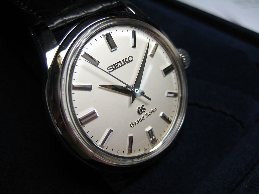
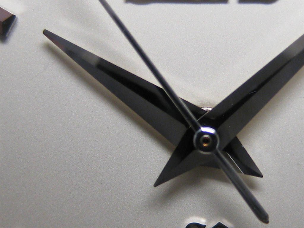
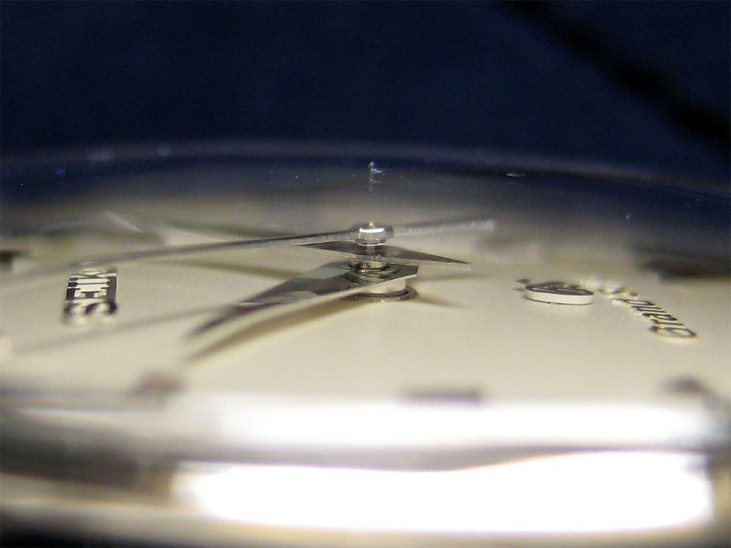
Perhaps the next most obvious feature of the dial is the set of hands. At the macro scale the hands truly are a sight to behold even under the dimmest of lighting conditions. The traditional dauphine styling of the hour and minute hands, and the tapering, extruded teardrop shape of the second hand are extremely enticing.
The set of three hands:
The minute and hour hands appear perfectly polished and are without finishing flaws under a 10X loupe. The minute hand is slightly thinner than the hour hand, which adds to the effect of its greater length and helps to differentiate the two at a quick glance. The pointed tip of the minute had extends almost completely to the printed minute track, while the hour hand falls approximately 2mm short of the base of the applied indices. I feel the ratio of the size of the two main hands is very thoughtful – they are in a pleasing proportion to each other which allows one to tell them apart very easily. Again, this differentiation is also assisted by the differences in thicknesses. Too often I feel that not enough attention is paid to the proportion of the hands both in terms of thickness and length. In this regard I feel that higher-end brands such as A. Lange & Sohne are somewhat guilty, although to be fair, they are clearly not the worst culprits.
A pleasing ratio:
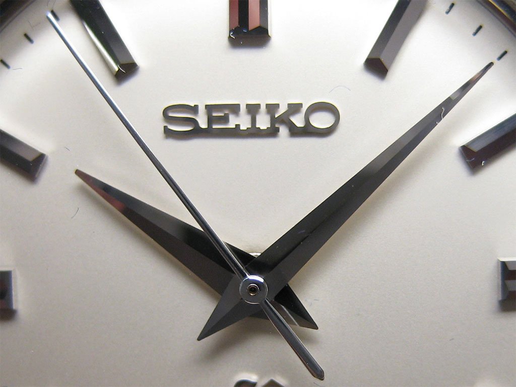
The dauphine creases of the hour and minute hand appear to be executed perfectly under a 10X loupe. These creases flawlessly dissect both hands along their centre lines creating two facets that reflect and ‘absorb’ the light accordingly in a most beautiful way. The machining and finishing of the hour and minute hands is consistently excellent, bar one slight ‘flaw’. At higher magnifications the pointed tip of the hour hand appears to be ‘stubby’, for lack of a better word. It would appear that this feature is intentional as it seems to be consistent with photographs of other SBGW001s, but in the interests of completeness, I cannot rule out the possibility that this is a manufacturing flaw and a subsequent oversight by Seiko. In any case, it seems strange to me that the three other pointed tips of the hour and minute hands so well-formed. To be fair to Seiko, this is an observation that is only noticeable at high magnifications – in real world conditions it would be very difficult to see this flaw without being ‘tainted’ by prior knowledge. (It was later confirmed that the 'stubiness' of the hour hand is common in other SBGW001 watches - in other words, it is a design choice.)
The minute hand, and the ‘stubby’ hour hand:
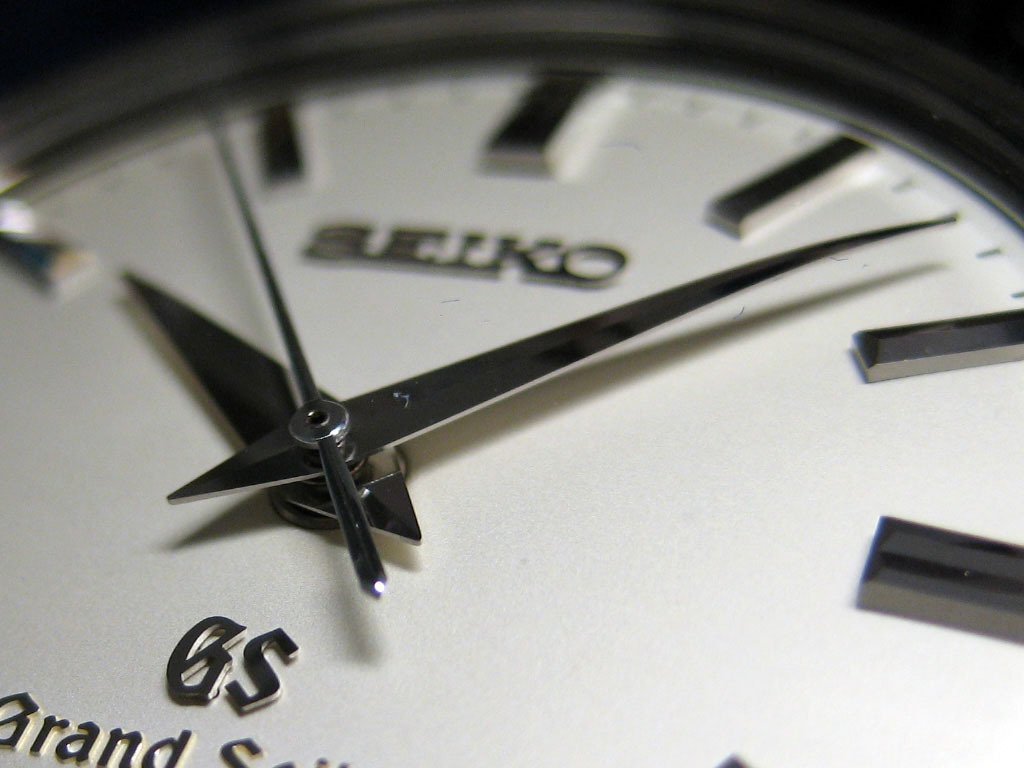
The second hand demonstrates the same attention to detail as the hour and minute hands. As mentioned above, the second hand begins as an extruded teardrop shape and then tapers towards the centre pinion where it ultimately terminates in a rounded tip. The combined effect of both disparate sides is stunning. When viewed from above, the second hand is polished to the standard of the both the hour and minute hands. However, when viewed from the side, the second hand exhibits a ‘raw’ finish. The contrast to the polished surfaces is quite stark, and it should be noted that the same features are present on the hour and minute hands. The underside of the second hand is similarly unfinished, and, in a delightful ‘irony’, is viewable thanks to the highly-polished surfaces of the other two hands. Presumably the undersurfaces of the main hands are highly-polished. I’m still unsure if I should criticize the unfinished sides and underbelly of the second hand, as well as the unfinished sides of the main hands, simply because I have seen similar features on watches from high end brands such as Patek Philippe. I suppose that it is not unreasonable to assume that finishing these extremely delicate areas is difficult. In true Seiko apologist fashion I must admit that I am not overly distressed by this fact. Even if the unfinished surfaces are ‘raw’, they do add visual interest when inspecting the dial with a loupe. Or at least that’s what I tell myself when I’m tossing and turning in bed at night. (I’m kidding.) On a similar, but less important note, I would have preferred it if the centre pinion was not brass coloured, but perhaps this is a design constraint.
Some side on views of the hands. Note the ‘raw’ surfaces:
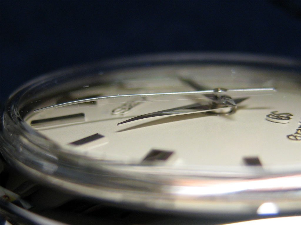
All three hands are curved subtly downwards in order to reduce parallax error. This curvature is not an uncommon feature, especially on watches with raised and domed sapphire crystals, but it is nevertheless an appreciated one and suggests an attention to detail that is consistent throughout the design of the SBGW001.
Curvature of the minute hand:
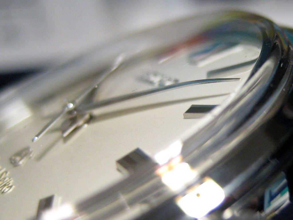
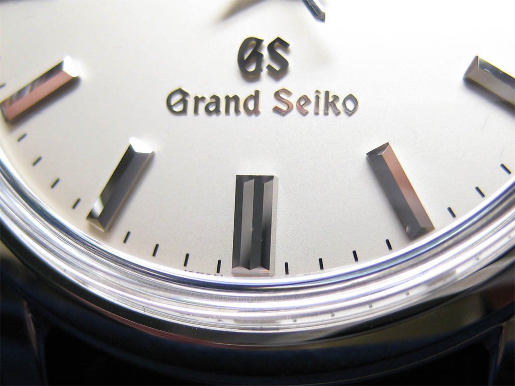
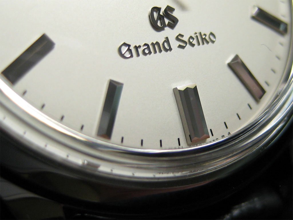
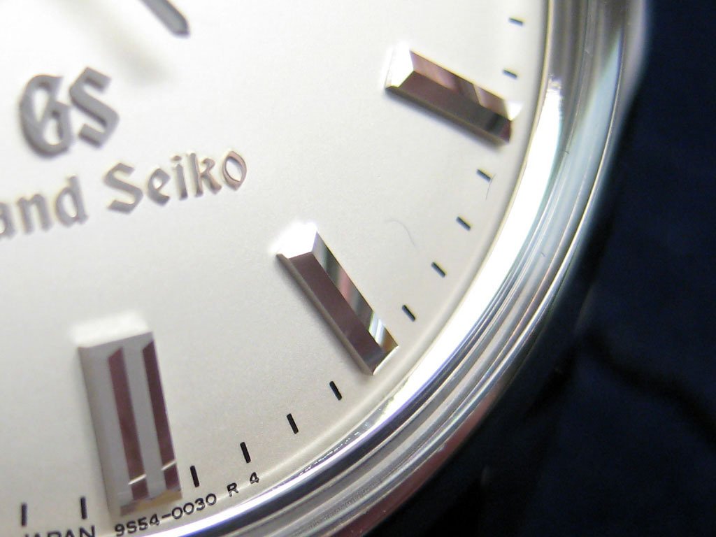
The applied indices have been lavished with the same attention to detail as the hands. There are two types of applied indices on the dial of the SBGW001: Double batons, which are affixed at 12 ‘o clock and at subsequent 15 minute intervals, and single batons, which are affixed in the remaining 5 minute intervals. The finishing of the indices is superb. They are highly-polished and faceted in such a manner that would appear consistent with a complex machining process. The high polish and faceting combine together to produce a fascinating kaleidoscope of reflected light at every viewable angle. After having examined the applied indices separately with a 10X loupe, I can safely declare that they are all without flaws of any kind, at least to my untrained eye.
Various views of the indices. Note the high-polish surfaces and the reflection of printed minute markers in the indices:
The misalignment of the applied indices between the printed minute markers is minimal, but it is there if you look hard enough (note the 12 o’clock and 9 o’clock double batons). Personally I feel that this misalignment is within tolerances for hand application and is only noticeable when you’re as anal as me.
A final interesting detail to note is that the indices are applied directly to the actual minute track, not in front of it, and in doing so serve as the only minute marker for that particular area of the minute track. This is in contrast to watches such as the PP 5127 and the new ALS Saxonia, where you will note that the applied indices are positioned in front of, and in addition to, the minute track markers. I prefer Seiko’s implementation, but naturally tastes will vary.
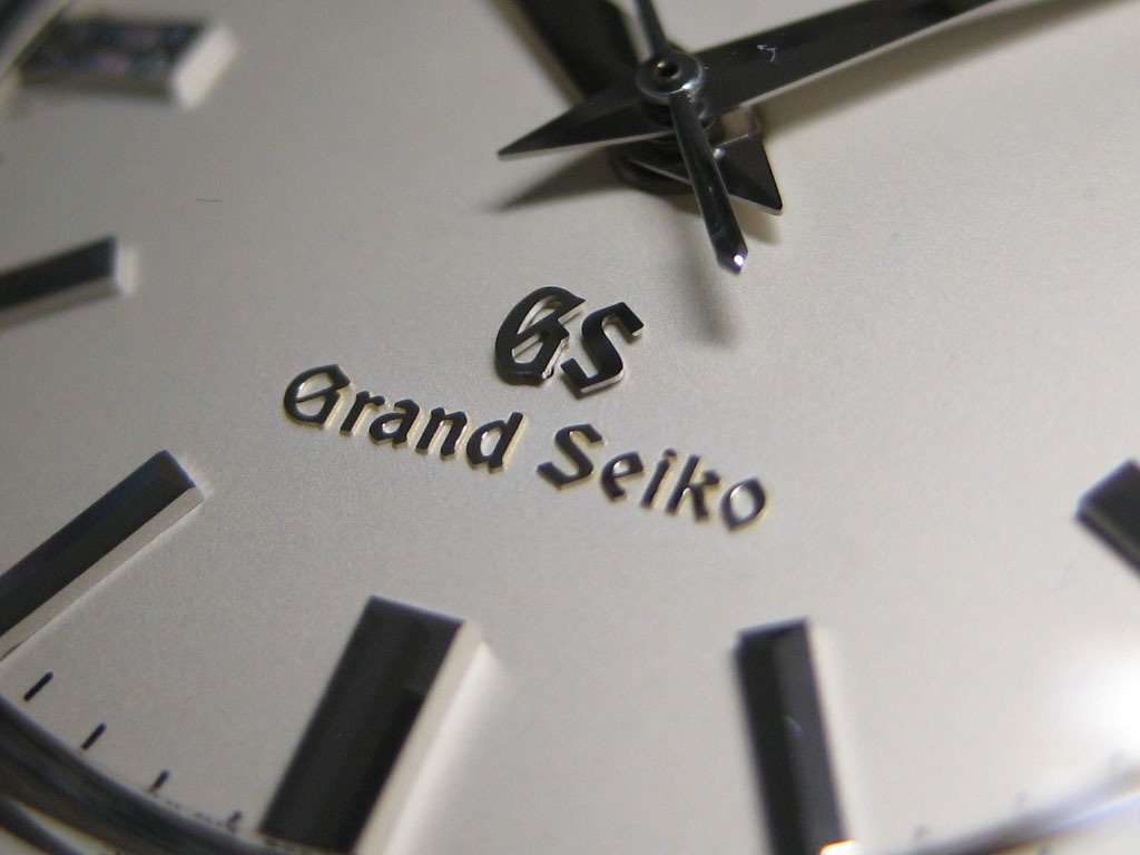
There are four separate blocks of text on the SBGW001’s dial. The most immediately noticeable are “Seiko”, “GS”, and “Grand Seiko”. All three blocks of text have relief and cast a shadow, but only “Seiko” and “GS” are applied. At higher magnifications the applied blocks of text appear to have small ‘feet’ that indicate dial attachment points. It is unclear to me if the applied blocks of text are glued, friction fit, or ‘riveted’ in some way, but I will assume that they are glued. In any case, there are no visible application flaws under a 10X loupe. The “Grand Seiko” block of text seems to have been stamped or embossed in some fashion. It has a certain height from the dial and its top surface has gilded with a polished gold material.
“SEIKO”, “GS”, and “Grand Seiko”:
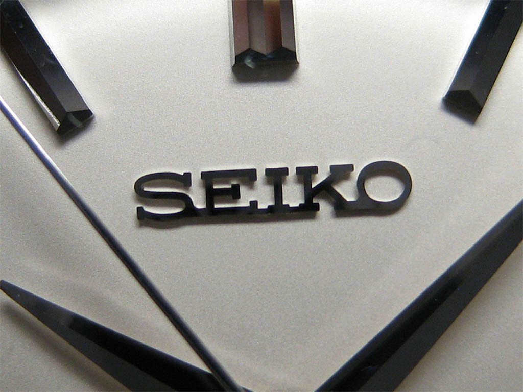
My major quibble with the dial of the SBGW001 is the “GS” and “Grand Seiko” text. The reason is twofold: I would prefer a cleaner, more Spartan look, and in doing so the undeniable kitschiness of the Gothic font would be avoided, even if I do understand and appreciate its origins. That said, the offending portions of text are certainly not as bad as I thought they were going to be. This is thanks in part to the well-understood phenomenon of macro photography exaggerating the features of its subjects. The effect is similar to the much-maligned “RolexRolexRolex” ring that is in everyday use more subdued than photos of it would suggest. I suppose that the unwanted text could also be said to ‘balance’ the dial, but I suspect that is just a rationalization.
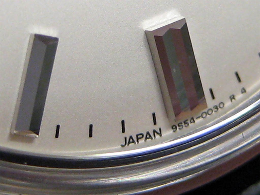
The final block of text appears at the bottom of the dial. “JAPAN 9S54-0030 R 4” is printed beneath the minute marker track and shows no signs of flaking and bleeding or any other visible printing error. The same can be said for the individual minute track markers that border the dial (rest assured – I checked them all).
Dial printing:
In summary, even to a casual observer the finishing standards of the SBGW001’s dial are clearly high. Finishing was an area of key importance when it came to my decision to buy a Grand Seiko watch, and I consistently find that for me a high standard of dial finishing is often many more times important than elaborated movement decoration. In this area I have not been disappointed. I cannot stress this enough. It’s remarkable how well Seiko has finished their hands and indices, and they are easily on par with watches that cost many times as much. Make no mistake, I’m very anal when it comes to dial finishing, and I think it’s a testament to Seiko’s machining techniques and philosophy that such fine finishing typically associated with expensive Swiss brands can be had by a discerning consumer shopping at lower price points. Please understand that I intend no hyperbole – in my experience the hands and indices really are that good!
Sapphire Crystal
As mentioned earlier, the sapphire crystal is raised and domed in a manner that is in keeping with the design’s vintage and classic roots. The raised section of the crystal has the effect of creating a ‘ring’ or ‘halo’ of light around the dial when certain lighting and orientation conditions are met, and the domed shape helps to minimize reflections. Supposedly there is an anti-reflective coating applied to the inside surface of the sapphire crystal, but I can find no evidence of such a coating existing. (I cannot remember the source that suggests the SBGW001 has an AR coating. I may be mistaken on this point.) Normally one can see the slight telltale green or blue discolouration of the AR coating when the watch is tilted at certain angles. Again, I find no evidence of this.
The sapphire crystal. Note the ‘raise’, and then the ‘dome’:
Regardless, the domed shape of the sapphire crystal confines any unwanted reflections to a small area, and in doing so results in a dial that is easy to read at practical angles (this helped along by the highly polished hands and indices). I’m sure that people who have had experience comparing domed crystals to completely flat crystals will be able to appreciate the different reflective profiles.
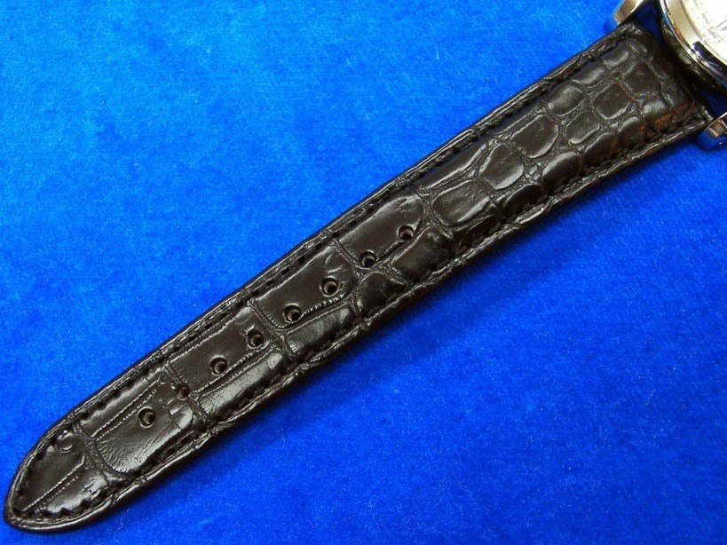
Strap
The SBGW001’s strap is made of matte black alligator leather. The 6 o’clock section of the strap is 115mm long, and the 12 o’clock section is 90mm long (without the tang buckle the 12 o’clock section is 75mm long). The strap is 19mm wide at the lugs and tapers to a final width of 16mm. The 6 o’clock section of the strap tapers further before terminating at a pointed tip. The size and shape of the strap is consistent with the classic styling of the watch to which it is attached.
The following images are sourced from the web (my strap photographs were awful):
The quality of the leather and stitching of the Grand Seiko strap is on par with those used used by higher-end brands. Specifically, the SBGW001’s strap is favourably comparable to straps produced by ABP and Camille Fournet (I have had experience with straps from both of these producers). The keepers are made to the same quality standards and are 6mm wide, which is a very functional and aesthetically pleasing size. Of special note is the fixed keeper. When viewed from underneath, the inside lining of the strap can be seen to cover the keeper, which provides another layer of security in addition to the original stitched join. To be clear, this ‘failsafe’ feature is also present on the higher quality straps that I have handled, but it is worth mentioning because it is not always present.
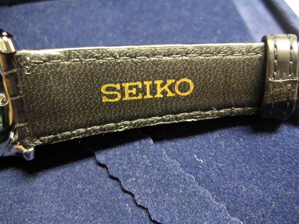
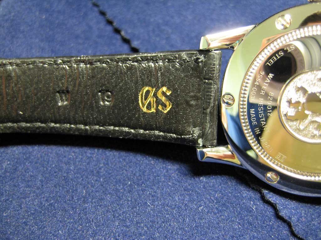
The lining is also home to “Seiko” and “GS” printed gold text. The “GS” text is printed near the lug end of the 6 o’clock strap and next to the stamped “W” and “19” leather ‘hallmarks’ (width=19mm), and the “Seiko” text is printed in the centre between the lug end and the keepers when the keepers are placed directly next to each other. In a way the gold colour of the text conveys a certain sense of luxury, but I would have preferred that any branding be stamped directly into the strap. Over time I can see the gold printing flaking and peeling away, and although this is a minor issue in the grand scheme of things, it would still be unfortunate.
“SEIKO” and “GS” in printed gold lettering. Note the leather ‘hallmarks’:
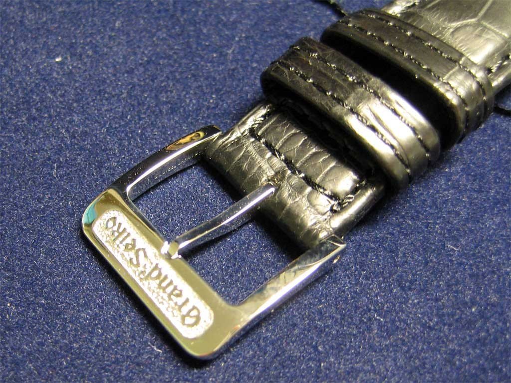
The SBGW001’s tang buckle reminds me of an ALS tang buckle in terms of its thickness and ‘rough-frosted’ “Grand Seiko” ‘name plate’. It is solid and thick as far as tang buckles go, and for that reason it almost feels out of place on a watch with such classical styling. However, despite this seeming inconsistency, I do prefer the slightly thicker, more solid machining of the Grand Seiko clasp. This is because it feels ‘stronger’ and ‘sturdier’ to the point where it overcomes a ‘flimsy’ and ‘cheap’ feeling without wandering in overtly ridiculous Panerai-like territory.
The “Grand Seiko” ‘rough-frosted’ tang buckle. Note the sizeable, high-quality keepers:
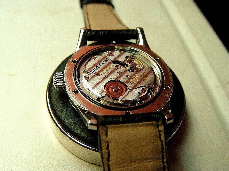
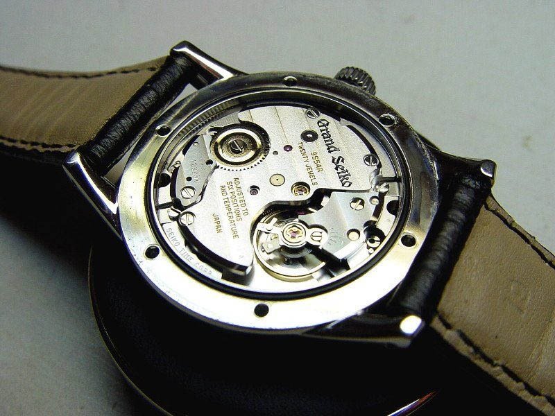
Movement
The SBGW001 is powered by the 9S54 movement that is, as far as I know, used only in Grand Seiko watches. Unfortunately information about Grand Seiko watches is notoriously hard to come by in English, and this is doubly so when it comes to Grand Seiko movements. Nevertheless, I can list the most obvious specifications and talk in generalities about Grand Seiko movement design and manufacturing philosophy.
The 9S54 movement has the following technical specifications:
(Note: The movement dimensions are sourced from SteveG – I was unable to verify them anywhere else.)
The 9S54 has been certified indicating that it has meet, or is at least capable of meeting the Grand Seiko standard. The Grand Seiko standard has tighter tolerances than the equivalent COSC standard, but I feel the differences are minimal to the point where it would be meaningless to debate the virtues of one over the other.
Needless to say, as evidenced by the Grand Seiko standard, Seiko has committed to producing mechanical watches that are capable of world class accuracy. However, what’s relatively unique is how Seiko, in a characteristically Japanese manner, has decided to go about achieving this accuracy. Although the movements are assembled and regulated by hand, each individual part is made to exacting tolerances using automated manufacturing processes that are typical of Seiko’s production line mentality. Interestingly, this philosophy of automation has also been extended to the finishing and decoration of the parts that will make up the movement. All that’s left for the Grand Seiko watchmakers is to assemble and regulate the movement! The theory is that the automation of the entire production and finishing/decoration process will result in movements that have very fine tolerances and are incredibly consistent – and with consistency comes accuracy.
The decoration is no doubt basic and sparse; some may even say ‘cold’ or ‘sterile’. I personally prefer to use terms and phrases such as ‘apropos’, ‘sensible’, ‘precise’, ‘utilitarian’, and ‘softly austere’. Naturally this is a matter of subjective feeling and interpretation, but I respectfully believe that people who dismiss the machine finishing and decoration as ‘bad’ are missing the point.
This style of movement production and finishing is very reminiscent of Rolex, although I do think that decorations such as perlage are applied by hand on Rolex movements.
As outlined earlier, general information, including visual media, is exceedingly hard to come by. Nonetheless, I have managed to collect a small number of 9S54 movement images that can be viewed below. I do not intend to sound like a Grand Seiko apologist, but all I ask is that they be evaluated in the proper context of Seiko’s very Japanese philosophy of automation resulting in precision and accuracy.
The following images are sourced from the web. Some of them are by a user called "Autonomy":
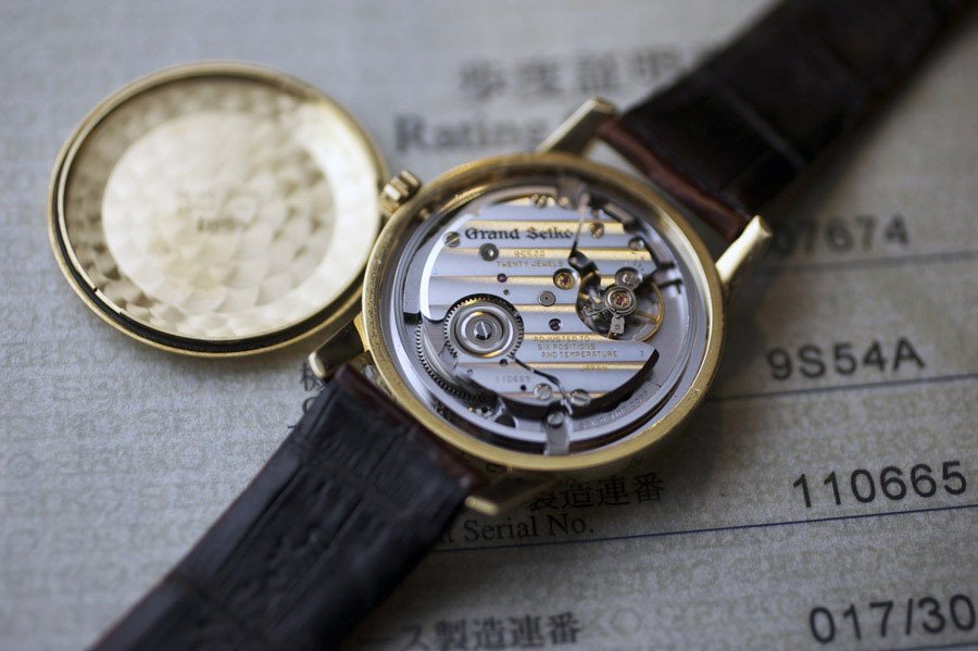
Also worth linking to is SteveG’s review of his limited edition SBGW003 (click here ). In this review you will find excellent high resolution photographs of the 9S54 movement. I would chiefly like to draw your attention to the third and fourth photographs of SteveG’s movement series. These photographs admirably showcase the effects of Seiko’s automated manufacturing and finishing process. Indeed, “(..)the bridges…are cut almost razor-sharp…with no burrs visible under a 4x loupe” and “are milled to an almost mirror quality, and appear exceptionally true and smoothly curved.”
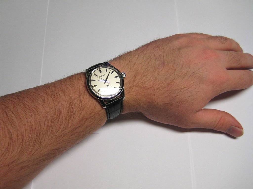
Real World Use
The SBGW001 is a pleasure to use and to wear, so much so that at the time of writing this review I have barely any recollection of using it all – it simply disappears both functionally and on the wrist, unless of course my attention is required to maintain the power reserve or to set the time.
The SBGW001 is one of the smoothest winding watches that I have used, and the crown is very easy to manipulate. The only sound that can be heard is the regular click of what I assume to be the ratcheting mechanism, but if I hold the watch close to my ear I can hear the soft whirring ‘grind’ of the winding train. At lower states of wind there is barely any resistance and the crown can be operated with the push of finger. The Seiko manual recommends that approximately 40 turns are needed to fully wind the watch. I interpreted this as 40 complete 360-degree revolutions, but in my experience this was not sufficient to reach a full state of power reserve.
Initially the watch was only running in ~24 hour increments and exhibited poor timekeeping that is typically associated with low states of wind. According to the instruction manual, the 9S54 movement can be hand wound indefinitely thanks to mechanisms typically associated with automatic watches. (Hopefully there will not be any potential damage and additional wear of the kind associated with hand winding an automatic movement too frequently.) Eventually I realised that I had been under-winding the watch because I was following the instruction manual too literally, and not feeling for the increased resistance that is present even on a ‘special’ hand winding watch such as this. By a process of elimination I discovered that to reach a noticeable winding resistance and by extension a full state of wind, my SBGW001 requires approximately 60 complete 360-degree revolutions. This is an increase of 50% more winds than recommended in the Seiko instruction manual.
Perhaps I am overcompensating in my winding procedure, so I would be very interested to hear from other SBGW001 owners about this phenomenon.
(Addendum: I have felt the crown tightening up when winding, even to the point where I felt I was getting close to a traditional hand-winding stop. Upon reading some further information I pushed it a little further, and the 9S54 movement does indeed 'lock up' like any other hand-winding movement. It would appear that I've been fooled - as I said earlier in the review, according to the instruction manual you can wind it indefinitely like any automatic. Looks like there was a problem in the translation or booklet design department. I did think it interesting that Seiko would design a hand-winding movement with features similar to an automatic and with all the problems that entails.)
(Addendum 2: I have continued my experimentation with the power reserve. I originally wrote that it took me "~60-70" revolutions to meet stopping resistance, but I now think that this was an overestimation made in haste. My new estimate is 55±5 revolutions, but it is quite difficult to accurately gauge the true number due to the 'springiness' of the crown. At the moment my working formula is 9±1 'ratchet clicks' per revolution, which seems to be relatively consistent if one exerts a gentle forward force on the crown to prevent 'spring back'.)
Another ‘quirk’ of the crown is that it will ‘spring back’ in the opposite direction to the direction of wind, especially as higher power reserves are reached, thereby confirming the law of conservation of momentum (a joke). This is not necessarily a concerning feature, but is worth mentioning for the sake of completeness.
Setting the time on the SBGW001 is very satisfying. The hands respond smoothly and are almost entirely without ‘slop’ – this is testament to quality engineering. Moreover, the hands have been positioned such that the hour hand lines up perfectly with each of the hour indices when the minute hand reaches 12 o’clock. Again, this is evidence of attention to detail. Further proof of this attention to detail is the accurate alignment of the dial to the hands. To elaborate, if the time is set exactly by hacking the seconds hand at 12 o’clock and by the moving the minute hand to the desired minute marker before starting the balance, the minute hand will continue to perfectly track the minute markers around the entire dial when the seconds hand completes a full revolution.
The strap is functional and comfortable. Initially it was too stiff, but this can be said of ny new strap. The tang buckle operates the same as all tang buckles before it. The size of the strap seems tailor made to my 6.5” wrist – it would seem that this Caucasian was Japanese in a past life. In fact, the size is so perfect that any straps that I custom order in the future will use the dimensions of the SBGW001’s strap.
The SBGW001 sits comfortably on the wrist. This is due to a combination of proper strap length, and the downward curve of the thoughtfully designed lugs. In terms of wearability, I think Seiko really nailed it with this one.
Here are some wrist shots (the yellow colour of the dial is due to poor lighting). Note that I am not 'choking' my wrist – the strap had yet to 'break-in' at the time:
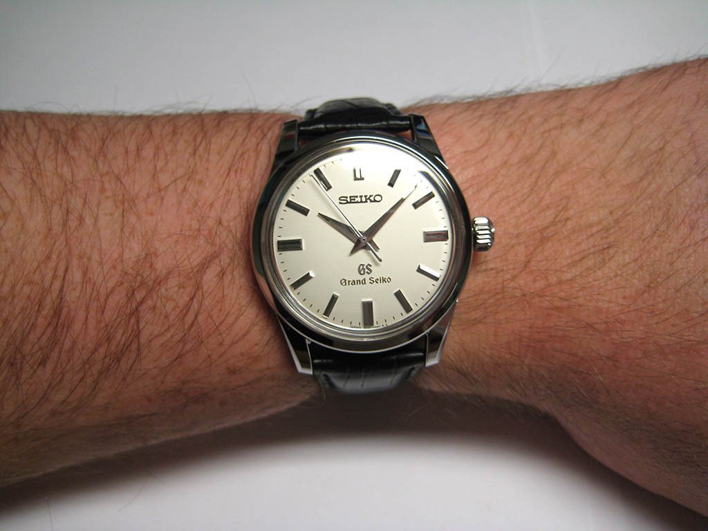
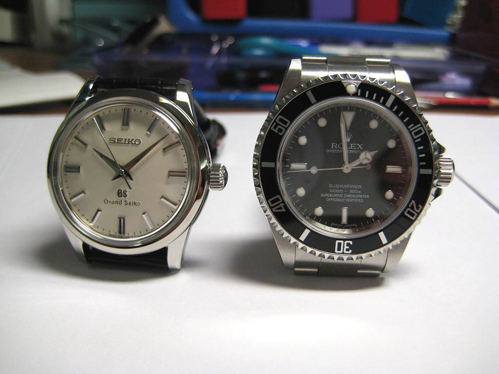
Size comparison to a very well-known watch:
Performance
At this stage it is too early to provide any truly meaningful data about timekeeping. Nevertheless, on the wrist my SBGW001 gains ~3 seconds ‘per day’, but I can leave the watch overnight in the crown up position to lose ~1 second ‘per day’, thus resulting in a net gain of ~+2 seconds over a 24 hour cycle. This is acceptable.
Closing Thoughts
I have already written too much, so I will try and keep this short.
Seiko has achieved something truly remarkable with its line of Grand Seiko watches. For the price of a mid-range watch from Omega or Breitling et al., you can a own a completely in-house, classically-styled and ageless timepiece with charming historical quirks from a respected manufacture that enjoys case, dial, and strap finishing favourably comparable to upper echelon brands, and a movement that is functionally finished according to Japanese industrial philosophy and is arguably as durable and accurate as any Rolex or IWC.
In my opinion Grand Seiko watches are one of the best keep secrets in the horological world, and are certainly worth the price of admission.
To quote from SteveG’s review: "(…)Grand Seiko is the realization of a very independent company's vision of Quality, and requires no other justification, just understanding."
I couldn’t agree more.
My final recommendation: Go out and buy one before the Japanese realise they should raise prices!
Some parting glamour shots:


The Montblanc Timewalker Twinfly Chronograph (SBGW001) represents a significant advancement for the Timewalker collection, introducing an in-house developed chronograph movement. Launched in 2011, this model marked a strategic shift for Montblanc towards greater horological independence and innovation within its timepiece offerings.
This limited edition features a 43mm titanium case with a deep black DLC coating, making it notably lighter than its stainless steel counterparts. It houses the caliber MB LL100, an automatic movement with a flyback chronograph function and a second timezone display. The dial presents a central 60-minute chronograph, with minutes recorded by a small red hand on an innermost circular scale.
For collectors, the SBGW001 is notable for its combination of the established Timewalker case design with a technically sophisticated in-house movement. Its flyback chronograph and GMT functions, along with the lightweight DLC titanium construction, offer a compelling package that underscores Montblanc's commitment to serious watchmaking.
No message body
yours is very remaniscent of my 1963 GS57 calibre, the lines are the same as is the dial, markers etc. here's the 1968 GS45 hi-beat and my new GS GMT i did have a few more but preferred the vintage manual wind models so let the auto's go. the vintage pieces are worth taking a look at as well as the vintage King Seiko's. not quite the same quality, but very nice. now you've got 2 watches i'm sure we'll see you posting regularly with new aquisitions. its an addiction that nothing can cure, but it
Impressive work on a very informative review, my friend!!! A Purist Standard Review, indeed... Pics, informations, Passion, Enthusiasm, all is here... Welcome here, it's a pleasure to have you with us! Best. Nicolas
No stone left unturned! Many thanks. G.
. . . which happens to be on my very short future acquisition list. Here's a photo of Mike's GS on my wrist, taken at dusk last July (the background is the hood of a Mercedes) . . . . . . which illustrates the magnifying effect of a white dial on my equally slender wrist . . . cordially, Art
Not only that, I love the conclusion, and already own the watch. And I know Dr. No agrees with me (as shown in him posting his arm) One correction; your last movement shot shows a gold GS watch with snap back, and that's not correct for the watch you are reviewing. This is the proper watch back and its outrageously detailed screws. Mike (aka Autonomy)
This thread is active on the Horological Meandering forum with 24 replies. Share your knowledge with fellow collectors.
Join the Discussion →