New Release
Jay (Eire) delves into the F.P. Journe Furtif, the brand's submission for Only Watch, and its potential as a future regular production piece. His initial impressions highlight the watch's tantalum case and integrated bracelet, sparking a discussion about its design nuances and the innovative techniques employed in its creation. This article explores the community's insights into what makes the Furtif a significant release for collectors.


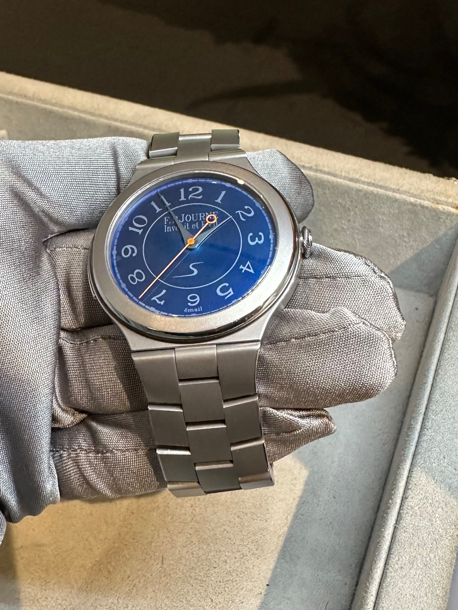
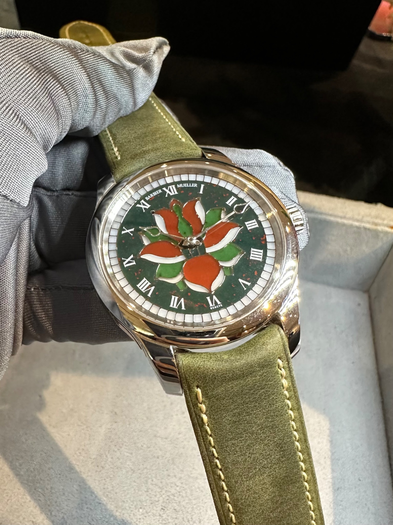
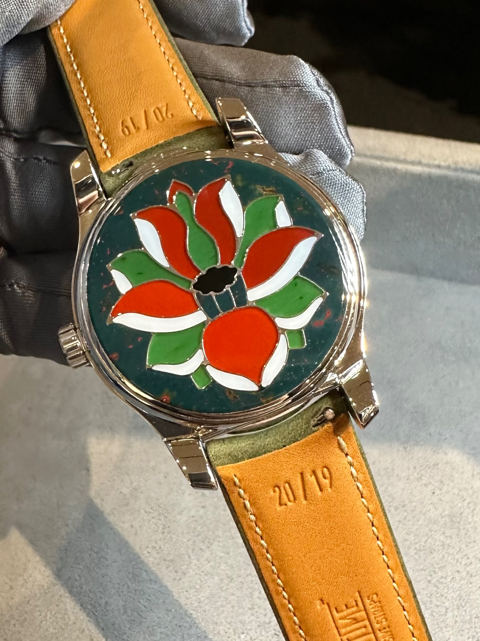
The Furtif, as previously mentioned here, is this years Only Watch from Maison Journe. As it was last time around, there is another Journe watch (kind of) in the catalogue (the Barbier-Mueller Mosaïque II).
The Furtif, as prior Only Watch submissions from Journe have, introduces us to a reference which might very well become part of the regular collection (with some variances) in the coming year or two. That’s somewhat exciting, although for me personally I’d have been a lot more excited if it was 40mm or below !
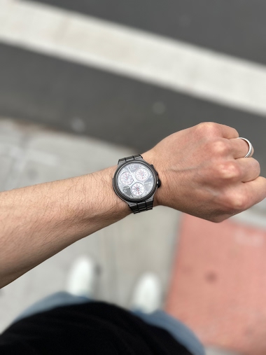
It’s a monster with the tantalum case and bracelet, as you can see from the picture below the tantalum (finish is sand blasted and polished chamfers) looks very different to the CB.
The big S on the dial is as most of you will know an indicator for the Line Sport, and with the case (42mm) and integrated bracelet it has some similarities with the first generation CTS.
The dial is enamel, what I don’t know are the details on how the markers, the outside track etc have been completed. They definitely don’t appear to be hand painted. I will say the dial doesn’t present as clearly enamel like others do, again, perhaps some more information on the process might explain why.
As Christian mentioned in a prior post the calibre for the Furtif is new, and as referenced elsewhere the reverse / movement side for this watch shows both a moon phase and power reserve.
Last comment, overall (to me) the watch has a very stark appearance. The flat wide bezel perhaps being the most prominent feature, it also seems a little like the current Line Sport models which to me visually feel like they have huge pizza pie size dials (those cases are larger of course, I’m not sure if those dials are larger however).
The Mosaïque II case, dial and movement sees Journe’s involvement via Les Cadraniers de Genève (dial) and Les Boîtiers de Genève (case). The movement is Journe’s 1304.
It’s a very cool watch, bloodstone features prominently and then several others to create the mosaic for the lotus flower and inlays on the case side. For me when thinking about similar high artisan craft pieces from other manufactures I’ve always been less than enthusiastic solely because the designs tend to be of a specific style (which are not for me). Here, as in 2017, there is something I personally find more attractive.
Some pictures are below; the lighting in the showroom was terrible and I was short on time so apologies for now capturing better images.
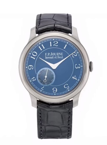
The F.P. Journe Centigraphe Souverain represents the brand s approach to chronograph complications within the Souverain collection. This reference features the specialized caliber 1506 movement and carries the distinctive Centigraphe designation, positioning it as F.P. Journe s chronograph offering in their manual-winding lineup.
The 40mm case is crafted from 18k rose gold and fitted with a sapphire crystal. The silver dial provides the backdrop for the chronograph functions. The manual-winding caliber 1506 movement delivers an 80-hour power reserve. Water resistance is rated to 30 meters, and the watch is completed with a leather strap. The fixed bezel maintains clean proportions around the case perimeter.
This reference appeals to collectors seeking F.P. Journe s interpretation of chronograph mechanics in precious metal construction. Production began in 2007, establishing this as part of the contemporary F.P. Journe catalog. The Centigraphe attracts those interested in independent watchmaking combined with traditional manual-winding chronograph complications, offering substantial power reserve within the 40mm rose gold case format.
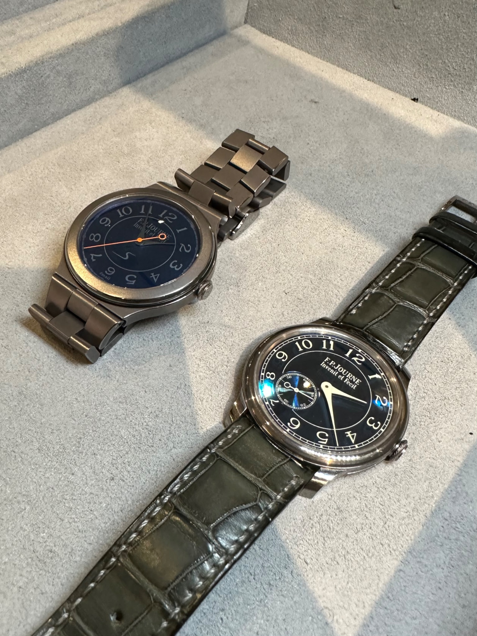
I feel like when we see it again, assuming the production version will look similar, it’ll be another one of those designs that are slow burners.
You can clearly notice the Journe case on the second piece, but I don't like it. It's too much.
…but in more recent years watches like this grab my attention more. That said, the prior iteration for the last Only Watch I prefer (very similar, but dial design is different). It’s a beautiful watch and honesty not that loud or blingy.
I was a big fan of the first version too. I'm sure both of these will do well at auction.
This thread is active on the F.P. Journe forum with 12 replies. Share your knowledge with fellow collectors.
Join the Discussion →