Reference Guide
ChristianDK's original post, featuring a captivating image of the F.P. Journe Octa Lune Havana, sparked a vibrant discussion among collectors. This article delves into the nuances of this beloved reference, exploring its design evolution and the community's appreciation for its unique aesthetic. ChristianDK's personal aspiration to own this piece resonates with many who admire its blend of elegance and practicality.

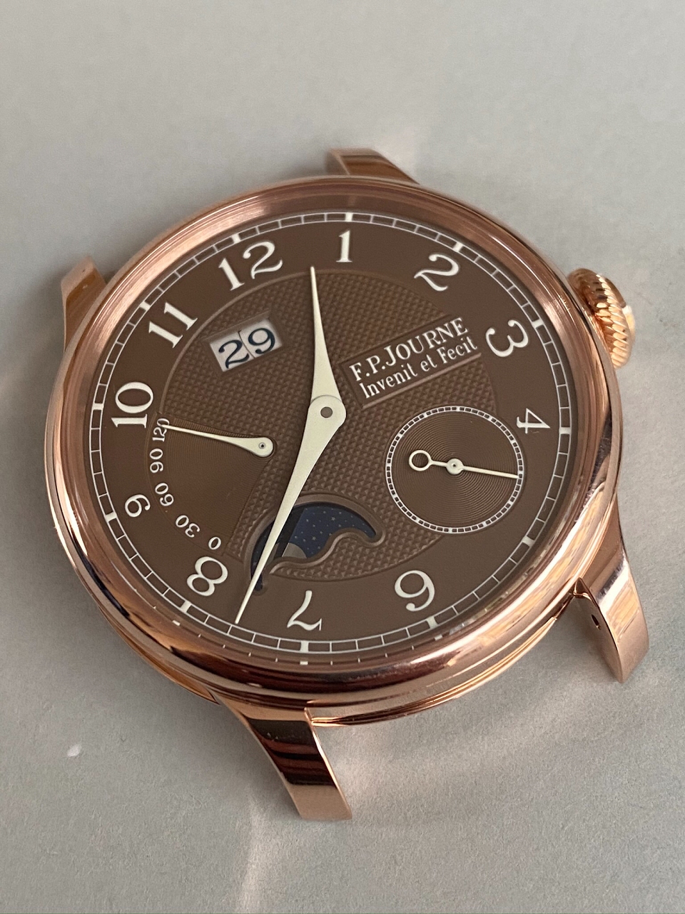
It’s really beautiful and the warm tint of the dial really brings some depth to it ❤️
I think it looks super on your wrist. Perhaps even better than on mine. What I also love, besides being a beautiful watch, it that it seems like such an easy daily wearer. Very legible and with the easiness of being automatic.
Is this one the latest generation or an earlier one? I thought there were some subtle differences, like a bigger date window. There is only one thing that brothers me - the tiny 9. The dial would be better off without it in my opinion ...
It’s one of those specific things that I’d think FP would have taken care of. He did for the Ruthenium, Anniversary pieces etc. For some dials it’s OK but for others the contrast is just too much for me. I do like Havana on Rose, it’s a very warm combination.
I wear so many blue shirts that this brown would actually work well with what I wear! Very elegant timepiece!
A couple of ways to tell, on the new one, the 4 and the 9 are small, whereas on the older one, the 3, 4, 8, 9 &10 are all small. Also on the new one the date window does not overlap the hour ring.
This thread is active on the F.P. Journe forum with 31 replies. Share your knowledge with fellow collectors.
Join the Discussion →