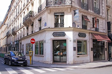
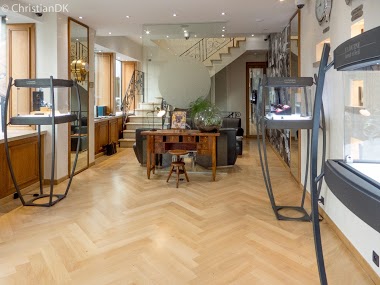
Independents
ChristianDK's post initiates a discussion on the final version of the F.P. Journe Chronomètre à Résonance, specifically highlighting the blue print on its dial. This thread delves into community opinions on this particular aesthetic, its comparison to previous iterations, and broader implications for F.P. Journe's approach to limited editions and design evolution.


The F.P. Journe Chronomètre Souverain represents the foundational timepiece within the brand's Souveraine collection. This reference demonstrates the manufacture's approach to precision timekeeping through manual winding mechanics, positioned as a core offering in F.P. Journe's lineup.
The 40mm case is executed in 18k rose gold with a fixed bezel configuration. A sapphire crystal protects the silver dial, while the manual-winding caliber 1304 movement provides an 80-hour power reserve. The timepiece features 30-meter water resistance and is paired with a leather strap. Production commenced in 2000.
This reference appeals to collectors seeking F.P. Journe's mechanical execution in a fundamental three-hand configuration. The substantial power reserve and manual winding caliber position this model for enthusiasts who appreciate traditional watchmaking approaches within the Souveraine series framework.
Absolutely. I like this watch with a 24 hour dial; and this one is so much more legible than the digital virgin from a couple years ago. The blue print is a nice touch. It could be improved with a different color for the dial. But a terrific virgin.
As far as I can tell, the final version widely reported last year, before the first new version appears next year (2020), had black print on the dials. Most of us will recall the flak LF got for making a numbered LE model (12 pieces?) only to roll out an almost identical version a year or two later... is FPJ somewhat following in his footsteps with this one then? As for how it looks – not great. A bit wishy-washy, since the dials remind me of the extremely old fashioned chintzy china dinner plat
I also prefer it to the "gasmeter" . Do you prefer the 24 to the original symmetric?
announced end of 2018 and only produced throughout 2019. there is no other last version or limited edition. Only with blue print. the black print was on the previous 12h/12h dial. thanks for chiming in.
We can call it the Delft. See below.
The blue doesn’t work for me. The 24hr doesn’t work either, too close not to be the same. The previous “Parking Meter” dial, which I know wasn’t widely appreciated, at least was showing something completely different. And, wasn’t FP always adamant that this was NOT a two timezone watch. (Christian, that’s another question for your next interaction (in addition to the silicon question)).
This thread is active on the F.P. Journe forum with 48 replies. Share your knowledge with fellow collectors.
Join the Discussion →