"The
criterion of true beauty is that it increases on examination; if false,
that it lessens. There is therefore, something in true beauty that
corresponds with right reason, and is not the mere creation of fancy." -
Sir Fulke Greville (1554 - 1628)
Concord C1 Chronograph: Reassessing a design
by Marcus Hanke
What
makes a design iconic? This is not a basic discussion whether there is
“good” and “bad” design, but I take it as given that some designs will
stay in memory longer than others, that are forgotten in the moment the
object is out of sight.
A commonly used example is about cars:
There are thousands of different models on the streets, new ones, older
ones, out of production already. When passing through our field of view,
they sometimes stimulate subjective reactions from us: nice, nice, -
long pause - , awful, - long pause - wow! The long pauses are created by
those designs that tell us nothing, do not create any aesthetic
stimulus, they are like a blank sign, without any content. This is the
majority of designs, then there are some that are actually noticed, but
not really kept in mind: they are “nice”, “not bad”, or the opposite:
“Ugh, what’s that?”. But at least they are able to pass that unspecified
borderline between immediate oblivion and notice, even after the
object/car has passed.
And then there are designs, which do not
simply cause an indifferent “nice”, but much, much more: “Great!”,
“Wow!”, or the opposite: “Aarrrgh! Put it away, that is terrible!” But
they stimulate strong reactions, very subjective, very emotional, either
enthusiastic, or dismissive - but strong they are. This is what I call
“iconic”. Sometimes, and these are really great designs, they continue
to stimulate these feelings after many years, decades even, overcoming
the limits of pure fashion periods.
Definitely NOT a criterion
for good design is its economic success, in the contrary: It is quite
common that a design is met with rejection by the majority of the
market; it is often considered a too radical departure from established
design conventions. Only (much) later, it becomes an adored object of
desire, and its design qualities are widely appreciated.
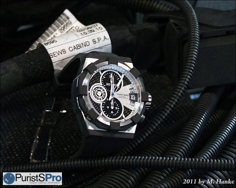
In
2007, Concord, a watch brand formerly concentrating in supplying the
U.S. market with Swiss built watches, presented a watch that stirred
reactions like those quoted above: “Wow”, “Hot!”, were representative
for the one side, “Weird”, “Really bad”, for the other. The C1
Chronograph was certainly a watch out of the ordinary.
Today,
four years later, it is time to put the C1’s design to test: What is
left of the original fascination and emotion it created, after the
industry has put out so many watches with strong, edgy, excessive
designs? Is it still an original design, one that can be credited as
“unique”? Has it advanced further on the path towards becoming “iconic”?
This
is why I reevaluate the C1 Chronograph today. The reason why I do this
now is the launch of the new C2 Chronograph series during this years’s
Basel fair, which will force its predecessor (that is still in
production, though) into the comparison. Unfortunately, it has become a
bit quiet around the company today, and cannot be compared with the
bustling activity, accompanying the presentation of new models during
the former years. One reason for this might be the demise of Concord’s
main development partner BNB, another the former CEO’s sudden migration
to another watch brand. Apparently, the new C2 has been shaped in order
to attract a larger number of watch enthusiasts, abstaining from radical
design experiments. Against the trend, it is even relatively small,
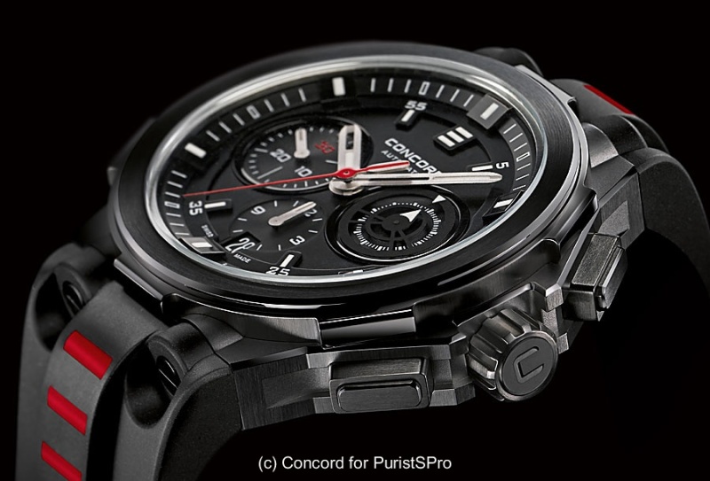
with 43mm diameter and a thickness of less than 13mm.
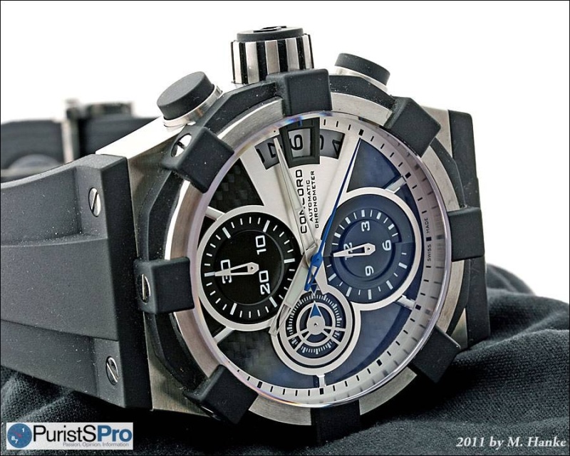
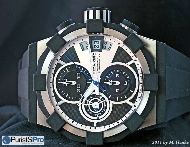
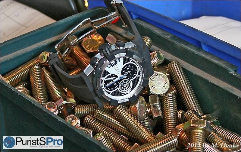
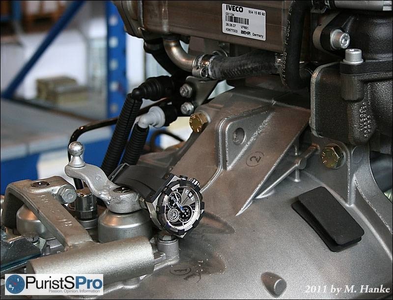
Concord C2 Chronograph
Four
years ago, the C1 Chronograph was a huge watch: 45mm diameter, together
with the large crown even 50 mm, 17 mm thickness, and a weight of 183
grams (with rubber strap). Today, we would call these dimensions
“Ambitious, but not spectacular”. However, it was a big merit of Concord
to shape the C1 in a manner that permitted a truly comfortable wear,
which had to be mostly credited to the unique way of how the massive
rubber strap was attached to the case.
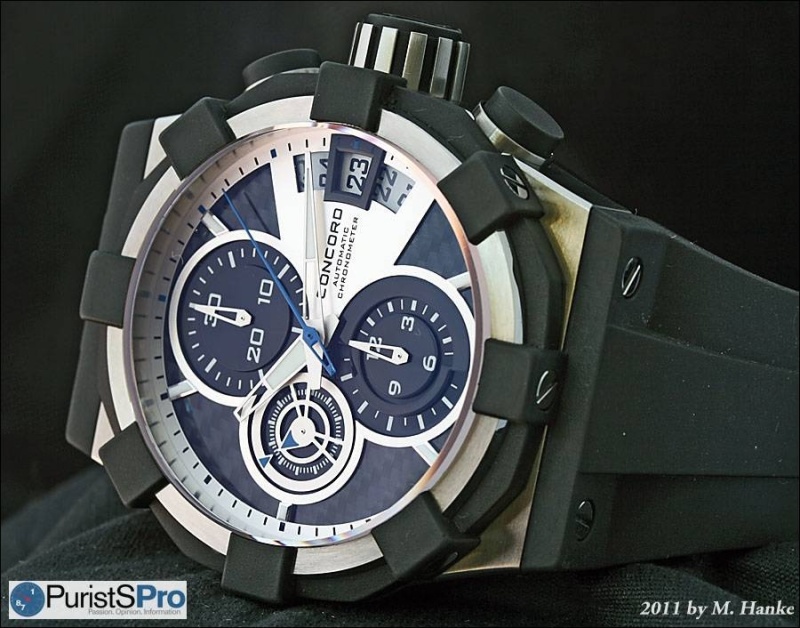
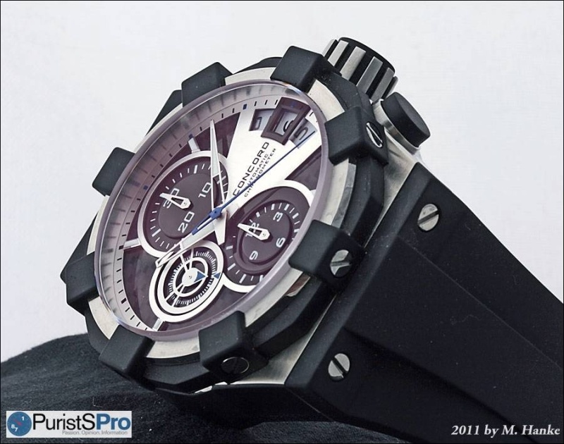
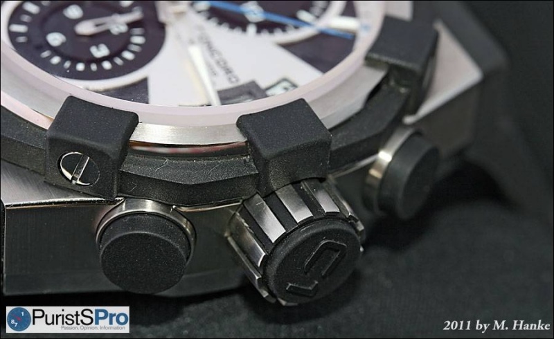
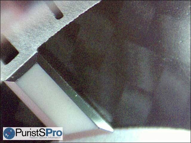
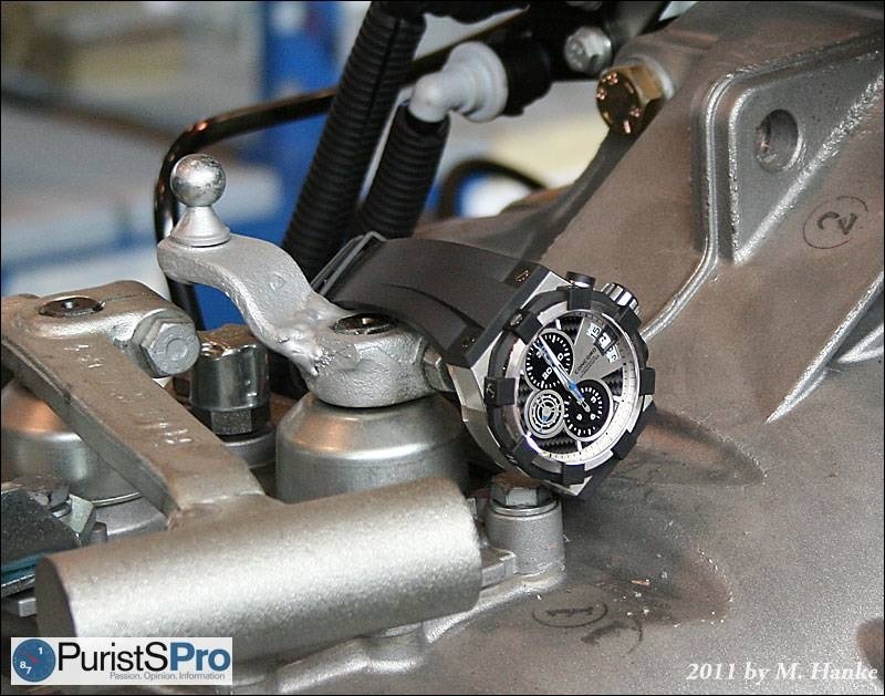
A
3.3 mm thick sapphire crystal needs a massive bezel to protect it, and
how Concord’s designers solved the issue became the C1’s most important
eye-catcher: the eight large rubber cubes surrounding the crystal,
protruding from a rubber ring, combine function and shape. Almost
architectural they are in form and arrangement.
However, they could be also perceived as a
crown, dominating over the case. The latter is neither round nor square,
not tonneau- or cushion-shaped. It is another architectural shape with
straight walls, and together with the bezel sums up to an interesting
combination of geometric figures. It is, by the way, rated watertight to
190 meters.
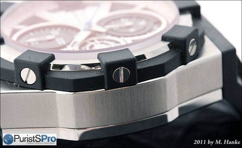
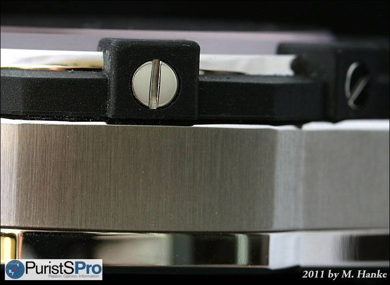
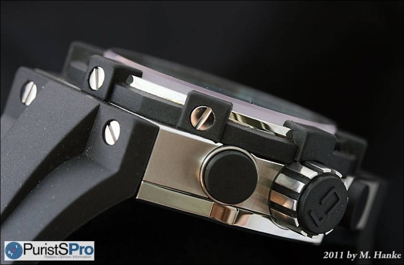
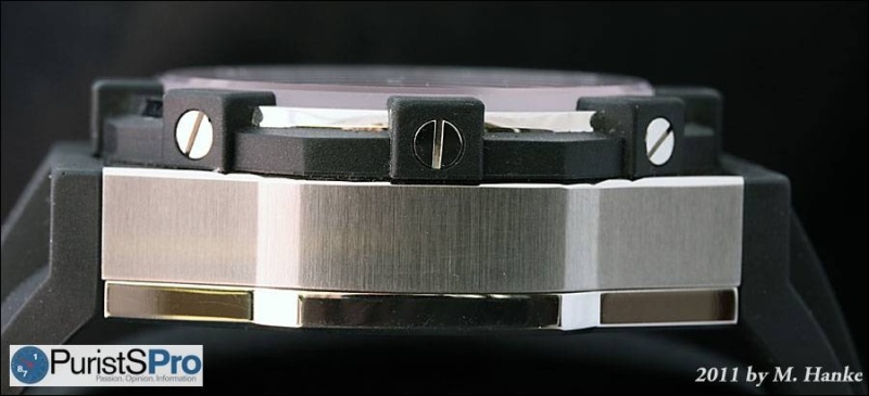
That
the individual rubber cubes are held in place by large and visible
screws, does not really compromise the impression, since the polished
screwheads nicely match the polished caseback, that can be seen from the
side as well. The same applies to the similarly attached rubber strap.
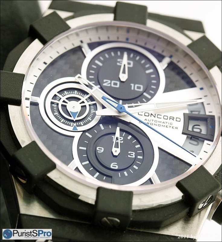
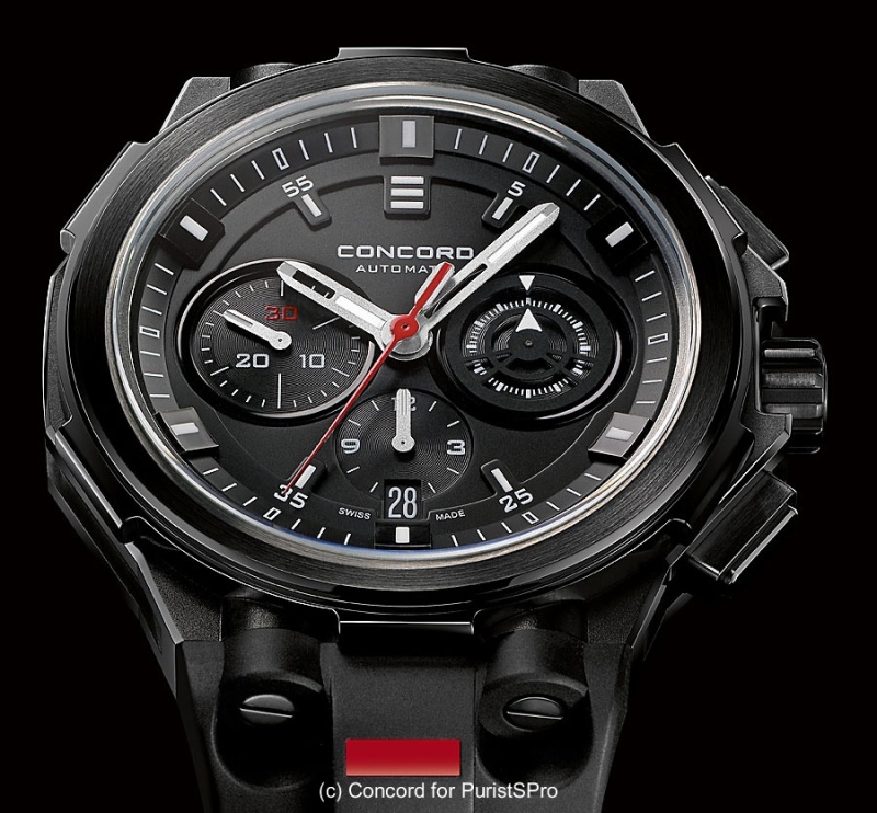
Let’s
speak about the dial. Design-wise, it cannot hold its ground against
the brilliantly self-contained case. Not that it looks bad, but the
multi-layered material mix of carbon fiber and metal has been shown by
so many watch brands since, that it is lacking the uniqueness I am
searching in an “iconic” design.
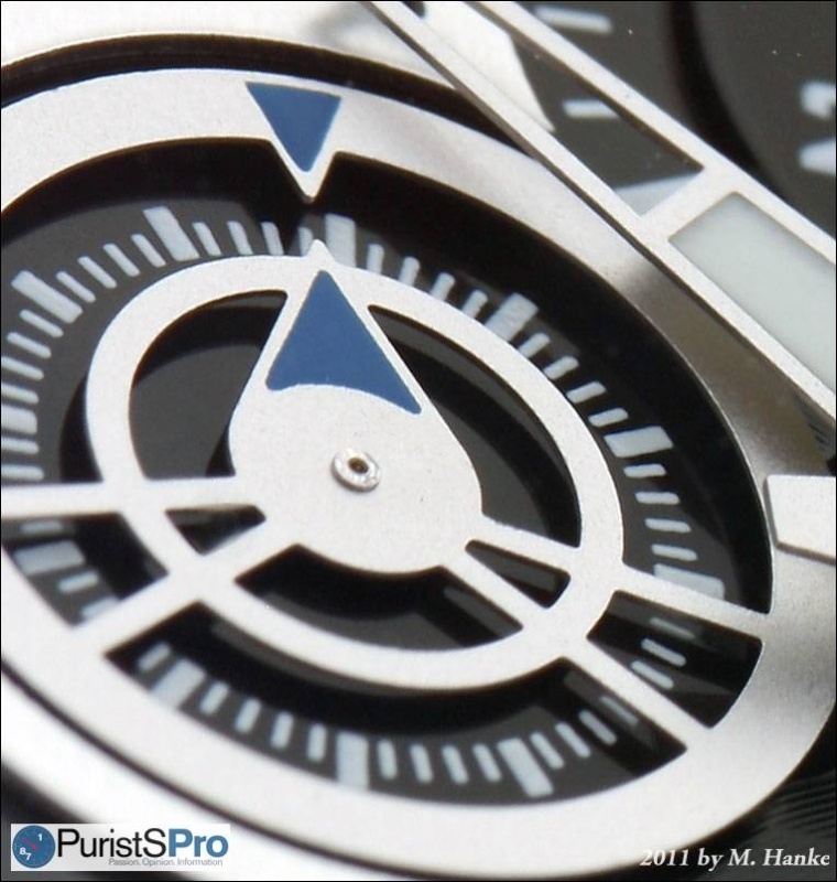
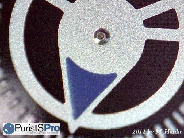
Nevertheless,
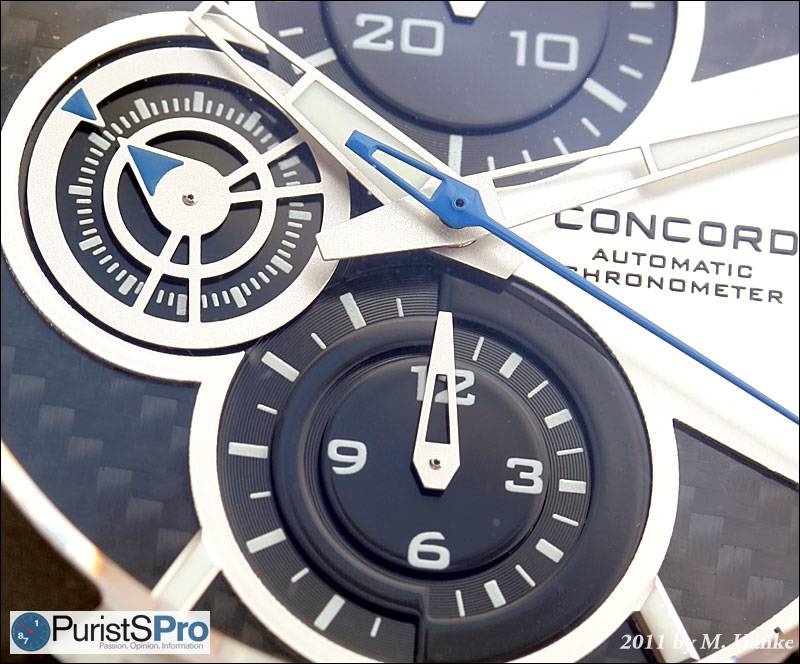
the love for detail that can be found after thorough inspection, is
astonishing: Just look at the 12 hours counter, better: the way how its
framework and scale are alternating halfway, at 6 and 12.
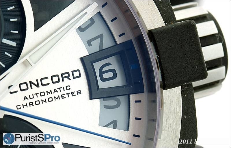
Also
the permanent second indicator and the date with the frame around the
actual date are such details. While the stretched date windows have
become a weird design standard on contemporary watches, most of these
content themselves with a mere marking to point out the current date.
Concord added that nice frame.
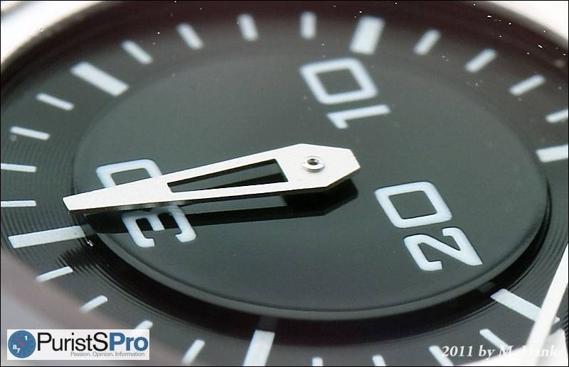
The dial is flawlessly executed in all its
richness of details, which is also valid for the modern-style hands.
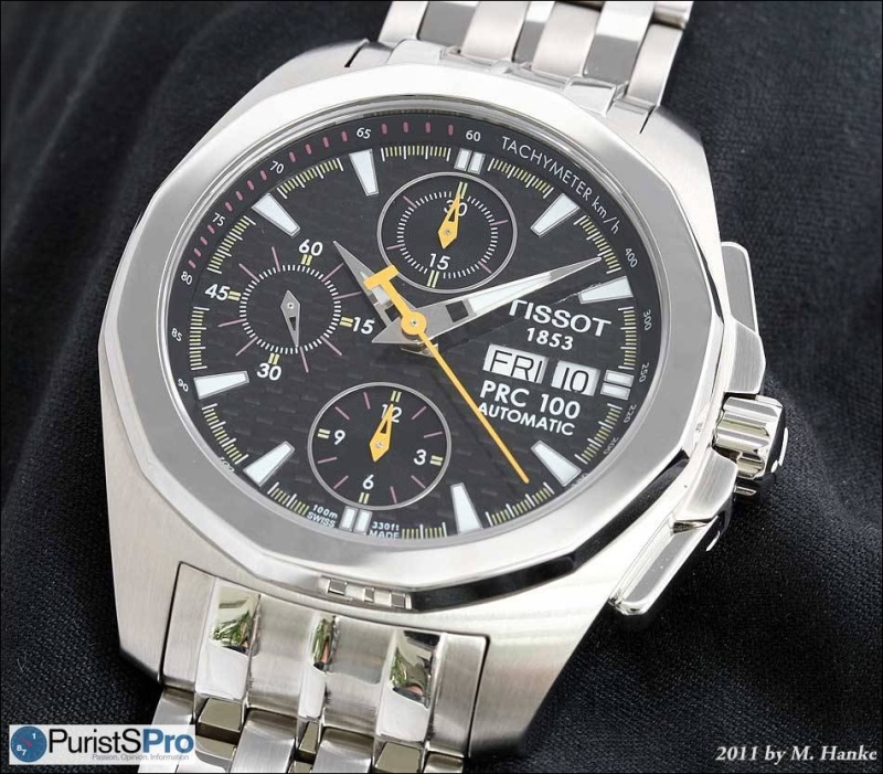
These hands match wonderfully, and seem to have influenced some more
recent watch models as well, at least I have a Tissot with very similar
hands, and also the new Linde Werdelin chronograph is sharing a nearly
identical hand design.
The
only problem of this combination is its poor legibility, whenever the
hands are over one of the many bright parts of the dial:
From
the very beginning, I was convinced that blued hands would offer a much
improved contrast, without any compromise in design, and I am of this
opinion still today.
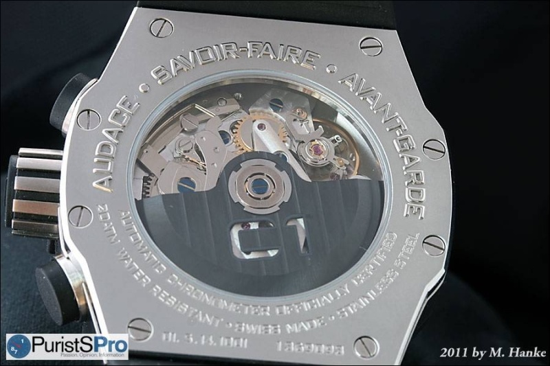
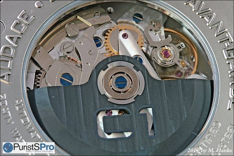
There is nothing special to be said about
the movement. The C1’s main emphasis lies on design, not on mechanics.
The movement is an ETA Valgranges A07.211, which is an enlarged variant
of the trustworthy and reliable Valjoux 7750. The COSC chronometer
certificate is not a common standard, though, especially not with
chronographs.
The finish is good, with some stripes and blued screws, and an attractively blackened rotor.
One
might think that the main purpose of the movement chosen by Concord is
to deliver the height the case needs to get the right proportion. A
flatter case under that rubber crown would simply be consumed by the
latter’s expression. I could confirm this by means of the other C1
watches released in later years, especially the world timer; it is
simply too thin.
To
sum up, the really brilliant and unique design part is the case,
especially the interaction of the rubber cubes of the bezel, the
substantial block of the case’s main block, and the screwed-on rubber
strap, that appears to be part and non-part of the case at the same
time. In my opinion, this style is iconic, or at least has the potential
to become so. I would strongly wish that Concord continues to produce
the C1 in this shape, especially, since the C2 can by no means compete
with the former’s strength and character. It is clearly an effort to
make the C1’s design more mass-compatible, but resulted in a perfect
blend into the anonymous mash of contemporary, “modernistic” watch
designs.
Even
if it were the C1 Chronograph’s fate to mark only a phase of limited
duration in Concord’s history, I am convinced this watch will stand out
from the mass of contemporary timepieces in every collection and auction
of the future.
This message has been edited by Marcus Hanke on 2011-05-29 12:58:02 This message has been edited by ED209 on 2011-06-01 11:30:13