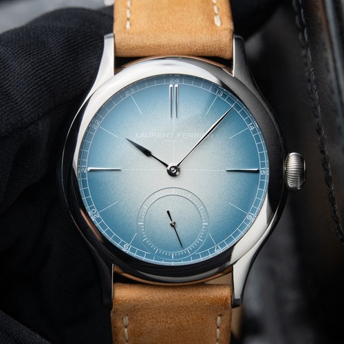
Stabilizer's insightful post delves into the subtle, often overlooked design nuances of the Laurent Ferrier Classic Origin case. His detailed observations challenge the perception of its shape, highlighting how minute deviations from a perfect circle contribute to its unique aesthetic and wearability. This exploration invites collectors to look beyond the obvious and appreciate the sophisticated artistry in high horology case design.
Do you notice it in any of these photos?

Is the case round?


Or is it non-round??

For me, this snuck up on me. Of course the case is described as “galet”. Does LF ever say it is round? I don’t think so. The dial, of course, is round. The bezel, also round. The sapphire of the case back and its titanium frame, are both round. But the mid-case is wider than it is tall. It’s non-round. Ever so slightly. The pieces, all of high polish, visually blend together to make this an almost unnoticeable trait. This is a non-round watch, with a round bezel and dial. Perhaps this is already known and understood by others here, but for me when I realized it, something clicked. This may be the thing that’s so tough to put a finger on, that distinguishes this piece, perhaps even if only on a subconscious level, from others. Aside from the overall execution of course, and the other readily apparent and subtle attributes that are noticed upon wearing the piece and further inspection.
It’s Millenary-esque, but way more subtle. It think it’s even fair to say this is likely completely unnoticed by most, at a glance. Have other owners noticed this? And if so how long did it take you to figure out? Am I crazy here!??
By the way, playing with this glossy grey gator strap, which is a much darker vibe than the alcantara it came with. I think is an OK option but maybe not the jackpot. Does make for an interesting monotone aesthetic though, to me. Have some others coming which I think will be more “out there” and will share. Would love to hear reactions.