ant
1261

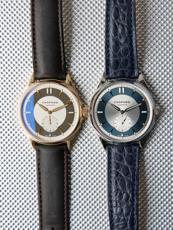
Straps harmonising and emphasising dial colours
Recently I was fortunate enough to get a Chopard Jubilee QF.
It is a delightful and elegant watch, I am very pleased with it.
On the other side I couldn't get on with the tan coloured strap. I found a nice ocean blue replacement and as soon as I fitted it noticed how it brought out the subtlty of the dial's colours.
Hmm, I thought, I should have a closer look at my QF. The colour is an interesting deep(ish) brown with a faint hint of green.
I got a mid-deep brown Hirsch Merino strap, I think the result is pretty good.
Later I will get down to Jean Rousseau straps to get one with a better colour match.
What do you think?


Straps harmonising and emphasising dial colours
Recently I was fortunate enough to get a Chopard Jubilee QF. It is a delightful and elegant watch, I am very pleased with it. On the other side I couldn't get on with the tan coloured strap. I found a nice ocean blue replacement and as soon as I fitted it...

Thanks,
I'm red/green colour deficient, selecting a colour is, as they say, challenging! HAGWE! Antony


Beautiful.
I'm really more focused on the watch than the strap, but I have to admit, the strap is great!
I agree
my idea was that careful choice of strap colour can 'bring out' and compliment subtle colours on the dial. On the other hand the watches are gorgeous!! I think that the original QF is under appreciated. Regards Antony
Both these
straps were low price, my main concern was getting just the right colour. I think that I did okay with the Jubilee but not so well with the original QF. That deep greeny brown is difficult to find. I am hoping that a visit to Jean Rosseau will yield a per...

If I was in your position, strap selection for these watches would be based on texture first, and colour second.
It's clear from the Jubilee that the texture compliments the cleanliness of the dial nicely. I see that first and the blue second. So perhaps a different texture (but texture nonetheless) for the original QF? That way you could stay with in the 'difficult...