
foversta
[PuristSPro Moderator]
20814

Hands on review of the Lange & Söhne 1815 Annual Calendar
It must be confessed, the unveiling at the last SIHH of the annual calendar as a new complication within the Lange & Söhne 1815 collection was not a surprise. There were many observers who were expecting it. With this addition, the manufacture from Saxony offers an useful complication in its most characteristic aesthetic context (Arabic numerals, peripheral railroad track, Alpha hands etc ...).
Unquestionably, Lange & Söhne has reached a neat and balanced outcome that also makes us enjoy the moonphases display in an "1815" context with a more affordable price than the 1815 Rattrapante Perpetual Calendar. However, it is not the only watch of the catalog to feature an annual calendar since the Saxonia collection has one too. Obviously, the question that comes to our minds is to know which one is the most convincing. I had the same type of question by comparing the ways the perpetual calendar complication was designed in the Langematik Perpetual and in the Datograph Perpetual. And in the end, the answer depends on what we look for.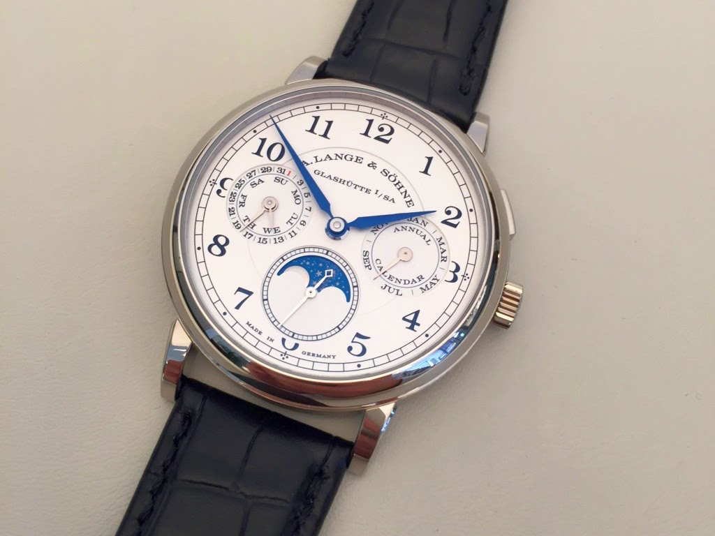
There are two main differences between the 1815 Annual Calendar and the Saxonia Annual Calendar: the first watch, as it is required in the 1815 collection, has no big date and displays the dates with a hand. The second watch is a self-winding one while the 1815 remains faithful to manual winding. For the rest, the lay-out of the dial remains similar between the two watches: the moonphases sub-dial is at 6 pm and includes the second hand, the months are displayed in the right sub-dial and the days of the week in the left one. The 1815 adds inside the latter the date display while on the Saxonia, each sub-dial is dedicated to a single display.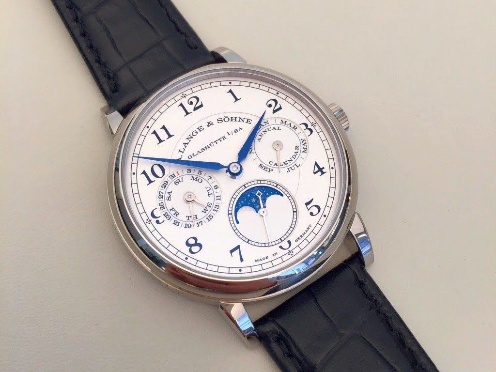
The 1815 is slightly larger than the Saxonia (40mm vs 38,5mm) but it is not easily perceptible. The Saxonia has a purer approach while the 1815 has to host the Arabic numerals and the peripheral railroad track. Both watches offer similar legibility ... except in regard to the most important information of a calendar watch: the date. The Saxonia is unbeatable in this field with the big date which occupies the upper part of the dial. However, a good pair of glasses is required with the 1815 since it is the traditional weakness of the hand display... and here, the hand is tiny!
The movement L051.3 of the 1815 Annual Calendar: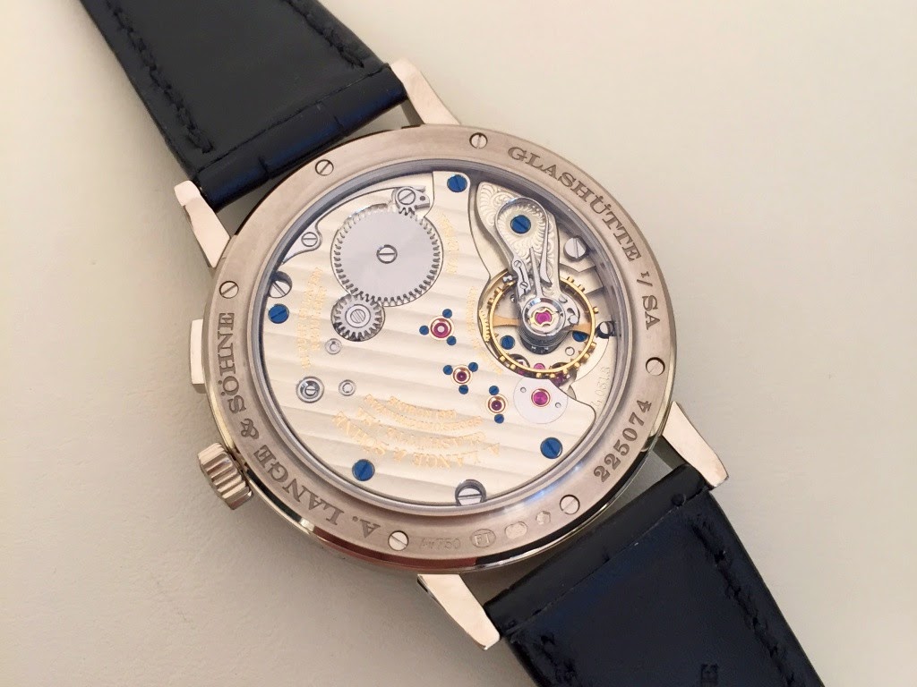
If the Saxonia outweighs the theme of legibility, I have however a clear preference for the aesthetic approach of the 1815. I like to find again all those little details specific to the collection and which strengthen the Germanic appearance of the the watch.
The other big difference is therefore found at the level of the movements. Just for once, the automatic movement gets my preference for two main reasons. The first one is based on a pure practical point of view: an automatic watch can be put in a winder what makes sense for a calendar complication to avoid unnecessary adjustments (even if both watches can be set quickly and easily). And the second reason is based on aesthetics. The movement of the Saxonia Annual Calendar is the superb Sax-O-Mat with 3/4 rotor. This watch and the Langematik Perpetual are the only opportunities to enjoy this movement in the current catalog ... what is a pity. Fortunately, the handwind movement of the 1815 Annual Calendar is not devoid of interest. It belongs to the Lange family of handwind calibers with a 3 day power reserve (an interesting asset for a calendar watch) and its visual rendering is enjoyable. Beyond the fine (and typical) finish from the Lange Manufacture, this type of movement makes visible the ratchet, the crown wheel, the click and its spring. There is more to see with the L051.3 than with the movement L051.1 of the classic 1815. Please note that the frequency of the movements of the two annual calendar watches is the same, which is 3hz.
The Saxonia Annual Calendar, here in its Platinum Version: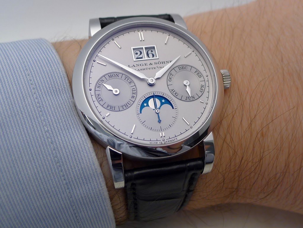
As stated above, the 1815 Annual Calendar and Saxonia Annual Calendar provide a similar presence in the wrist. The sleek style of Saxonia compensates its smaller size. The 1815, however, appears to be more slender as it has almost the same thickness but with a larger diameter. Moreover, the same sense of harmony and balance emerges from the two watches. On this aspect, there is no clear winner.
The 1815 Annual Calendar in Pink Gold:
However, my choice is made. If the 1815 gets my preference on the aesthetics field, the practical dimension of the Saxonia clearly tilts the balance in its favor from my point of view. The big date is a strong benefit for a calendar watch and I still have a lot of problems with the annual or perpetual calendars when the dates are not easily legible. This is unfortunate because the 1815 Annual Calendar is a successful and carefully executed watch. But I would have wished, once again, that Lange had left its ultra-marked path to offer a tip, a more surprising dial lay-out to make us read more easily the dates.
The 1815 Annual Calendar in White Gold: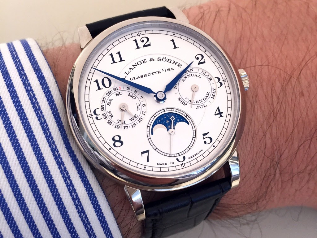
I also have to say that the price of the Saxonia is significantly higher than that of the 1815 (44,500 euros vs 37,800 euros with taxes in France) in white or rose gold (the Saxonia Annual Calendar is available in platinum what is not the case of the 1815 Annual Calendar). And this argument can restore the balance. The price difference is explained by the specific big date mechanism and the use of the caliber Sax-O-Mat, more expensive to produce than a handwind movement.
Thanks to the staff of the Lange & Söhne boutique in Paris Rue de la Paix.
Pros:
+ a balanced and harmonious watch
+ the performance and the visual rendering of the movement L051.3
+ A more affordable price than the Saxonia Annual Calendar
Cons:
- the dates are not very readable, at least by me. Maybe I should change my glasses...
Fr.Xavier
PS: I would be happy to read your point of view about what is your fav annual calendar watch between the 1815 and the Saxonia. Thanks!
Hands on review of the Lange & Söhne 1815 Annual Calendar

Thank you FX for this interesting and in depth review as usual
My pleasure FX

I prefer the saxonia annual calendar
much prefer the saxonia..

Your point regarding the month sub-dial is a good one.
Another excellent review, Fx.

Have not seen this 1815 yet

Love the watch, but...


Great review Fr.Xavier

Saw it irl recently

Prefer the 1815