
Echi
6497

Interesting comparison!
Thanks for doing this.
I suppose they have their own character and interestingly enough quite appropriate with the watch. I can't imagine having that MM thickness on the luminor for example. I like how it is thick and compact on the 372. Now I understand better why I like its font design!
Best, Echi

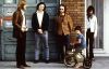
Panerai PAM 372 / PAM 587 / PAM 662. So close, so different.
Sandwich dial or not, pencil hands or not, light caramel or black, Luminor Panerai, or Radiomir Panerai, or Marina Militare, gilt or white wording... Even the size and the thickness of the wording is not the same. At the end, three different characters......
Interesting comparison!
Thanks for doing this. I suppose they have their own character and interestingly enough quite appropriate with the watch. I can't imagine having that MM thickness on the luminor for example. I like how it is thick and compact on the 372. Now I understand ...
I have a weak spot for the 662
That dial colour is awesome and would be perfect for the summer... to be enjoyed with a nice caffe freddo


372 is more rugged with its thick hands, printing, and crown guard
587 -- more elegant with its trim hands, printing, and simple crown. 662 -- it's all about the dial color!

The very essence of your.....
post is what non Paneristi fail to understand. The..diversity. If I had a dime for everythime I've read..they are all the same..I'd be a rich man

To each its own Nicolas! Three different watches and three different personalities. You know I have a soft spot for the Mamma Mia... but love the 372. Then there is the 662 and its...
... awesome dial. It could be better yet if they had used a sandwich dial in this light brown color.. A lovely winner anyway which I wear with joy You know what Dexter did with this dilemma! Lol! Abrazos amigo!! Abel.
Ha ha ha!! Yes yes this is the way to go! And yes I’m very lucky mi amigo!!
un abrazo Nicolas!! Abel

Still the 372 for me of this trio. But, I would gladly own any of them.
Each has its own merits, the 373 is just uber Panerai for me, aside from the open caseback (wish it were solid here). The 662 has a great dial color, the 587 MM with pointy hands. As I age I enjoy variety, owning different brands. But if I were still a Pa...