
foversta
[PuristSPro Moderator]
20814

Hands on Review of the Patek Philippe 5196P
I would like to come back to to a very well-known watch, the Calatrava 5196P as it is for me an excellent demonstration of the Patek Philippe skills with its strengths ... and some weaknesses.
First of all, the 5196P is a radically different watch when compared with the 3 gold 5196 (G,R and J). This is one facet of the talent of Patek Philippe: while almost all brands would have proposed the same presentation to focus only on the color changes according to the case materials, Patek Philippe completely redesigned the dial to highlight the range of gray and the subtle chromatic play made possible by the neutral rendering of the case. The applied indexes and the very discreet graduation of the sub-dial second hand are replaced by Arabic numerals with a small relief and by a clearer delineation of the area dedicated to the second hand. The silvery gray and opaline white smooth dials give way to a dial composed of several areas. Even the hands were changed, fine leaf hands succeeding the dauphine hands. Finally only the peripheral scale remains.
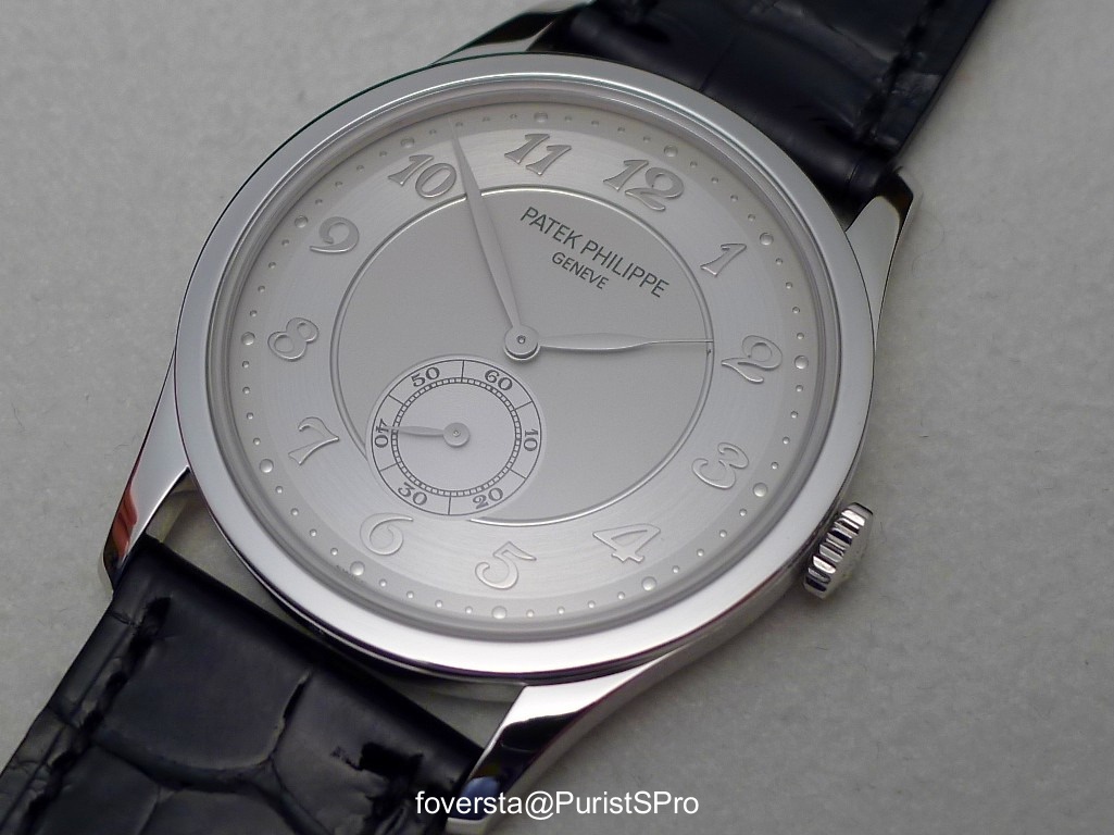
Beyond the beauty of the applied figures which provide a harmonious effect of relief, the charm of the dial comes undoubtedly from the interaction between the various parts that compose it. In fact, each area has its own reflection in gray and I must admit that it is impossible to remain indifferent when we observe how these colors blend or oppose or coexist. The area on which the figures are applied elegantly stands out since it contrasts gently with the circumferential area of ??the peripheral scale and with the central disc of the dial becoming a kind of ring around the central portion itself delimited by a delightful rim. The second hand sub-dial becomes a clear and visible part of the 5196P while it was almost invisible on the gold versions. Its lighter color and especially the use of the ten seconds marks strengthen its presence on the dial.
This style effect is important because it allows to hide a problem inherent in this watch: the too small movement which powers it. Indeed, the 215PS caliber has a diameter of 21.9 mm which are more than 15mm less than the case diameter (37mm). The second hand is located too close to the center of the dial despite after all the reasonable dimensions of the watch. Patek Philippe chose two methods to make it less visible this imbalance:
- on gold watches, sub-dial is almost invisible
- on the platinum watch, it is on the contrary strengthened to display that it does not "bite" on the "6" of the dial: all the figures are preserved. Patek Philippe took advantage of a problem to create an opportunity.

The two aesthetic solutions provide a new proof of the talent of the designers of the Manufacture. They both work and the small size of the caliber tends to be forgotten regardless of the version of 5196... and more specifically with the Platinum version. But Patek Philippe should not fall asleep on its laurels! Aesthetic miracles do not last forever and it really becomes urgent that Patek Philippe unveils a simple handwind movement with a diameter more in line with those of its contemporary cases. Meanwhile, despite its small crown, the caliber 215PS can be smoothly wound and its performances are really acceptable with a 4hz frequency for a power reserve of 44 hours. The caliber is of course not visible for obvious aesthetic reasons. If the caliber by itself is very nice to observe thanks to its fine finishings and the pretty bridges shapes, seen it lost in the middle of the caseback would not have been a spectacular and enjoyable show especially for a Manufacture of this level. The solid caseback was the only solution that was available and Patek Philippe did not hesitate to use it.
The 5196P on the left and the 5196G:

Unlike the first feelings it may bring, the 5196P is not only a dress watch. Its neutral colors, the dial lay-out, the applied figures and its thin case make it very versatile. It is a watch which combines perfectly with a suit or with a more casual attire. Actually, I find it more convincing in this regard than the 5196G which, because of its great simplicity, seems almost entirely dedicated to a formal context. By comparing these two watches that operate in similar color ranges, the successful design of the 5196P becomes almost obvious. While remaining a classic watch, it seems bolder, more dynamic than its little sister in white gold.
Putting the 5196P on the wrist gives a great pleasure thanks to the reflections of light and the subtle and delicate way in which the figures stand out from the dial. The weight is higher than with the gold versions but the delicacy of its case makes this difference not very noticeable even if it is felt. The watch is worn with comfort as tradition with any Calatrava.

The main assets of the 5196P make it maybe the most successful 3 hands Calatrava of the Patek Philippe current collection. However, this superb success should not hide that the caliber 215PS is not eternal. I look forward to a proud successor to this movement: a brand of such prestige can not be satisfied in 2013 with a movement which, despite its qualities, is visibly out of context in contemporary cases.
Pros:
+ One of the finest dials of a 3 hands watch
+ The subtle play of the neutral colors
+ The discretion of the watch and its versatility
+ Perfect for an everyday use thanks to its comfort and the pleasure given by the winding process
Cons:
- Time is coming for a successor to the caliber 215PS which doesn't match anymore the contemporary cases even when they are not bulky
First of all, the 5196P is a radically different watch when compared with the 3 gold 5196 (G,R and J). This is one facet of the talent of Patek Philippe: while almost all brands would have proposed the same presentation to focus only on the color changes according to the case materials, Patek Philippe completely redesigned the dial to highlight the range of gray and the subtle chromatic play made possible by the neutral rendering of the case. The applied indexes and the very discreet graduation of the sub-dial second hand are replaced by Arabic numerals with a small relief and by a clearer delineation of the area dedicated to the second hand. The silvery gray and opaline white smooth dials give way to a dial composed of several areas. Even the hands were changed, fine leaf hands succeeding the dauphine hands. Finally only the peripheral scale remains.
Beyond the beauty of the applied figures which provide a harmonious effect of relief, the charm of the dial comes undoubtedly from the interaction between the various parts that compose it. In fact, each area has its own reflection in gray and I must admit that it is impossible to remain indifferent when we observe how these colors blend or oppose or coexist. The area on which the figures are applied elegantly stands out since it contrasts gently with the circumferential area of ??the peripheral scale and with the central disc of the dial becoming a kind of ring around the central portion itself delimited by a delightful rim. The second hand sub-dial becomes a clear and visible part of the 5196P while it was almost invisible on the gold versions. Its lighter color and especially the use of the ten seconds marks strengthen its presence on the dial.
This style effect is important because it allows to hide a problem inherent in this watch: the too small movement which powers it. Indeed, the 215PS caliber has a diameter of 21.9 mm which are more than 15mm less than the case diameter (37mm). The second hand is located too close to the center of the dial despite after all the reasonable dimensions of the watch. Patek Philippe chose two methods to make it less visible this imbalance:
- on gold watches, sub-dial is almost invisible
- on the platinum watch, it is on the contrary strengthened to display that it does not "bite" on the "6" of the dial: all the figures are preserved. Patek Philippe took advantage of a problem to create an opportunity.
The two aesthetic solutions provide a new proof of the talent of the designers of the Manufacture. They both work and the small size of the caliber tends to be forgotten regardless of the version of 5196... and more specifically with the Platinum version. But Patek Philippe should not fall asleep on its laurels! Aesthetic miracles do not last forever and it really becomes urgent that Patek Philippe unveils a simple handwind movement with a diameter more in line with those of its contemporary cases. Meanwhile, despite its small crown, the caliber 215PS can be smoothly wound and its performances are really acceptable with a 4hz frequency for a power reserve of 44 hours. The caliber is of course not visible for obvious aesthetic reasons. If the caliber by itself is very nice to observe thanks to its fine finishings and the pretty bridges shapes, seen it lost in the middle of the caseback would not have been a spectacular and enjoyable show especially for a Manufacture of this level. The solid caseback was the only solution that was available and Patek Philippe did not hesitate to use it.
The 5196P on the left and the 5196G:
Unlike the first feelings it may bring, the 5196P is not only a dress watch. Its neutral colors, the dial lay-out, the applied figures and its thin case make it very versatile. It is a watch which combines perfectly with a suit or with a more casual attire. Actually, I find it more convincing in this regard than the 5196G which, because of its great simplicity, seems almost entirely dedicated to a formal context. By comparing these two watches that operate in similar color ranges, the successful design of the 5196P becomes almost obvious. While remaining a classic watch, it seems bolder, more dynamic than its little sister in white gold.
Putting the 5196P on the wrist gives a great pleasure thanks to the reflections of light and the subtle and delicate way in which the figures stand out from the dial. The weight is higher than with the gold versions but the delicacy of its case makes this difference not very noticeable even if it is felt. The watch is worn with comfort as tradition with any Calatrava.
The main assets of the 5196P make it maybe the most successful 3 hands Calatrava of the Patek Philippe current collection. However, this superb success should not hide that the caliber 215PS is not eternal. I look forward to a proud successor to this movement: a brand of such prestige can not be satisfied in 2013 with a movement which, despite its qualities, is visibly out of context in contemporary cases.
Pros:
+ One of the finest dials of a 3 hands watch
+ The subtle play of the neutral colors
+ The discretion of the watch and its versatility
+ Perfect for an everyday use thanks to its comfort and the pleasure given by the winding process
Cons:
- Time is coming for a successor to the caliber 215PS which doesn't match anymore the contemporary cases even when they are not bulky
More posts:
Hands on Review of the Patek Philippe 5196P
I would like to come back to to a very well-known watch, the Calatrava 5196P as it is for me an excellent demonstration of the Patek Philippe skills with its strengths ... and some weaknesses. First of all, the 5196P is a radically different watch when co...

I agree with you 95%
The missing 5% is about the material of the case. Now it's 95% platinum but I would like it made of 100% steel. Best, Kari
But in that case...
it would become a Patek 5565! ;) Thanks Kari for your comments! Fx ...
I would like to have both!
And the new 5196A with basically identical dial as P. Naturally I could accept happily a new bigger movement plus a similar hinged back as in the newest Calatrava. Dream, dream, dreams. Kari

It is nice, no doubt
Personally, aside from the points which you have covered so well, I would like to have a little more contrast between the indices and the dial...that would add a little more to the versatility for casual occasions a little more....again, IMO. Thanks for s...
Thanks Richard for your comments!
And I think that your idea about the contrast is excellent. Fx

Thanks Puffy. Both are great indeed...
but I much prefer the 5196P for this dial lay-out... Fx

I reckon the 5119 is the most successful three hand watch
But I have to differ in a second point also: The case height / diameter ratio was not harmonious when I tried a 5196 J on. It was too thin for the size and hence it looked big on my wrist. The proportions where much, much better with the 5119, which I see...

Thanks FX for such a detailed review !!
I tried on the 5196P and the weight feels so good and the dial is so stylish !! Brequet numerals just make this reference looks very classy yet uncluttered !! Cheers, Gordon
Agree
I tried the 5196J and agree completely with your observations. Looks great in photos, but somewhat of a disappointment on the wrist. The 5196P however has just enough added weight that it almost offsets that feeling on flatness on the wrist. Almost. Still...


With the 5196P Patek is almost trying to turn a weakness into a strength,...
With a dial design that practically emphasises the small movement, its just like an ironic reminder on the current (still persistent) trend towards larger watches, and Patek's market position which allows them to get along with an 'old' movement: Patek's ...